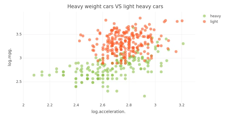
我需要在散点图上画出两条加速度与油耗之间的斜率线,一条针对轻型车,另一条针对重型车。我创建了以下内容:
cars_light <- cars_log[cars_log$log.weight. <= log(mean(cars$weight)), ]
cars_heavy <- cars_log[cars_log$log.weight. > log(mean(cars$weight)),]
cars_log$wt_cat <- ifelse(cars_log$log.weight. > log(mean(cars$weight)), 'heavy', 'light')
到目前为止,我是通过以下方式创建散点图的:
    plot_ly(
  data = cars_log,
  type = "scatter",
  x = ~log.acceleration.,
  y = ~ log.mpg.,
  color = ~ factor(wt_cat),
  colors = c("#8bc34a", "#ff5722"),
  marker = list(size = 10, opacity = 0.6)
) %>%
  layout(title = "Heavy cars VS light cars")
这给我带来了以下结果:
现在,我想为重型车辆创建一个斜坡,为轻型车辆创建另一个斜坡,我知道我需要使用plotly的add_ribbons跟踪,但我无法弄清楚如何生成它。我在使用plotly计算lm时遇到了问题。我可以用ggplot做同样的事情,但我不知道如何在plotly中实现。
    ggplot(cars_log, aes_string('log.acceleration.', 'log.mpg.')) +
  geom_point(aes(color = factor(wt_cat))) +
  geom_smooth(method = 'lm', aes(color = factor(wt_cat)))
这是我的数据样例:
    > cars_log[1:5,]
  log.mpg. log.cylinders. log.displacement. log.horsepower. log.weight. log.acceleration. model_year origin
1 2.890372       2.079442          5.726848        4.867534    8.161660          2.484907         70      1
2 2.708050       2.079442          5.857933        5.105945    8.214194          2.442347         70      1
3 2.890372       2.079442          5.762051        5.010635    8.142063          2.397895         70      1
4 2.772589       2.079442          5.717028        5.010635    8.141190          2.484907         70      1
5 2.833213       2.079442          5.710427        4.941642    8.145840          2.351375         70      1
ggplotly吗? - Andrew Gustardput(例如dput(mtcars)),这将使人们更容易地剪切/粘贴您的数据。 - steveb