如何使用CSS创建一个圆角矩形形状?

5
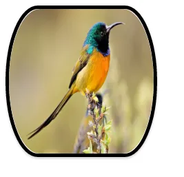
我正在尝试设计一个像这样的个人资料图片形状: correct image design 但是我的代码给出了以下设计: my design 我担心边框内部的白色空间,这里是代码的形状。请帮我检查一下。

.doctor-profile-photo {
  width: 210px;
  height: 210px;
  border-radius: 60px/140px;
  border: 5px solid #000;
  box-shadow: 0px 2px 5px #ccc;
}
.doctor-profile-photo img {
  width: 100%;
  height: 100%;
  border-radius: 60px/140px;
}
<div class="doctor-profile-photo">
  <img src="http://weknowyourdreams.com/images/bird/bird-09.jpg" alt="">
</div>


1
不要将与父元素相同的 border-radius 应用于 img。如果我没记错的话,它需要减去边框宽度。尝试使用 50px/130px 作为 img 的值,这样应该可以消除角落中的空白。 - Harry
@NijrajGelani 这些不是静态图像,我必须通过后端支持进行管理,因此在这种情况下,背景图像不是一个正确的想法。 - Kashif Latif
1
这是一个很好的问题。如果在两天内没有人提供解决方案,请告诉我。那么我会指定一份赏金来吸引更多人关注这篇文章。 - Alexander Elgin
感谢 @AlexanderElgin 的支持。 - Kashif Latif
@NijrajGelani:为什么你删除了你的回答?我觉得那对我有点用处。 - Kashif Latif
显示剩余5条评论
2个回答

4

这将会输出与您想要的非常相似的结果。尝试调整border-radius和height-width的值,以实现您想要的精确效果。

<style>
 #pic { 
    position: relative;     
    width: 130px; 
    height: 150px; 
    margin: 20px 0; 
    background: red; 
    border-radius: 50% / 10%; 
    color: white; 
    text-align: center; 
    text-indent: .1em;
 } 
 #pic:before { 
    content: ''; 
    position: absolute; 
    top: 10%; 
    bottom: 10%; 
    right: -5%; 
    left: -5%; 
    background: inherit; 
    border-radius: 5% / 50%; 
 } 
</style>
<div id="pic"></div>

下面是一个有用的链接:https://css-tricks.com/examples/ShapesOfCSS/


我正在尝试,给我一秒钟。 - Kashif Latif
@KashifLatif 这并不会真正起作用,它只会显示形状,但你实际上无法在其中放置图像。这就是为什么我删除了它。 - Nijraj Gelani

1

SVG路径和图案

您可以使用单个路径创建形状。我使用了二次贝塞尔曲线。
路径 MDN

我使用图像标签和图案标签向SVG添加了图像。
然后使用fill="url(#img1)"将其放置在路径内。
defs标签用于隐藏我们不直接使用的元素。

<svg viewBox="0 0 100 100" width="400px" xmlns="http://www.w3.org/2000/svg">
  <defs>
    <pattern id="img1" patternUnits="userSpaceOnUse" width="400" height="400">
      <image xlink:href="http://lorempixel.com/400/400/" x="0" y="0" width="100px" height="100px" />
    </pattern>

  </defs>
  <path d="M15,15 Q 50,0 85,18 100,50 85,85 50,100 18,85 0,50 15,15Z" fill="url(#img1)" />
</svg>


网页内容由stack overflow 提供, 点击上面的
可以查看英文原文,
原文链接