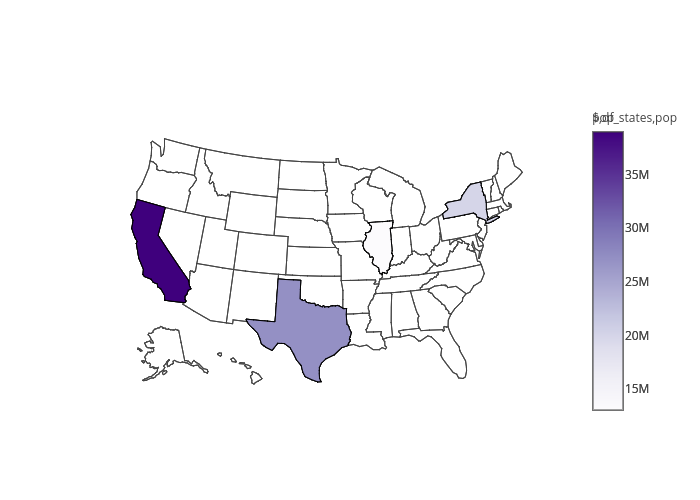
我希望您能在plotly中将两种类型的地图合并成一张地图,即气泡图和区域填充图。目标是通过悬停鼠标在地图上来展示国家层面(区域填充)和城市层面(气泡)的人口规模。以下是用于区域填充地图的plotly示例代码:
如何将这两种类型的地图合并为一张地图?
library(plotly)
    df <- read.csv('https://raw.githubusercontent.com/plotly/datasets/master/2014_world_gdp_with_codes.csv')

    # light grey boundaries
    l <- list(color = toRGB("grey"), width = 0.5)

    # specify map projection/options
    g <- list(
      showframe = FALSE,
      showcoastlines = FALSE,
      projection = list(type = 'Mercator')
    )

    plot_ly(df, z = GDP..BILLIONS., text = COUNTRY, locations = CODE, type = 'choropleth',
            color = GDP..BILLIONS., colors = 'Blues', marker = list(line = l),
            colorbar = list(tickprefix = '$', title = 'GDP Billions US$'),
            filename="r-docs/world-choropleth") %>%
      layout(title = '2014 Global GDP<br>Source:<a href="https://www.cia.gov/library/publications/the-world-factbook/fields/2195.html">CIA World Factbook</a>',
             geo = g)
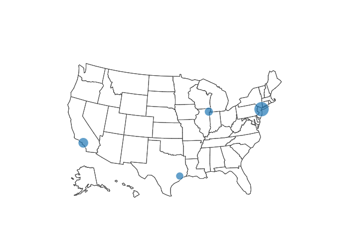
一个气泡地图的 Plotly 示例代码如下:
library(plotly)
    df <- read.csv('https://raw.githubusercontent.com/plotly/datasets/master/2014_us_cities.csv')
    df$hover <- paste(df$name, "Population", df$pop/1e6, " million")

    df$q <- with(df, cut(pop, quantile(pop)))
    levels(df$q) <- paste(c("1st", "2nd", "3rd", "4th", "5th"), "Quantile")
    df$q <- as.ordered(df$q)

    g <- list(
      scope = 'usa',
      projection = list(type = 'albers usa'),
      showland = TRUE,
      landcolor = toRGB("gray85"),
      subunitwidth = 1,
      countrywidth = 1,
      subunitcolor = toRGB("white"),
      countrycolor = toRGB("white")
    )

    plot_ly(df, lon = lon, lat = lat, text = hover,
            marker = list(size = sqrt(pop/10000) + 1),
            color = q, type = 'scattergeo', locationmode = 'USA-states',
            filename="r-docs/bubble-map") %>%
      layout(title = '2014 US city populations<br>(Click legend to toggle)', geo = g)
如何将这两种类型的地图合并为一张地图?
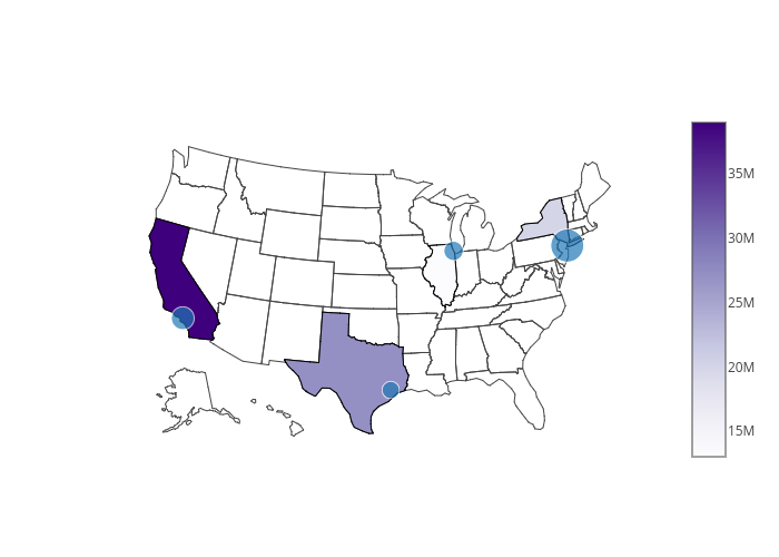
scope、lonaxis和lataxis来为其他国家制作类似的图表。请参见此示例。问题在于,您想要州级别的细节,而据我所知,Plotly仅提供美国的这种选项(选项locationmode)。此外,我认为Plotly不支持使用shapefiles。对于此问题,您可以尝试使用leaflet。 - kanimbla