最近我在滚动网站时遇到了一个问题,就是每当我向下滚动一点时,白色块会出现在网站的顶部/底部。这些白色块是背景的一部分,因为更改背景颜色也会使块的颜色发生变化。
我已经尝试设置的不透明度,但这没有任何效果... 有什么想法可能出了问题吗?或者我的过渡/淡入淡出内容太重了,导致渲染不流畅?
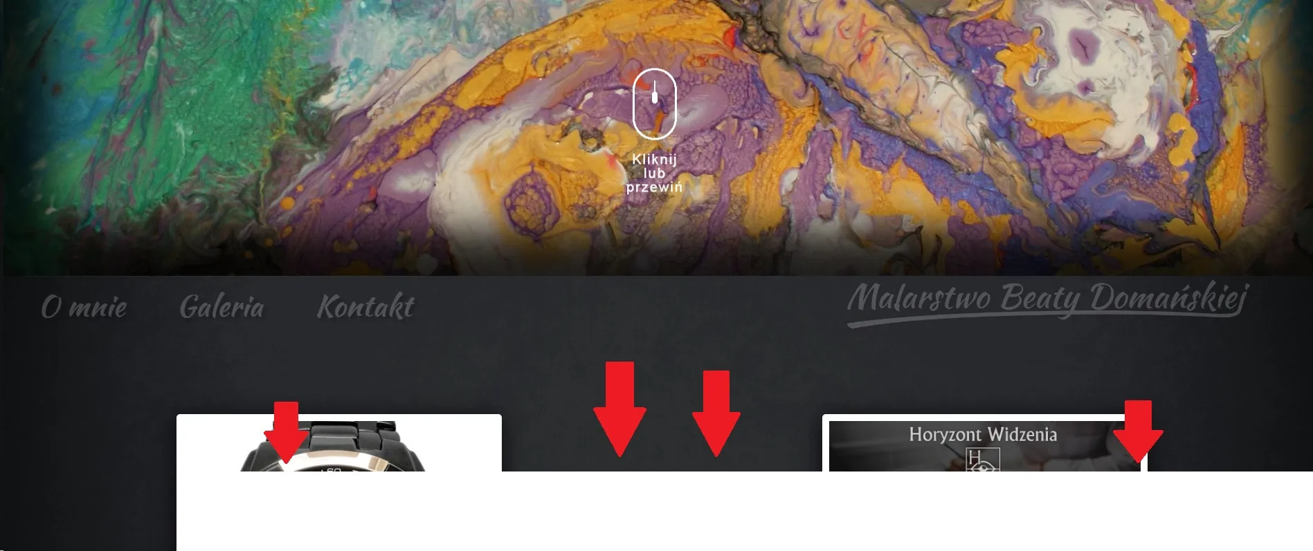
这是问题的截图,很难在截图上捕捉到,因为它只在滚动时持续半秒钟。该块由红色箭头指示。
编辑:
我实际上会发布我的css文件的一部分,也许这会提供任何线索:
html, body {
    height: 100%;
    position: static;
    overflow-x:hidden;
    -webkit-transform: translate3d(0, 0, 0);
    background-color: rgba(255, 255, 255, 0.06);
    transform: translate3d(0,0,0);
}
.heroEffects .bg {
    -webkit-backface-visibility: hidden;
    transform: scale(1);
    -webkit-box-shadow: inset 4px 1px 77px 40px rgba(0,0,0,0.78);
    -moz-box-shadow: inset 4px 1px 77px 40px rgba(0,0,0,0.78);
    box-shadow: inset 4px 1px 77px 40px rgba(0,0,0,0.78);
    position: absolute;
    top: 0;
    left: 0;
    width: 100%;
    height: 100%;
    z-index: 2;
    -webkit-transition: opacity 1s ease-in-out;
    -moz-transition: opacity 1s ease-in-out;
    -o-transition: opacity 1s ease-in-out;
    transition: opacity 1s ease-in-out;
    transform: translate3d(0,0,0);
}
.bgimg {
    -webkit-backface-visibility: hidden;
    -webkit-background-size: cover;
    -moz-background-size: cover;
    -o-background-size: cover;
    background-size: cover;
    position: absolute;
    background-repeat: no-repeat;
    background-position: center center;
    transform: scale(1);
    overflow: hidden;
    -webkit-box-shadow: inset 0px 0px 97px 69px rgba(0,0,0,0.85);
    -moz-box-shadow: inset 0px 0px 97px 69px rgba(0,0,0,0.85);
    box-shadow: inset 0px 0px 97px 69px rgba(0,0,0,0.85);
    top: 0;
    left: 0;
    height: 100%;
    width: 100%;
    background-image: url("../img/gallery/slonecz.jpg");
    animation-name: backgroundchangeFadeInOut;
    animation-timing-function: ease-in-out;
    animation-iteration-count: infinite;
    animation-duration: 15s;
    animation-delay: 5s;
    -webkit-animation-delay: 5s
    -webkit-animation-name: backgroundchangeFadeInOut;
    -webkit-animation-timing-function: ease-in-out;
    -webkit-animation-iteration-count: infinite;
    -webkit-animation-duration: 15s;
    transform: translate3d(0,0,0);
}

@keyframes backgroundchangeFadeInOut {
    0% {
       background-image: url("../img/gallery/slonecz.jpg");
    }
    15% {
       background-image: url("../img/gallery/slonecz.jpg");
    }
    30% {
       background-image: url("../img/gallery/slonecz.jpg");
    }
    42% {
       background-image: url("../img/gallery/slonecz.jpg");
    }
    50% {
       background-image: url("../img/gallery/motyl.jpg");
    }
    68% {
       background-image: url("../img/gallery/motyl.jpg");
    }
    80% {
       background-image: url("../img/gallery/motyl.jpg");
    }
    95% {
       background-image: url("../img/gallery/motyl.jpg");
    }
    100% {
       background-image: url("../img/gallery/slonecz.jpg");
   }
}

.heroEffects .shade {
    opacity: 0;
    background: rgba(0, 0, 0, 0.8);
    z-index: 3;
    height: 100vh;
    position: fixed;
    width: 100%;
}
这里是Vimeo视频,屏幕录制似乎在顶部,并且您可以实际看到当浏览器与此网站处于后台时会发生什么... https://vimeo.com/198493320