材料设计未对警报对话框进行样式化处理。

165

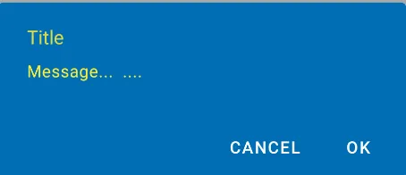
我已经将appCompat的Material Design添加到我的应用程序中,但似乎警报对话框没有使用我的primary、primaryDark或accent颜色。

这是我的基本样式:

<style name="MaterialNavyTheme" parent="@style/Theme.AppCompat.Light.DarkActionBar">
    <item name="colorPrimary">@color/apptheme_color</item>
    <item name="colorPrimaryDark">@color/apptheme_color_dark</item>
    <item name="colorAccent">@color/apptheme_color</item>
    <item name="android:textColorPrimary">@color/action_bar_gray</item>
</style>

根据我的理解,对话框按钮文本也应使用这些颜色。我的理解有误吗?还是我需要做更多的事情?


解决方案:

被标记的答案让我找到了正确的方向。

<style name="MaterialNavyTheme" parent="@style/Theme.AppCompat.Light.DarkActionBar">
    <item name="colorPrimary">@color/apptheme_color</item>
    <item name="colorPrimaryDark">@color/apptheme_color_dark</item>
    <item name="colorAccent">@color/apptheme_color</item>
    <item name="android:actionModeBackground">@color/apptheme_color_dark</item>
    <item name="android:textColorPrimary">@color/action_bar_gray</item>
    <item name="sdlDialogStyle">@style/DialogStyleLight</item>
    <item name="android:seekBarStyle">@style/SeekBarNavyTheme</item>
</style>

<style name="StyledDialog" parent="Theme.AppCompat.Light.Dialog">
    <item name="colorPrimary">@color/apptheme_color</item>
    <item name="colorPrimaryDark">@color/apptheme_color_dark</item>
    <item name="colorAccent">@color/apptheme_color</item>
</style>
8个回答

479

已于2019年8月更新,使用Material Design组件库:

利用新的Android Material Design组件库,可以使用新的com.google.android.material.dialog.MaterialAlertDialogBuilder类。该类继承现有的androidx.appcompat.AlertDialog.Builder类,并支持最新的Material Design规范。

只需像这样使用:

new MaterialAlertDialogBuilder(context)
            .setTitle("Dialog")
            .setMessage("Lorem ipsum dolor ....")
            .setPositiveButton("Ok", /* listener = */ null)
            .setNegativeButton("Cancel", /* listener = */ null)
            .show();

您可以通过扩展ThemeOverlay.MaterialComponents.MaterialAlertDialog样式来自定义颜色:

  <style name="CustomMaterialDialog" parent="@style/ThemeOverlay.MaterialComponents.MaterialAlertDialog">
     <!-- Background Color-->
     <item name="android:background">#006db3</item>
     <!-- Text Color for title and message -->
     <item name="colorOnSurface">@color/secondaryColor</item>
     <!-- Text Color for buttons -->
     <item name="colorPrimary">@color/white</item> 
     ....
  </style>  

要应用您的自定义样式,只需使用构造函数:

new MaterialAlertDialogBuilder(context, R.style.CustomMaterialDialog)

输入图像描述

要自定义按钮、标题和正文文本,请查看此帖子获取更多详细信息。

您还可以在应用程序主题中全局更改样式:

 <!-- Base application theme. -->
 <style name="AppTheme" parent="Theme.MaterialComponents.Light">
    ...
    <item name="materialAlertDialogTheme">@style/CustomMaterialDialog</item>
 </style>

使用支持库和AppCompat主题:

在新的AppCompat v22.1中,您可以使用新的android.support.v7.app.AlertDialog

只需像这样使用代码:

import android.support.v7.app.AlertDialog

AlertDialog.Builder builder =
       new AlertDialog.Builder(this, R.style.AppCompatAlertDialogStyle);
builder.setTitle("Dialog");
builder.setMessage("Lorem ipsum dolor ....");
builder.setPositiveButton("OK", null);
builder.setNegativeButton("Cancel", null);
builder.show();

并使用这样的样式:

<style name="AppCompatAlertDialogStyle" parent="Theme.AppCompat.Light.Dialog.Alert">
        <item name="colorAccent">#FFCC00</item>
        <item name="android:textColorPrimary">#FFFFFF</item>
        <item name="android:background">#5fa3d0</item>
    </style>
否则,您可以在当前主题中定义:
<style name="AppTheme" parent="Theme.AppCompat.Light">
    <!-- your style -->
    <item name="alertDialogTheme">@style/AppCompatAlertDialogStyle</item>
</style>

然后在你的代码中:

 import android.support.v7.app.AlertDialog

    AlertDialog.Builder builder =
           new AlertDialog.Builder(this);

这是KitKat版本中的AlertDialog: 在此输入图片描述


@AAverin 关于Material Design指南:分隔线只应在特定情况下出现。更常见的警报对话框使用场景不会使用它们,因此现在它假定较简单的样式。如果您属于需要分隔线的较不常见的情况,则必须升级到自定义对话框布局,而不是简单的对话框构建器。抱歉。 - Jon Adams
1
非常好的答案,但是我该如何在低于Lollypop版本的Android上实现相同的UI呢?因为在这些设备上,UI看起来很奇怪。 - Pranav P
通过使用AppCompat主题,您可以在所有API < 21的设备上拥有相同的用户界面。 - Gabriele Mariotti
1
添加 import android.support.v7.app.AlertDialog 即可。 - FlipNovid
1
如何在其中添加监听器? - hitesh141
显示剩余7条评论

11

在初始化对话框构建器时,将第二个参数作为主题传递。它将自动显示 API 级别 21 的 Material Design。

AlertDialog.Builder builder = new AlertDialog.Builder(this, AlertDialog.THEME_DEVICE_DEFAULT_DARK);

或者,

AlertDialog.Builder builder = new AlertDialog.Builder(this, AlertDialog.THEME_DEVICE_DEFAULT_LIGHT);

5

AppCompat目前尚未为对话框做到这一点

编辑:现在可以了。请确保使用android.support.v7.app.AlertDialog


看起来你可以使用AppCompat对对话框样式进行一些修改。 - Matthew
我的Android Studio默认给了我import app.AlertDialog而不是appCompat的。在实际检查之前,我试图弄清楚问题出在哪里大约40分钟...该死的谷歌! - Glorifind

4

Material Design 风格的警告对话框:自定义字体、按钮、颜色和形状等

 MaterialAlertDialogBuilder(requireContext(),
                R.style.MyAlertDialogTheme
            )
                .setIcon(R.drawable.ic_dialogs_24px)
                .setTitle("Feedback")
                //.setView(R.layout.edit_text)
                .setMessage("Do you have any additional comments?")
                .setPositiveButton("Send") { dialog, _ ->

                    val input =
                        (dialog as AlertDialog).findViewById<TextView>(
                            android.R.id.text1
                        )
                    Toast.makeText(context, input!!.text, Toast.LENGTH_LONG).show()

                }
                .setNegativeButton("Cancel") { _, _ ->
                    Toast.makeText(requireContext(), "Clicked cancel", Toast.LENGTH_SHORT).show()
                }
                .show()

样式:

  <style name="MyAlertDialogTheme" parent="Theme.MaterialComponents.DayNight.Dialog.Alert">
  
        <item name="android:textAppearanceSmall">@style/MyTextAppearance</item>
        <item name="android:textAppearanceMedium">@style/MyTextAppearance</item>
        <item name="android:textAppearanceLarge">@style/MyTextAppearance</item>

        <item name="buttonBarPositiveButtonStyle">@style/Alert.Button.Positive</item>
        <item name="buttonBarNegativeButtonStyle">@style/Alert.Button.Neutral</item>
        <item name="buttonBarNeutralButtonStyle">@style/Alert.Button.Neutral</item>

        <item name="android:backgroundDimEnabled">true</item>

        <item name="shapeAppearanceOverlay">@style/ShapeAppearanceOverlay.MyApp.Dialog.Rounded
        </item>

    </style>


    <style name="MyTextAppearance" parent="TextAppearance.AppCompat">
        <item name="android:fontFamily">@font/rosarivo</item>
    </style>


        <style name="Alert.Button.Positive" parent="Widget.MaterialComponents.Button.TextButton">
   <!--     <item name="backgroundTint">@color/colorPrimaryDark</item>-->
        <item name="backgroundTint">@android:color/transparent</item>
        <item name="rippleColor">@color/colorAccent</item>
        <item name="android:textColor">@color/colorPrimary</item>
       <!-- <item name="android:textColor">@android:color/white</item>-->
        <item name="android:textSize">14sp</item>
        <item name="android:textAllCaps">false</item>
    </style>


    <style name="Alert.Button.Neutral" parent="Widget.MaterialComponents.Button.TextButton">
        <item name="backgroundTint">@android:color/transparent</item>
        <item name="rippleColor">@color/colorAccent</item>
        <item name="android:textColor">@color/colorPrimary</item>
        <!--<item name="android:textColor">@android:color/darker_gray</item>-->
        <item name="android:textSize">14sp</item>
        <item name="android:textAllCaps">false</item>
    </style>


  <style name="ShapeAppearanceOverlay.MyApp.Dialog.Rounded" parent="">
        <item name="cornerFamily">rounded</item>
        <item name="cornerSize">8dp</item>
    </style>

输出: 在这里输入图片描述


3

2
编辑:这个答案不再推荐使用。
你可以考虑这个项目: https://github.com/fengdai/AlertDialogPro 它可以为你提供几乎与Lollipop相同的材料主题警告对话框。兼容Android 2.1。

只是一点提醒:这个答案比被接受的那个要旧。 - rekire

1
由于某些原因,android:textColor 似乎只能更新标题颜色。您可以通过使用

更改消息文本颜色。
SpannableString.AlertDialog.Builder builder = new AlertDialog.Builder(new ContextThemeWrapper(this, R.style.MyDialogTheme));

AlertDialog dialog = builder.create();
                Spannable wordtoSpan = new SpannableString("I know just how to whisper, And I know just how to cry,I know just where to find the answers");
                wordtoSpan.setSpan(new ForegroundColorSpan(Color.BLUE), 15, 30, Spannable.SPAN_EXCLUSIVE_EXCLUSIVE);
                dialog.setMessage(wordtoSpan);
                dialog.show();

0

我的库更加强大。而且你总是可以用DialogFragment包装一个Dialog。 - afollestad

网页内容由stack overflow 提供, 点击上面的
可以查看英文原文,
原文链接