安卓材料设计按钮样式

345

我对Material Design中的按钮样式感到困惑。我想要像附加链接中所示的那样有色彩且凸起的按钮,例如在使用部分下方看到的"强制停止"和"卸载"按钮。是否有可用的样式或者我需要自己定义呢?

http://www.google.com/design/spec/components/buttons.html#buttons-usage

我找不到默认的按钮样式。

示例:

 <Button style="@style/PrimaryButton"
    android:layout_width="wrap_content"
    android:layout_height="wrap_content"
    android:text="Calculate"
    android:id="@+id/button3"
    android:layout_below="@+id/editText5"
    android:layout_alignEnd="@+id/editText5"
    android:enabled="true" />

如果我尝试通过添加代码来改变按钮的背景颜色

    android:background="@color/primary"

所有的样式都会消失,比如触摸动画、阴影、圆角等。


1
这将对自定义按钮非常有帮助 http://angrytools.com/android/button/ - Kharak
https://stackoverflow.com/a/56822378/7254873 - Sumit Shukla
12个回答

808
我会添加我的答案,因为我没有使用其他提供的答案。
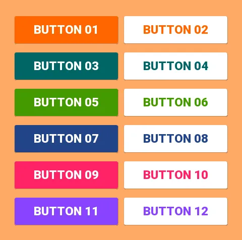
使用Support Library v7,所有样式都已经定义好并可供使用。对于标准按钮,所有这些样式都可用:
style="@style/Widget.AppCompat.Button"
style="@style/Widget.AppCompat.Button.Colored"
style="@style/Widget.AppCompat.Button.Borderless"
style="@style/Widget.AppCompat.Button.Borderless.Colored"

Widget.AppCompat.Button: enter image description here

Widget.AppCompat.Button.Colored: enter image description here

Widget.AppCompat.Button.Borderless enter image description here

Widget.AppCompat.Button.Borderless.Colored:
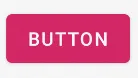
 enter image description here


回答这个问题,因此需要使用的样式是
<Button style="@style/Widget.AppCompat.Button.Colored"
.......
.......
.......
android:text="Button"/>

如何更改颜色

对于整个应用程序:

所有用户界面控件(不仅是按钮,还包括浮动操作按钮、复选框等)的颜色都由属性colorAccent管理,如此处所述。 您可以修改此样式并在自己的主题定义中应用自己的颜色:

<style name="AppTheme" parent="Theme.AppCompat.Light.NoActionBar">
    ...
    <item name="colorAccent">@color/Orange</item>
</style>

针对特定按钮:
如果您需要更改特定按钮的样式,可以定义一个新样式,继承上述任意一个父级样式。在下面的示例中,我只更改了背景和字体颜色:
<style name="AppTheme.Button" parent="Widget.AppCompat.Button.Colored">
    <item name="colorButtonNormal">@color/Red</item>
    <item name="android:textColor">@color/White</item>
</style>

然后你只需要使用以下代码将这个新样式应用到按钮上:

android:theme="@style/AppTheme.Button"

要在布局中设置默认按钮设计,请将以下行添加到styles.xml主题中:
<item name="buttonStyle">@style/btn</item>

其中@style/btn是您的按钮主题。这将为具有特定主题的布局中的所有按钮设置按钮样式。


7
我认为,就目前而言,这实际上是最好的方法。 - xsorifc28
5
你在KitKat设备上测试过它吗? - maohieng
14
“colorButtonNormal”属性在我的Android 4.1.2上无法工作。我无法设置按钮颜色(“android:background”会破坏按钮的材料样式)。 - Konstantin Konopko
2
@YoannHercouet,您使用的是哪个Android版本来制作这些图片?在我的Android 4.1.2和4.4.2上,带有style="..AppCompat.Button"的按钮没有凸起。 - Grzegorz Dev
7
如果你和我一样,使用了 style="" 而不是 Android:theme="",改用后者可以解决这个问题。 - John Snow
显示剩余13条评论

91

最简单的解决方案


步骤 1:使用最新的支持库

compile 'com.android.support:appcompat-v7:25.2.0'

步骤2:将AppCompatActivity用作您的父Activity类


public class MainActivity extends AppCompatActivity

步骤三:在您的布局XML文件中使用应用程序命名空间


<RelativeLayout
    xmlns:android="http://schemas.android.com/apk/res/android"
    xmlns:app="http://schemas.android.com/apk/res-auto"
    android:layout_width="match_parent"
    android:layout_height="match_parent">

第四步:使用AppCompatButton代替Button


<android.support.v7.widget.AppCompatButton
    android:id="@+id/buttonAwesome"
    android:layout_width="wrap_content"
    android:layout_height="wrap_content"
    android:text="Awesome Button"
    android:textColor="@color/whatever_text_color_you_want"
    app:backgroundTint="@color/whatever_background_color_you_want"/>

enter image description here


14
当你指定Button时,构建工具会自动使用android.support.v7.widget.AppCompatButton,因此你不需要指定android.support.v7.widget.AppCompatButton - Mark
2
自动启用/禁用是否有效?还是我们需要重新指定样式? - Sundeep1501
这对我来说删除了Pre-Lollipop上的状态列表,导致一个没有任何点击效果的按钮。 - Florian Walther
似乎在Android P上可以工作,除了textColor会覆盖禁用状态下的文本颜色。 - l33t
2
@Sundeep1501至少没有将Widget.MaterialComponents.Button.OutlinedButton更改为灰色。 - Dr.jacky
@Mark 在动态创建/使用Java创建按钮时,需要使用AppCompatButton,否则可能无法获得预期的样式。 - ban-geoengineering

68

如果我理解你的意思正确,你想做类似于这样的事情:
enter image description here

在这种情况下,只需要使用以下内容即可:

<item name="android:colorButtonNormal">#2196f3</item>

或者对于 API 版本低于 21 的情况:

<item name="colorButtonNormal">#2196f3</item>

除了使用材料主题教程之外。

动画变体在这里


1
@androiddeveloper 将示例推送到了 GitHub,核心内容在这里——https://github.com/AlexKorovyansky/BlueRaisedButton/blob/master/app/src/main/res/values-v21/styles.xml。 - AlexKorovyansky
我认为你必须使用兼容库来支持旧版本。 - AlexKorovyansky
2
它本身不会,但是如果API是21或更高版本,你可以进行设置。我已经找到了一种方法,但我不知道最好的做法是什么。 - android developer
4
这种方法能够支持多种颜色吗?看起来它只允许一次选择一个颜色。 - gerfmarquez
2
@gerfmarquez 你需要为不同的按钮设置不同的样式。 - KISHORE_ZE
显示剩余2条评论

64

你可以使用Material Component库

依赖项添加到你的build.gradle

dependencies { implementation ‘com.google.android.material:material:1.3.0’ }

然后将 MaterialButton 添加到您的布局中:

<com.google.android.material.button.MaterialButton
        style="@style/Widget.MaterialComponents.Button.OutlinedButton" 
        android:layout_width="wrap_content"
        android:layout_height="wrap_content"
        android:text="@string/app_name"
        app:strokeColor="@color/colorAccent"
        app:strokeWidth="6dp"
        app:layout_constraintStart_toStartOf="parent"
        app:shapeAppearance="@style/MyShapeAppearance"
   />

您可以在这里查看完整文档以及API文档

要更改背景颜色,您有两个选项。

  1. 使用backgroundTint属性。

类似于:

<style name="MyButtonStyle"
 parent="Widget.MaterialComponents.Button">
    <item name="backgroundTint">@color/button_selector</item>
    //..
</style>
  1. 在我看来,这将是最好的选择。如果您想要覆盖默认样式中的一些主题属性,则可以使用新的materialThemeOverlay属性。

例如:


  1. 在我看来,这将是最佳选项。如果您想要从默认样式覆盖某些主题属性,则可以使用新的materialThemeOverlay属性。

类似于:

<style name="MyButtonStyle"
 parent="Widget.MaterialComponents.Button">
   <item name=“materialThemeOverlay”>@style/GreenButtonThemeOverlay</item>
</style>

<style name="GreenButtonThemeOverlay">
  <!-- For filled buttons, your theme's colorPrimary provides the default background color of the component --> 
  <item name="colorPrimary">@color/green</item>
</style>

选项#2需要至少版本1.1.0

enter image description hereenter image description here

您可以使用以下样式之一:

  • 填充按钮(默认)style="@style/Widget.MaterialComponents.Button
  • 文本按钮style="@style/Widget.MaterialComponents.Button.TextButton"
  • 轮廓按钮style="@style/Widget.MaterialComponents.Button.OutlinedButton"

旧支持库:

通过新的Support Library 28.0.0,Design Library现在包含MaterialButton

您可以将此按钮添加到我们的布局文件中:

<android.support.design.button.MaterialButton
    android:layout_width="wrap_content"
    android:layout_height="wrap_content"
    android:text="YOUR TEXT"
    android:textSize="18sp"
    app:icon="@drawable/ic_android_white_24dp" />

默认情况下,此类将使用您主题的强调颜色作为按钮填充背景颜色,以及白色作为按钮文本颜色。

您可以使用以下属性自定义按钮:

  • app:rippleColor: 用于按钮涟漪效果的颜色

  • app:backgroundTint: 用于给按钮背景应用色彩。如果您想更改按钮的背景颜色,请使用此属性而不是background。

  • app:strokeColor: 用于按钮描边的颜色

  • app:strokeWidth: 用于按钮描边的宽度

  • app:cornerRadius: 用于定义按钮圆角的半径


44

这是我如何得到想要的东西。

首先,在styles.xml中创建一个按钮:

<style name="Button">
    <item name="android:textColor">@color/white</item>
    <item name="android:padding">0dp</item>
    <item name="android:minWidth">88dp</item>
    <item name="android:minHeight">36dp</item>
    <item name="android:layout_margin">3dp</item>
    <item name="android:elevation">1dp</item>
    <item name="android:translationZ">1dp</item>
    <item name="android:background">@drawable/primary_round</item>
</style>

作为可绘制对象primary_round.xml,按钮的纹理和背景:

<ripple xmlns:android="http://schemas.android.com/apk/res/android"
android:color="@color/primary_600">
  <item>
    <shape xmlns:android="http://schemas.android.com/apk/res/android">
        <corners android:radius="1dp" />
        <solid android:color="@color/primary" />
    </shape>
  </item>
</ripple>

这增加了我想要的波纹效果。


3
圆角半径应为2dp以匹配框架资产。此外,不应在XML中设置translationZ,并且无需覆盖默认的elevation、minWidth、minHeight或margin。 - alanv
3
啊,我没有注意到你缺少一个父样式。你应该添加parent="Widget.Material.Button"或者完全跳过创建自定义样式,直接在按钮本身设置背景。 - alanv
有人找到了像 @Sanket 说的那样投射动态阴影的方法吗? - gerfmarquez
@gerfmarquez 请参考上面被接受的答案,因为那个方法是可行的。 - xsorifc28
这真的是我正在寻找的。完美!非常感谢你! - Jei
显示剩余6条评论

29

除了Gabriele Mariotti提到的android.support.design.button.MaterialButton之外,还有另一个名为com.google.android.material.button.MaterialButton小部件,它具有不同的样式并继承自AppCompatButton

style="@style/Widget.MaterialComponents.Button"
style="@style/Widget.MaterialComponents.Button.UnelevatedButton"
style="@style/Widget.MaterialComponents.Button.TextButton"
style="@style/Widget.MaterialComponents.Button.Icon"
style="@style/Widget.MaterialComponents.Button.TextButton.Icon"

填充、凸起的按钮(默认)enter image description here

style="@style/Widget.MaterialComponents.Button"

填充的、未凸起的按钮输入图像描述

style="@style/Widget.MaterialComponents.Button.UnelevatedButton"

文本按钮: 输入图片描述

style="@style/Widget.MaterialComponents.Button.TextButton"

图标按钮: 输入图像描述

style="@style/Widget.MaterialComponents.Button.Icon"
app:icon="@drawable/icon_24px" // Icons can be added from this

一个带图标的文本按钮:: enter image description here


查看: https://material.io/develop/android/components/material-button/

用于创建新的 Material 按钮的方便类。

该类在构造函数中提供更新后的 Material 样式。小部件将显示正确的默认 Material 样式,而无需使用样式标志。


1
你知道怎么改变它的颜色吗? - Daniel Gomez Rico
1
文档中提取 app:backgroundTintapp:backgroundTintMode - ʍѳђઽ૯ท
他们如何分配禁用状态的颜色 - Zaid Mirza

22

这是一个示例,可以帮助您在应用程序中一致地应用按钮样式。

这是我使用的具有特定样式的示例主题。

<style name="MyTheme" parent="@style/Theme.AppCompat.Light">
   <item name="colorPrimary">@color/primary</item>
    <item name="colorPrimaryDark">@color/primary_dark</item>
    <item name="colorAccent">@color/accent</item>
    <item name="android:buttonStyle">@style/ButtonAppTheme</item>
</style>
<style name="ButtonAppTheme" parent="android:Widget.Material.Button">
<item name="android:background">@drawable/material_button</item>
</style>

这是我在res/drawable-v21文件夹中定义按钮形状和效果的方式...

<?xml version="1.0" encoding="utf-8"?>
<ripple xmlns:android="http://schemas.android.com/apk/res/android"
    android:color="?attr/colorControlHighlight">
  <item>
    <shape xmlns:android="http://schemas.android.com/apk/res/android">
      <corners android:radius="2dp" /> 
      <solid android:color="@color/primary" />
    </shape>
  </item>
</ripple>

2dp的圆角是为了与Material主题保持一致。


抱歉回复晚了,然而这个不是向后兼容的,因为主题是相当晚才引入的。 - samkya

6

我尝试了很多答案和第三方库,但没有一个能够在lollipop上具有涟漪效果的同时保持边框和凸起效果而没有缺陷。这是我的最终解决方案,结合了几个答案(由于灰度色深度,边框/凸起在gif上渲染效果不佳):

棒棒糖

enter image description here

Pre-lollipop

enter image description here

build.gradle

compile 'com.android.support:cardview-v7:23.1.1'

layout.xml

<android.support.v7.widget.CardView
    xmlns:android="http://schemas.android.com/apk/res/android"
    xmlns:card_view="http://schemas.android.com/apk/res-auto"
    android:id="@+id/card"
    card_view:cardElevation="2dp"
    android:layout_width="match_parent"
    android:layout_height="wrap_content"
    card_view:cardMaxElevation="8dp"
    android:layout_margin="6dp"
    >
    <Button
        android:id="@+id/button"
        android:layout_width="match_parent"
        android:layout_height="match_parent"
        android:layout_margin="0dp"
        android:background="@drawable/btn_bg"
        android:text="My button"/>
</android.support.v7.widget.CardView>

drawable-v21/btn_bg.xml

<?xml version="1.0" encoding="utf-8"?>
<ripple xmlns:android="http://schemas.android.com/apk/res/android"
    android:color="?attr/colorControlHighlight">
    <item android:drawable="?attr/colorPrimary"/>
</ripple>

drawable/btn_bg.xml

<?xml version="1.0" encoding="utf-8"?>
<selector xmlns:android="http://schemas.android.com/apk/res/android">
    <item android:drawable="@color/colorPrimaryDark" android:state_pressed="true"/>
    <item android:drawable="@color/colorPrimaryDark" android:state_focused="true"/>
    <item android:drawable="@color/colorPrimary"/>
</selector>

Activity的onCreate方法

    final CardView cardView = (CardView) findViewById(R.id.card);
    final Button button = (Button) findViewById(R.id.button);
    button.setOnTouchListener(new View.OnTouchListener() {
        ObjectAnimator o1 = ObjectAnimator.ofFloat(cardView, "cardElevation", 2, 8)
                .setDuration
                        (80);
        ObjectAnimator o2 = ObjectAnimator.ofFloat(cardView, "cardElevation", 8, 2)
                .setDuration
                        (80);

        @Override
        public boolean onTouch(View v, MotionEvent event) {

            switch (event.getAction()) {
                case MotionEvent.ACTION_DOWN:
                    o1.start();
                    break;
                case MotionEvent.ACTION_CANCEL:
                case MotionEvent.ACTION_UP:
                    o2.start();
                    break;
            }
            return false;
        }
    });

一直在寻找一个完整的例子,惊讶这个问题没有得到更高的投票 - 谢谢。 - XMAN

6

1) 您可以通过定义XML可绘制对象来创建 圆角按钮,并且您可以增加或减小半径以增加或减小按钮角的圆角度数。将此XML可绘制对象设置为按钮的背景。

<?xml version="1.0" encoding="utf-8"?>
<inset xmlns:android="http://schemas.android.com/apk/res/android"
    android:insetLeft="4dp"
    android:insetTop="6dp"
    android:insetRight="4dp"
    android:insetBottom="6dp">
    <ripple android:color="?attr/colorControlHighlight">
        <item>
            <shape android:shape="rectangle"
                android:tint="#0091ea">
                <corners android:radius="10dp" />
                <solid android:color="#1a237e" />
                <padding android:bottom="6dp" />
            </shape>
        </item>
    </ripple>
</inset>

圆角按钮

2) 若要更改默认阴影和按钮状态之间的阴影过渡动画,您需要定义选择器,并使用android:stateListAnimator属性将其应用于按钮。有关完整的按钮自定义参考,请查看:http://www.zoftino.com/android-button


1
// here is the custom button style
<?xml version="1.0" encoding="utf-8"?>
<selector xmlns:android="http://schemas.android.com/apk/res/android">
<item>
    <shape>
        <gradient
            android:angle="45"
            android:centerColor="@color/colorPrimary"
            android:startColor="@color/colorPrimaryDark"
            android:endColor="@color/colorAccent"
            >
        </gradient>
        <corners
            android:topLeftRadius="10dp"
            android:topRightRadius="10dp"
            android:bottomLeftRadius="10dp"
            android:bottomRightRadius="10dp"
            >
        </corners>
        <stroke
            android:width="2dp"
            android:color="@color/colorWhite"
            >
          </stroke>
      </shape>
       </item>

</selector>

网页内容由stack overflow 提供, 点击上面的
可以查看英文原文,
原文链接