使用CSS边框绘制三角形和倒置的三角形

4
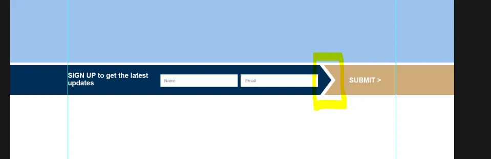
我想通过CSS边框来实现以下图像示例,这可能吗?并且它也可以是响应式的吗?我已经在这里开始了一个fiddle here. 我知道我在某个地方见过这个,但是记不起来在哪里看到的。

enter image description here

以下是目前的代码 -

HTML

<div class="container">

    <div class="row">

        <div class="sign-up col-sm-9">

            <div class="col-sm-4">

                <h3>SIGN UP to get the latest updates on Security News</h3>

            </div>

            <div class="col-sm-4">

            </div>

            <div class="col-sm-4">

            </div>

        </div>  <!-- /.sign-up -->          

        <div class="invert"></div>

            <div class="submit col-sm-3">

                <input type="submit" value="Submit">

            </div>

    </div> <!-- /.row -->

</div><!-- /.container -->

CSS(层叠样式表) -
.sign-up {
  background: #002d56;
  padding: 0px 0px;
  color: #ffffff;
  font-size: 20px;
}

.sign-up h3{
  padding: 10px 0px;
  font-size: 20px;
}

.sign-up:after {
  content: "";
  display: block;
  width: 0; 
  height: 0; 
  border-top: 70px solid #ffffff;
  border-bottom: 69px solid #ffffff;
  border-left: 70px solid #002d56;
  position: absolute;
  right: 0;
}

.invert {
  position:relative;
}

.invert:after {
  content: "";
  display: block;
  width: 0; 
  height: 0; 
  border-top: 70px solid #cfab7a;
  border-bottom: 69px solid #cfab7a;
  border-left: 70px solid #ffffff;
  position: absolute;
  right: 118px;
}

.submit {
  background: #cfab7a;
  width: 0; 
  height: 0; 
}

.submit:before {

}

.submit input[type="submit"] {
  background: #cfab7a;
  padding: 10px 0px;
  border: none;
}

我喜欢Chris Coyier关于CSS形状的概述,它还包含你正在寻找的三角形。http://css-tricks.com/examples/ShapesOfCSS/ - Marijke Luttekes
1个回答

7

好的,我已经尝试实现了您想要的内容,请检查这段代码并查看这个Fiddle

注意:需要使用两个三角形来实现,因为CSS三角形是通过边框绘制的。

HTML:

 <div class="rectangle"></div> 
 <div class="hidden-div">
     <div class="big-triangle"></div>
     <div class="triangle"></div> 
  </div>

CSS(层叠样式表):
.triangle {
    width: 0px;
    height: 0px;
    border-style: solid;
    border-width: 63px 0 63px 80px;
    border-color: transparent transparent transparent #007bff;
    position:absolute;
}
.big-triangle {
    width: 0px;
    height: 0px;
    border-style: solid;
    border-width: 80px 0 80px 100px;
    border-color: transparent transparent transparent #fff;
    position:absolute;
    top:-17px;
}
.rectangle {
    background-color:#007bff;
    width:300px;
    height:125px;
    position:absolute;
}
.hidden-div {
    width:300px;
    height:110px;
    position:absolute;
    left:50px;
}

网页内容由stack overflow 提供, 点击上面的
可以查看英文原文,
原文链接