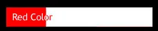
有没有一种CSS属性可以根据背景颜色反转字体颜色,就像这张图片一样?
有一个CSS属性叫作mix-blend-mode,但是IE浏览器不支持。我建议使用伪元素来替代。如果你需要支持IE6和IE7浏览器,也可以使用两个DIV元素代替伪元素。
.inverted-bar {
    position: relative;
}

.inverted-bar:before,
.inverted-bar:after {
    padding: 10px 0;
    text-indent: 10px;
    position: absolute;
    white-space: nowrap;
    overflow: hidden;
    content: attr(data-content);
}

.inverted-bar:before {
    background-color: aqua;
    color: red;
    width: 100%;
}

.inverted-bar:after {
    background-color: red;
    color: aqua;
    width: 20%;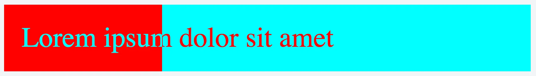
}<div class="inverted-bar" data-content="Lorem ipsum dolor sit amet"></div>mix-blend-mode,但是包含的代码中没有设置这个属性的地方。 - Michael Ziluck使用 mix-blend-mode。

div {
    position:absolute;
    height:200px
}

/* A white bottom layer */
#whitebg {
    background: white;
    width:400px;
    z-index:1
}

/* A black layer on top of the white bottom layer */
#blackbg {
    background: black;
    width:100px;
    z-index:2
}

/* Some white text on top with blend-mode set to 'difference' */
span {
    position:absolute;
    font-family: Arial, Helvetica;
    font-size: 100px;
    mix-blend-mode: difference;
    color: white;
    z-index: 3
}

/* A red DIV over the scene with the blend-mode set to 'screen' */
#makered {
    background-color: red;
    mix-blend-mode: screen;
    width:400px;
    z-index:4
}<div id="whitebg"></div>
<div id="blackbg"></div>
<div id="makered"></div>
<span>test</span>我知道这是一个旧问题,但在学习到mix-blend-mode之前,我想添加另一种解决方案。
这个想法是将信息复制到两个图层中,一个后面和一个前面,其中后面和前面具有不同的背景和文本颜色。它们在尺寸和文本上是相同的。之间,我使用剪切框div来裁剪前面(顶部)图层到所需的宽度,显示没有被剪切的前面图层,并在剪辑窗口之外显示后面图层。
这类似于采纳答案中“两个div”的解决方案,但使用了额外的剪切框。这种解决方案的优点在于如果需要,可以轻松地使文本居中,并直接选择颜色。
// Set *front* width to *back* width
// Do this after DOM is ready
$('#front').width($('#back').width())

// Based upon an event that determines a content change
// you can set the text as in the below example
percent_complete = 45  // obtain this value from somewhere; 45 is just a test

$('#front').text(percent_complete.toString() + '% complete')
$('#back span').text($('#front').text())
bb_width = (percent_complete * $('#back').width())/100
$('#boundbox').css('width', bb_width.toString())
.progress {
display: block;
margin: 0;
/* Choose desired padding/height in coordination with font size */
padding: 10px;
height: 28px;
}
#back {
position: relative;
/* Choose a border to your liking, or none */
border: 1px solid lightgray;
/* Choose your desired text attributes */
text-align: center;
font-family: Calibri, "Sans Serif";
font-size: 16pt;
/* Set the desired width of the whole progress bar */
width: 75%;
/* Choose the desired background and text color */
background-color: white;
color: black;
}
#front {
position: absolute;
left: 0;
top: 0;
/* Choose the desired background and text colors */
background-color: navy;
color: white;
}
#boundbox {
position: absolute;
left: 0;
top: 0;
overflow: hidden;
}html
<div class='progress' id='back'>
<span></span>
<div class='progress' id='boundbox'>
<div class='progress' id='front'>
</div>
</div>
</div>
<script src="https://ajax.googleapis.com/ajax/libs/jquery/3.6.4/jquery.min.js"></script>我使用jQuery编程来动态设置百分比进度,并确保前端的宽度与后端相匹配,并且它们具有相同的文本。这也可以很容易地通过纯JavaScript完成。
这里还有一个演示:进度条。
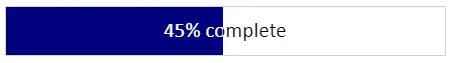
我在Chrome、Firefox、Microsoft Edge和IE 11版本中进行了测试。
我看到这是一个相当老的问题,但是在发现自己遇到了同样的问题后,我想出了一种只使用CSS的解决方案,但需要在三个独立的div中使用相同的文本。
<!DOCTYPE html>
<html lang="en">
<head>
    <meta charset="UTF-8">
    <meta http-equiv="X-UA-Compatible" content="IE=edge">
    <meta name="viewport" content="width=device-width, initial-scale=1.0">
    <title>Document</title>
    <style>
        .container {
            width: fit-content;
            padding: 1rem;
            font-size: 4rem;
            overflow: hidden;
            border: 1px solid black;
            position: relative;
            color: white;   /* Hide the first text */
        }
        .container .bellow, .container .above {
            position: absolute;
            top: 0;
            left: 0;
            width: 100%;
            height: 100%;
        }
        .container .bellow span, .container .above span {
            position: relative;
            top: 1rem;    /* Same as padding */
            left: 1rem;   /* Same as padding */
        }
        .container .bellow {
            color: black;   /* The text as seen normally */
        }
        .container .above {
            color: white;   /* Text color when background slides in*/
            overflow: hidden;
            white-space: nowrap;
            background-color: red;
            width: 0;        /* width: 50%; --> See the effect*/
            transition: width 5s;
        }
        .container:hover .above {
            width: 100%;
        }

    </style>
</head>
<body>
    <div class="container">
            Input text (hover)
        <div class="bellow">
            <span>Input text (hover)</span>
        </div>
        <div class="above">
            <span>Input text (hover)</span>
        </div>
    </div>
</body>
</html>我知道这是一个老问题,但我遇到了同样的问题,而且提供的解决方案都不能满足我的使用情况。我能够使用background-clip: text仅使用锚点和::before伪元素实现相同的效果。请注意,此解决方案并不适用于所有浏览器,因此您可能需要提供备用样式,请检查支持background-clip和transform-style属性的浏览器列表。
属性transform-style: preserve-3d和translateZ(-1px)需要保持::before伪元素在文本背景后面。
.link {
  position: relative;
  cursor: pointer;
}

@supports ((background-clip: text) or (-webkit-background-clip: text)) and (transform-style: preserve-3d) {
  .link {
    background-size: 200% 100%;
    background-position: 100%;
    transition: background-position 0.25s ease;
    background-clip: text;
    -webkit-background-clip: text;
    color: transparent;
    transform-style: preserve-3d;
    background-image: linear-gradient(90deg, white 50%, black 50%);
  }

  .link::before {
    content: "";
    display: block;
    position: absolute;
    width: 0;
    height: 100%;
    left: 0;
    top: 0;
    z-index: -1;
    transform: translateZ(-1px);
    transition: width 0.25s ease;
    background-color: black;
  }

  .link:hover {
    background-position: 0;
  }

  .link:hover::before {
    width: 100%;
  }
}

@supports not ((background-clip: text) or (-webkit-background-clip: text) or (transform-style: preserve-3d)) {
  .link {
    transition: color 0.25s ease;
  }

  .link:hover {
    color: black;
  }
}<a class="link">Example link!</a>我认为这更容易理解。
*{
    margin: 0;
    padding: 0;
    box-sizing: border-box;
    font-family: sans-serif;
}
.titulo{
    text-align: center;
    margin: 2em;
}
.padre{
    margin: 0 auto;
    display: flex;
    justify-content: center;
    align-items: center;
    margin-top: 10em;
    position: relative;
    width: 1000px;
    height: 500px;
}
.caja-1{
    background-color: black;
    width: 500px;
    height: 500px;
    left: 0;
    mix-blend-mode: screen;
    position:absolute;
}
.caja-3{
    width: 500px;
    height: 500px;
    display: flex;
    background-color: white;
    position: absolute;
    right: 0;
}
.texto{
    font-size: 5em;
    color: white;
    mix-blend-mode: difference;
    position:absolute;
}
<!DOCTYPE html>
<html lang="es">
<head>
<meta charset="UTF-8">
<meta name="viewport" content="width=device-width, initial-scale=1.0">
<meta http-equiv="X-UA-Compatible" content="ie=edge">
<title>ESTILOS CONTRASTADOS CSS3</title>
</head>
<body>
<h1 class="titulo">MIX-BLEND-MODE CSS EFFECT</h1>
<div class="padre">
<div class="caja-1"></div>
<div class="caja-3"></div>
<h1 class="texto">CODE STOCK CENTER</h1>
</div>
</body>
</html>