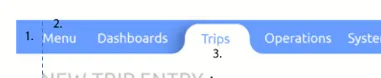
CSS反转背景颜色

4

目前我的CSS看起来像这样:

enter image description here

但我想要绿色圆角块的反面,也就是这样:

enter image description here

有没有什么方法可以用最少的额外div来实现这个效果?以下是我的代码:

.navbar {
  background-color: blue;
  height: 35px;
}

button {
  color: white;
  border: none;
  // background-color: green;
  background-color: transparent;
  height: 100%;
  padding: 0px 10px;
  cursor: pointer;
}

button.selected {
  background-color: white;
  color: black;
  cursor: default;
  border-radius: 15px 15px 0px 0px;
  position: relative;
  height: 30px;
  vertical-align: bottom;
}

button:after,
button:before {
  background-color: rgb(188, 218, 188);
  height: 20px;
  width: 20px;
  position: absolute;
  content: '';
  bottom: 0px;
}

button:after {
  right: -20px;
  border-bottom-left-radius: 15px;
}

button:before {
  left: -20px;
  border-bottom-right-radius: 15px;
}
<div class="navbar">
  <button>tab1</button>
  <button>tab2</button>
  <button class="selected">tab3</button>
  <button>tab4</button>
</div>


你必须使用SVG。 - flppv
相关:https://dev59.com/T6vka4cB1Zd3GeqPtnnQ#50402586 - Temani Afif
5个回答

1
一种可能的解决方案是使用box-shadow来处理beforeafter。此外,您还可以考虑为伪元素使用pointer-events:none,因为您不希望阻塞导航栏上的其他元素。
另一种解决方案是使用svg制作按钮。

.navbar {
  background-color: blue;
  height: 35px;
  overflow:hidden;
}

button {
  color: white;
  border: none;
  background-color: transparent;
  height: 100%;
  padding: 0px 10px;
  cursor: pointer;
}

button.selected {
  background-color: white;
  color: black;
  cursor: default;
  border-radius: 15px 15px 0px 0px;
  position: relative;
  height: 30px;
  vertical-align: bottom;
}

button:after,
button:before {
  background-color: transparent;
  height: 20px;
  width: 20px;
  position: absolute;
  content: '';
  bottom: 0px;
  box-shadow: 2px 10px 1px white;
  pointer-events:none;
}

button:after{box-shadow: -2px 10px 1px white;}

button:after {
  right: -20px;
  border-bottom-left-radius: 15px;
}

button:before {
  left: -20px;
  border-bottom-right-radius: 15px;
}
<div class="navbar">
  <button>tab1</button>
  <button>tab2</button>
  <button class="selected">tab3</button>
  <button>tab4</button>
</div>


1
我认为您应该添加一个包含内容文本的字典,就像这样:

.navbar {
  background-color: blue;
  height: 35px;
}

.content {
  color: white;
  border: none;
  background-color: blue;
  height: 100%;
  padding: 10px 10px;
  cursor: pointer;
}
button{
  background-color: white;
  padding: 0px;
  border: 0px;
  margin-left: -4px;
}
button.selected{
  background-color: blue;
}
button.selected .content{
  background-color: white;
  color: black;
  cursor: default;
  border-radius: 15px 15px 0px 0px;
  position: relative;
  vertical-align: bottom;
}

button.before-selected .content{
  border-bottom-right-radius: 10px;
}
button.after-selected .content{
  border-bottom-left-radius: 10px;
}
<div class="navbar">
  <button><div class="content">tab1</div></button>
  <button class="before-selected"><div class="content">tab2</div></button>
  <button class="selected"><div class="content">tab3</div></button>
  <button class="after-selected"><div class="content">tab4</div></button>
</div>


0
我建议使用svg和background-image或在::before::after上使用clip-path属性。

0
你必须在选项卡元素的::before::after上使用SVG。这是一个例子:
header {
  background: gray;
}

nav {
  padding-top: 10px;
}

.tab {
  background: none;
  border: none;
  padding: 10px;
  width: 100px;
}

.tab.selected {
  background: white;
  border-radius: 10px 10px 0 0;
  position: relative;
}

.tab.selected::before,
.tab.selected::after {
  content: '';
  bottom: 0;
  height: 10px;
  position: absolute;
  width: 10px;
} 

.tab.selected::before {
  background-image: url("data:image/svg+xml;utf8,<svg xmlns='http://www.w3.org/2000/svg' width='10' height='10'><path d='M 0 10 L 10 10 L 10 0 Q 10 10 0 10 Z' fill='%23ffffff'></path></svg>");
  left: -10px;
}

.tab.selected::after {
  background-image: url("data:image/svg+xml;utf8,<svg xmlns='http://www.w3.org/2000/svg' width='10' height='10'><path d='M 0 10 L 10 10 L 10 0 Q 10 10 0 10 Z' fill='%23ffffff'></path></svg>");
  right: -10px;
  transform: scaleX(-1);
}

<header>
  <nav>
    <button class="tab">Tab</button>
    <button class="tab selected">Tab</button>
    <button class="tab">Tab</button>
  </nav>
</header>

Codepen链接


0
您可以使用以下属性来获取绿色边框半径块的反转图像:
transform: rotate(180deg);

所以你的CSS将会是这样的:

button:after,
button:before {
  background-color: rgb(188, 218, 188);
  height: 20px;
  width: 20px;
  position: absolute;
  content: '';
  bottom: 0px;
  transform: rotate(180deg);
}

或者您可以使用以下代码并进行更好的样式设计:

.navbar {
  background-color: blue;
  height: 35px;
}

button {
  color: white;
  border: none;
  // background-color: green;
  background-color: transparent;
  height: 100%;
  padding: 0px 10px;
  cursor: pointer;
}

button.selected {
  background-color: white;
  color: black;
  cursor: default;
  border-radius: 15px 15px 0px 0px;
  position: relative;
  height: 30px;
  vertical-align: bottom;
}

button:after,
button:before {
  background-color: transparent;
  height: 20px;
  width: 20px;position: absolute;
  content: '';
  bottom: 0px;
  transform: rotate(180deg);
}

button:after {
  right: -20px;
  border-bottom-left-radius: 15px;
  -webkit-box-shadow: inset 0px 6px 5px 0px #000000;
  box-shadow: inset 0px 6px 5px 0px #000000;
}

button:before {
  left: -20px;
  border-bottom-right-radius: 15px;
  -webkit-box-shadow: inset 4px 8px 5px -3px #000000;
  box-shadow: inset 4px 8px 5px -3px #000000;
}
<div class="navbar">
  <button>tab1</button>
  <button>tab2</button>
  <button class="selected">tab3</button>
  <button>tab4</button>
</div>


嗨。谢谢你的想法,但这行不通。它会像这样显示:https://i.imgur.com/A9t4bpo.png - Paul Kruger

网页内容由stack overflow 提供, 点击上面的
可以查看英文原文,
原文链接