如何设置直方图的轴并交换x和y轴?

3

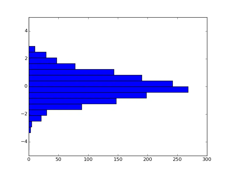
我有一个数据集,想要绘制每个深度测量次数的直方图。我想要绘制深度列中测量频率的直方图。我想将数据分成5m一组,从0m开始到155m。这段代码可以得到一个直方图,形状看起来合理,但值似乎不对,而且我无法让它从0开始。此外,我希望能够交换x轴和y轴,使深度在y轴上,频率在x轴上。

    import numpy as np
    import datetime as dt
    import matplotlib.pyplot as plt
    import glob


    #The data is read in, and then formatted so that an array Dout (based on depth) is created. This is done since multiple files will be read into the code, and so I can create the histogram for all the files I have up until this point.

    Dout = np.array(depthout)


    bins = np.linspace(0, 130, num=13) #, endpoint=True, retstep=False)


    plt.hist(Dout, bins)
    plt.xlabel('Depth / m')
    plt.ylabel('Frequency')
    plt.show()


    # the end

数据格式如下:
TagID    ProfileNo   ProfileDirn     DateTime    Lat     Lon     Depth   Temperature

2
当我读完标题后,我原本以为会看到一段不同的代码块。也许您可以发布一个更符合标题的最简示例,而无需进行所有这些数据管理。对于水平条形图,请查看matplotlib图库中的barh_demo:http://matplotlib.org/gallery.html - Nras
这似乎是pandas包的完美应用场景。使用pd.read_clipboard()将代码读入数据框中,然后df.Temperature.hist()即可生成直方图。此外,pandas提供了许多切片选项,可以用很少的代码实现你想要的操作。 - Joop
这个能处理多个文件吗?抱歉,我以前从没用过pandas。 - TDJ92
@Nras 这样好一些吗?那个链接提供了必要的分箱信息!谢谢!然而,频率仍然明显不对... - TDJ92
1个回答

8

你需要使用historientation参数(文档)。

import matplotlib.pyplot as plt
import numpy as np

fig, ax = plt.subplots()

data = np.random.randn(1500)
bins = np.linspace(-5, 5, 25, endpoint=True)

ax.hist(data, bins, orientation='horizontal')
ax.set_ylim([-5, 5])
plt.show()

enter image description here


网页内容由stack overflow 提供, 点击上面的
可以查看英文原文,
原文链接