我有一个简单的练习,但我不确定该怎么做。我有以下数据集:
男性100
第二个是:
我有以下代码:
这段文字的含义是:产生以下结果:
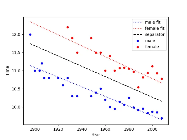
我尝试了调整 y 的参数,但没有成功。我还尝试对 male100、female100 和它们合并版本(跨行)进行线性回归拟合,但没有得到任何结果。
任何帮助都将不胜感激!
男性100
    Year    Time
0   1896    12.00
1   1900    11.00
2   1904    11.00
3   1906    11.20
4   1908    10.80
5   1912    10.80
6   1920    10.80
7   1924    10.60
8   1928    10.80
9   1932    10.30
10  1936    10.30
11  1948    10.30
12  1952    10.40
13  1956    10.50
14  1960    10.20
15  1964    10.00
16  1968    9.95
17  1972    10.14
18  1976    10.06
19  1980    10.25
20  1984    9.99
21  1988    9.92
22  1992    9.96
23  1996    9.84
24  2000    9.87
25  2004    9.85
26  2008    9.69
第二个是:
女性100
    Year    Time
0   1928    12.20
1   1932    11.90
2   1936    11.50
3   1948    11.90
4   1952    11.50
5   1956    11.50
6   1960    11.00
7   1964    11.40
8   1968    11.00
9   1972    11.07
10  1976    11.08
11  1980    11.06
12  1984    10.97
13  1988    10.54
14  1992    10.82
15  1996    10.94
16  2000    11.12
17  2004    10.93
18  2008    10.78
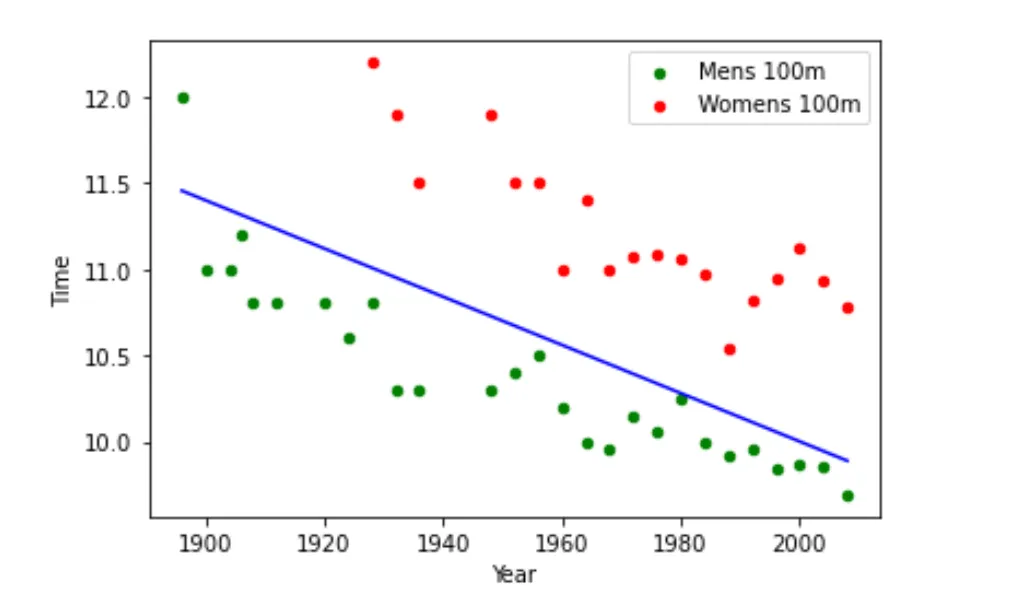
我有以下代码:
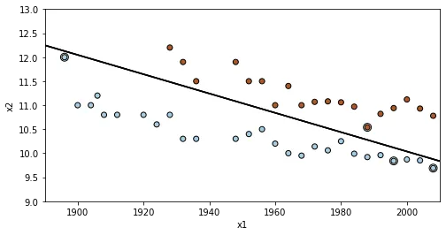
y = -0.014*male100['Year']+38

plt.plot(male100['Year'],y,'r-',color = 'b')
ax = plt.gca() # gca stands for 'get current axis'
ax = male100.plot(x=0,y=1, kind ='scatter', color='g', label="Mens 100m", ax = ax)
female100.plot(x=0,y=1, kind ='scatter', color='r', label="Womens 100m", ax = ax)
这段文字的含义是:产生以下结果:
我尝试了调整 y 的参数,但没有成功。我还尝试对 male100、female100 和它们合并版本(跨行)进行线性回归拟合,但没有得到任何结果。
任何帮助都将不胜感激!