使用Python中的pandas库绘制数据框中的两列数据。

19

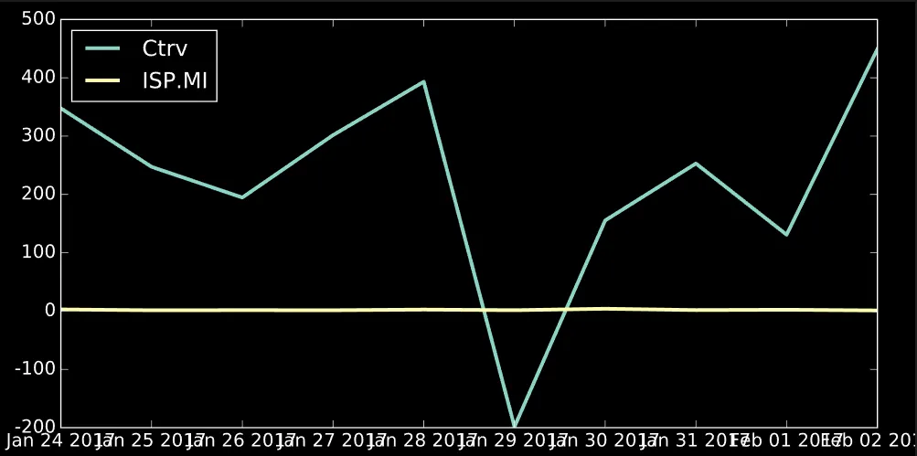
我有一个pandas数据帧,其中日期作为索引,还有一些列: 我想绘制一个折线图,有两条线(假设为“ISP.MI”和“Ctrv”); 在x轴上,我需要展示“Date”

Ticker       ISP.MI  Daily returns        Ctrv  Inv_Am  Giac_Media
Date                                                                 
2016-01-01  2.90117            NaN  100.000000     100       100.0   
2016-01-04  2.80159      -0.034927  196.507301     200       150.0   
2016-01-05  2.85608       0.019263  300.292610     300       200.0   
2016-01-06  2.77904      -0.027345  392.081255     400       250.0   
2016-01-07  2.73206      -0.017050  485.396411     500       300.0   
2016-01-08  2.72267      -0.003443  583.725246     600       350.0   
5个回答

55

我认为最简单的方法是使用子集选择列,然后使用DataFrame.plot

df[['ISP.MI','Ctrv']].plot()

如何将每列的样式和颜色作为列表添加,例如g-、ro等。请问能否在答案中添加?@jezrael - ihightower
1
@ihightower - 有多种解决方案可供选择,请查看答案。 - jezrael
@jezrael 你有没有想法如何保存这种方式创建的图形?我使用了 plt.savefig("path/pic1.png"),但它只保存了一张空白图片。 - i.n.n.m
如果您无法看到多列线/点,请检查数据框的“dtypes”,并将其从“object”转换为数字列。这个问题至少浪费了我几个小时。 - Dan

17

如果您不关心轴的刻度:

plt.figure()

x = df['Date']
y1 = df['ISP.MI']
y2 = df['Ctrv']

plt.plot(x,y1)
plt.plot(x,y2)

如果你关心它:

fig, ax1 = plt.subplots()

x = df['Date']
y1 = df['ISP.MI']
y2 = df['Ctrv']

ax2 = ax1.twinx()

ax1.plot(x, y1, 'g-')
ax2.plot(x, y2, 'b-')

17
import numpy as np
import pandas as pd
import matplotlib.pyplot as plt

d = {'x' : [1,2,3,4,5,6,7,8,9,10],
     'y_one' : np.random.rand(10),
     'y_two' : np.random.rand(10)}

df = pd.DataFrame(d)

df.plot('x',y=['y_one','y_two'])
plt.show()

在这里输入图片描述


3
我认为这种方法很有用,因为它展示了如何使用plot()函数从DataFrame中选择特定列,并将这些列映射到X轴和Y轴。 - Mepix

2

以下代码可以从头创建一个数据帧,它看起来和您的数据一样,并生成您所要求的图形:

import pandas as pd
import datetime
import numpy as np
from matplotlib import pyplot as plt

# The following two lines are not mandatory for the code to work
import matplotlib.style as style
style.use('dark_background')

def create_datetime_range(numdays=10):
    """Creates the timestamp range"""
    base = datetime.datetime.today()
    datelist = pd.date_range(base, periods=numdays).to_pydatetime()
    return datelist
def convert_to_date(datetime_list):
    """Converts a timestamp array into a date array"""
    return [x.date() for x in datetime_list]


a = pd.DataFrame(
    {
        'ISP.MI': np.random.normal(2,1,10),
        'Ctrv' : np.random.normal(200,150,10)
    }, 
    index=convert_to_date(create_date_range())
)
a.plot()

enter image description here

然而,我认为您的数据框在两个方面有所不同:

  1. 索引中似乎有两个级别(日期标题似乎在股票标题的第二行)。我想这可能是因为您使用了像.groupby()、.unstack()或其他聚合/透视方法。建议您查看reset_index()方法。

2.您的数据框具有比您需要的更多的列。如@jezrael所建议的那样,您应该先选择这些列。您可以使用以下方式进行操作:

df[['ISP.MI','Ctrv']]

然后在较小的数据框上使用.plot()方法,让pandas处理剩下的部分。


0

网页内容由stack overflow 提供, 点击上面的
可以查看英文原文,
原文链接