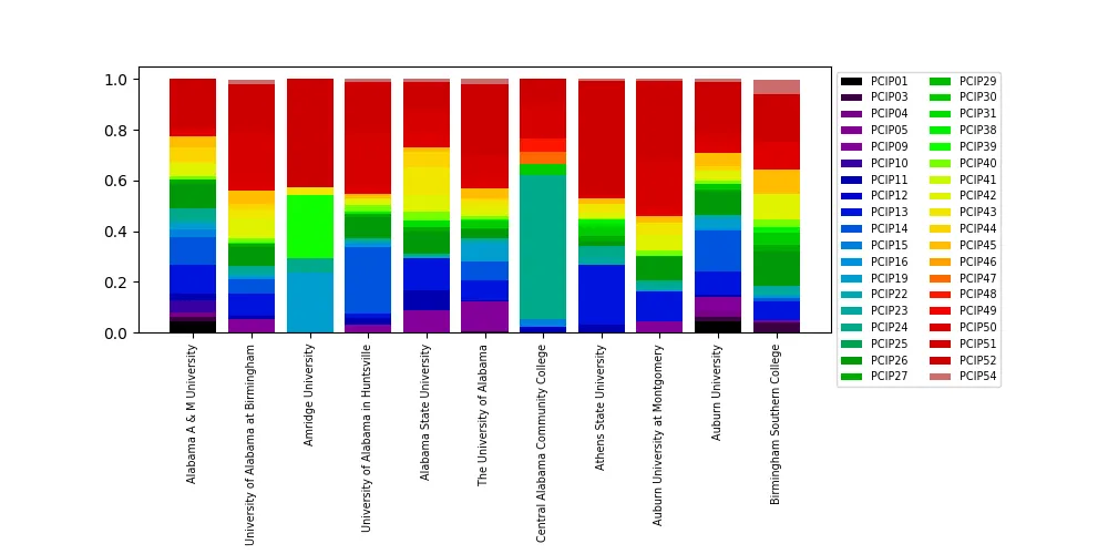
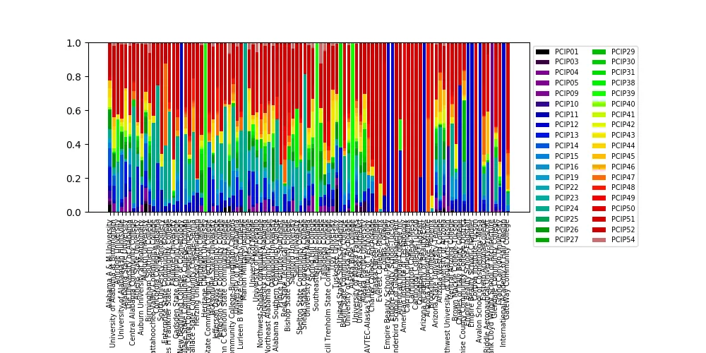
我正在尝试使用此网站的College Scorecard数据,在MatPlotLib中创建100%堆积条形图。
有38个列,它们是:[插入研究领域]获得学位的百分比,这就解释了为什么有38个字段!
我有一些子集的学校需要做这个堆积图。
我试图按照这里的说明去做。是的。代码相当冗长,但我想要按部就班地操作。(再加上我总是对这个博客好运)由于数据已经以百分比形式给出,所以我不必像Chris那样进行计算。
当我运行代码时,出现了错误:
bar_width = 1
bar_l = [i for i in range(len(df['PCIP01']))]
tick_pos = [i+(bar_width/2) for i in bar_l]

# Create a figure with a single subplot
f, ax = plt.subplots(1, figsize=(10,5))

ax.bar(bar_l,
       degrees.PCIP01,
       label='PCIP01',
       alpha=0.9,
       color='#2D014B',
       width=bar_width
       )
ax.bar(bar_l,
       PCIP04,
       label='PCIP04',
       alpha=0.9,
       color='#28024E',
       width=bar_width
       )
对于剩余的36个字段,依此类推。
# Set the ticks to be School names
plt.xticks(tick_pos, degrees['INSTNM'])
ax.set_ylabel("Percentage")
ax.set_xlabel("")
# Let the borders of the graphic
plt.xlim([min(tick_pos)-bar_width, max(tick_pos)+bar_width])
plt.ylim(-10, 110)

# rotate axis labels
plt.setp(plt.gca().get_xticklabels(), rotation=45, horizontalalignment='right')

# shot plot
我收到的错误信息如下:
ValueError                                Traceback (most recent call last)
<ipython-input-91-019d33be36c2> in <module>()
      7        alpha=0.9,
      8        color='#2D014B',
----> 9        width=bar_width
     10        )
     11 ax.bar(bar_l,

C:\Users\MYLOCATION\Anaconda3\lib\site-packages\matplotlib\__init__.py in inner(ax, *args, **kwargs)
   1889                     warnings.warn(msg % (label_namer, func.__name__),
   1890                                   RuntimeWarning, stacklevel=2)
-> 1891             return func(ax, *args, **kwargs)
   1892         pre_doc = inner.__doc__
   1893         if pre_doc is None:

C:\Users\MYLOCATION\Anaconda3\lib\site-packages\matplotlib\axes\_axes.py in bar(self, left, height, width, bottom, **kwargs)
   2077         if len(height) != nbars:
   2078             raise ValueError("incompatible sizes: argument 'height' "
-> 2079                               "must be length %d or scalar" % nbars)
   2080         if len(width) != nbars:
   2081             raise ValueError("incompatible sizes: argument 'width' "

ValueError: incompatible sizes: argument 'height' must be length 38678 or scalar
有人能帮我简化这段代码,以便我可以创建这个堆叠的 100% 条形图吗?