我该如何绘制一个与pylab的specgram()相同的频谱图?

16
在Pylab中,specgram()函数会为给定的振幅列表创建一个声谱图,并自动创建一个窗口来显示声谱图。
我想要生成声谱图(瞬时功率由 Pxx 给出),对其进行边缘检测并绘制结果。
(Pxx, freqs, bins, im) = pylab.specgram( self.data, Fs=self.rate, ...... )

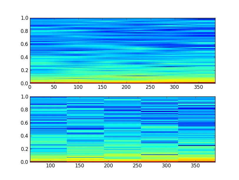
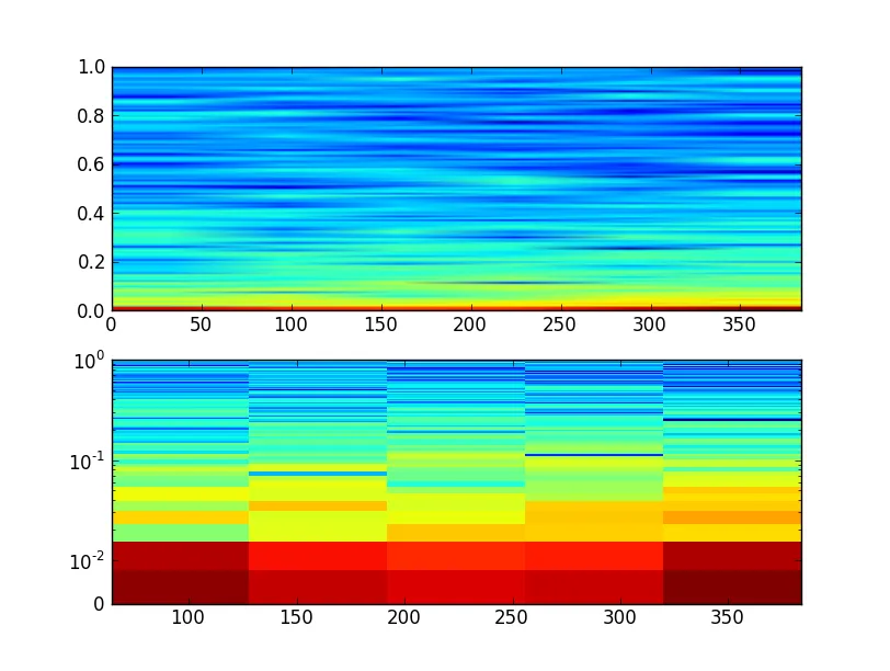
问题在于,每当我尝试使用imshow甚至NonUniformImage来绘制修改后的Pxx时,都会遇到以下错误消息。

/opt/local/Library/Frameworks/Python.framework/Versions/2.7/lib/python2.7/site-packages/matplotlib/image.py:336: UserWarning: Images are not supported on non-linear axes. warnings.warn("Images are not supported on non-linear axes.")

例如,我正在处理的代码的一部分如下所示:

    # how many instantaneous spectra did we calculate
    (numBins, numSpectra) = Pxx.shape

    # how many seconds in entire audio recording
    numSeconds = float(self.data.size) / self.rate


    ax = fig.add_subplot(212)
    im = NonUniformImage(ax, interpolation='bilinear')

    x = np.arange(0, numSpectra)
    y = np.arange(0, numBins)
    z = Pxx
    im.set_data(x, y, z)
    ax.images.append(im) 
    ax.set_xlim(0, numSpectra)
    ax.set_ylim(0, numBins)
    ax.set_yscale('symlog') # see http://matplotlib.org/api/axes_api.html#matplotlib.axes.Axes.set_yscale
    ax.set_title('Spectrogram 2')

实际问题

如何在matplotlib/pylab中使用对数y轴绘制类似图像的数据?

2个回答

23

使用 pcolorpcolormeshpcolormesh 更快,但只能处理矩形网格,而pcolor可以处理任意形状的单元格。 specgram 如果我没记错的话,使用了 pcolormesh(实际上是使用了 imshow。)

以下是一个快速示例:

import numpy as np
import matplotlib.pyplot as plt

z = np.random.random((11,11))
x, y = np.mgrid[:11, :11]

fig, ax = plt.subplots()
ax.set_yscale('symlog')
ax.pcolormesh(x, y, z)
plt.show()

在这里输入图片描述

您看到的差异是由于绘制了specgram返回的“原始”值。实际上,specgram绘制的是一个经过缩放的版本。

import matplotlib.pyplot as plt
import numpy as np

x = np.cumsum(np.random.random(1000) - 0.5)

fig, (ax1, ax2) = plt.subplots(nrows=2)
data, freqs, bins, im = ax1.specgram(x)
ax1.axis('tight')

# "specgram" actually plots 10 * log10(data)...
ax2.pcolormesh(bins, freqs, 10 * np.log10(data))
ax2.axis('tight')

plt.show()

在此输入图像描述

注意,当我们使用pcolormesh绘制图形时,没有插值。(这就是pcolormesh的部分意义 -- 它只是矢量矩形而不是图像。)

如果你想要在对数尺度上绘制图形,你可以使用带有pcolormesh的它:

import matplotlib.pyplot as plt
import numpy as np

x = np.cumsum(np.random.random(1000) - 0.5)

fig, (ax1, ax2) = plt.subplots(nrows=2)
data, freqs, bins, im = ax1.specgram(x)
ax1.axis('tight')

# We need to explictly set the linear threshold in this case...
# Ideally you should calculate this from your bin size...
ax2.set_yscale('symlog', linthreshy=0.01)

ax2.pcolormesh(bins, freqs, 10 * np.log10(data))
ax2.axis('tight')

plt.show()

输入图像描述


你真是个巫师!这个程序可以运行,但我必须说它运行得相当慢。此外,这看起来与“specgram”绘制的频谱图有些不同。你有什么想法吗?图片供比较。 - danmcardle
1
发生的情况是您正在绘制由
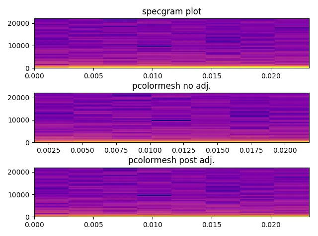
specgram返回的原始数据。它实际绘制的是10 * np.log10(Pxx)。我马上会添加一个例子。 - Joe Kington
太棒了,这似乎解决了颜色差异的问题。现在很明显y轴的刻度非常不同。非常感谢你的帮助! - danmcardle
我在pcolormesh版本的图中没有得到相同的比例。而且这里的示例看起来也不一样。它们很接近,但并不完全相同。specgram图的右上角是深蓝色的,但是pcolormesh版本却不是这样。我使用noverlap=0进行specgram,因此没有插值,所以我认为它们应该绘制相同。 - noisygecko
我该如何在这个上面添加一个色条? - goodcow

2
仅仅是为了补充Joe的回答... 我发现specgrampcolormesh的视觉输出存在一些小差异(就像noisygecko也有同感),这些差异让我感到困扰。
原来,如果你将从specgram返回的频率和时间bins传递给pcolormesh,则它会将这些值视为矩形中心而不是矩形边缘上的值。
稍微调整一下,它们就可以更好地对齐(虽然还不是100%完美)。颜色现在也完全相同。
x = np.cumsum(np.random.random(1024) - 0.2)
overlap_frac = 0
plt.subplot(3,1,1)
data, freqs, bins, im = pylab.specgram(x, NFFT=128, Fs=44100, noverlap = 128*overlap_frac, cmap='plasma')
plt.title("specgram plot")

plt.subplot(3,1,2)
plt.pcolormesh(bins, freqs, 20 * np.log10(data), cmap='plasma')
plt.title("pcolormesh no adj.")

# bins actually returns middle value of each chunk
# so need to add an extra element at zero, and then add first to all
bins = bins+(bins[0]*(1-overlap_frac))
bins = np.concatenate((np.zeros(1),bins))
max_freq = freqs.max()
diff = (max_freq/freqs.shape[0]) - (max_freq/(freqs.shape[0]-1))
temp_vec = np.arange(freqs.shape[0])
freqs = freqs+(temp_vec*diff)
freqs = np.concatenate((freqs,np.ones(1)*max_freq))

plt.subplot(3,1,3)
plt.pcolormesh(bins, freqs, 20 * np.log10(data), cmap='plasma')
plt.title("pcolormesh post adj.")

spectrogram_explain_v01


网页内容由stack overflow 提供, 点击上面的
可以查看英文原文,
原文链接