Pandas数据框分组绘图

91

我有一个以以下结构为基础的数据框:

          Date   ticker  adj_close 
0   2016-11-21     AAPL    111.730     
1   2016-11-22     AAPL    111.800    
2   2016-11-23     AAPL    111.230    
3   2016-11-25     AAPL    111.790     
4   2016-11-28     AAPL    111.570    
...          
8   2016-11-21      ACN    119.680            
9   2016-11-22      ACN    119.480              
10  2016-11-23      ACN    119.820              
11  2016-11-25      ACN    120.740 
...             

我该如何基于股票代码 ticker 绘制出 adj_closeDate 的关系图?

3个回答

153

简单绘图

您可以使用以下方法:

df.plot(x='Date',y='adj_close')

或者您可以预先将索引设置为Date,然后很容易绘制您想要的列:

df.set_index('Date', inplace=True)
df['adj_close'].plot()

如果你想要在一个图表上展示一个ticker的单一序列

你需要先进行分组(groupby)


df.set_index('Date', inplace=True)
df.groupby('ticker')['adj_close'].plot(legend=True)

在此输入图片描述


如果您需要包含单独子绘图的图表:

grouped = df.groupby('ticker')

ncols=2
nrows = int(np.ceil(grouped.ngroups/ncols))

fig, axes = plt.subplots(nrows=nrows, ncols=ncols, figsize=(12,4), sharey=True)

for (key, ax) in zip(grouped.groups.keys(), axes.flatten()):
    grouped.get_group(key).plot(ax=ax)

ax.legend()
plt.show()

enter image description here


36

类似于Julien上面的答案,我用以下方法成功了:

fig, ax = plt.subplots(figsize=(10,4))
for key, grp in df.groupby(['ticker']):
    ax.plot(grp['Date'], grp['adj_close'], label=key)

ax.legend()
plt.show()

如果你想在Matlab中获得更多的控制权,那么这个解决方案可能更加相关。

灵感来自:https://dev59.com/rIzda4cB1Zd3GeqPiylV#52526454


8
  • 问题是如何根据股票代码绘制adj_close和日期?
    • 可以通过使用.pivot.groupby将数据框重塑为宽格式,或直接使用seaborn绘制现有的长格式数据框来实现。
  • 在以下示例数据中,'Date'列具有datetime64[ns] Dtype
    • 如有需要,请使用pandas.to_datetime转换Dtype
  • python 3.10pandas 1.4.2matplotlib 3.5.1seaborn 0.11.2下测试通过

Imports and Sample Data

import pandas as pd
import pandas_datareader as web  # for sample data; this can be installed with conda if using Anaconda, otherwise pip
import seaborn as sns
import matplotlib.pyplot as plt

# sample stock data, where .iloc[:, [5, 6]] selects only the 'Adj Close' and 'tkr' column
tickers = ['aapl', 'acn']
df = pd.concat((web.DataReader(ticker, data_source='yahoo', start='2020-01-01', end='2022-06-21')
                .assign(ticker=ticker) for ticker in tickers)).iloc[:, [5, 6]]

# display(df.head())
        Date  Adj Close ticker
0 2020-01-02  73.785904   aapl
1 2020-01-03  73.068573   aapl
2 2020-01-06  73.650795   aapl
3 2020-01-07  73.304420   aapl
4 2020-01-08  74.483604   aapl

# display(df.tail())
           Date   Adj Close ticker
1239 2022-06-14  275.119995    acn
1240 2022-06-15  281.190002    acn
1241 2022-06-16  270.899994    acn
1242 2022-06-17  275.380005    acn
1243 2022-06-21  282.730011    acn

pandas.DataFrame.pivotpandas.DataFrame.plot

  • pandas 默认使用 matplotlib 作为后端进行绘图。
  • 使用 pandas.DataFrame.pivot 对数据框进行重塑,将长格式转换为宽格式,并将数据框放在正确的绘图格式中。
  • .pivot 不会聚合数据,因此如果每个索引、每个股票代码存在多个观察值,则需要使用.pivot_table
  • 添加 
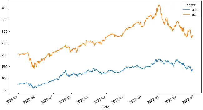
subplots=True 将生成一个包含两个子图的图形。
# reshape the long form data into a wide form
dfp = df.pivot(index='Date', columns='ticker', values='Adj Close')

# display(dfp.head())
ticker           aapl         acn
Date                             
2020-01-02  73.785904  203.171112
2020-01-03  73.068573  202.832764
2020-01-06  73.650795  201.508224
2020-01-07  73.304420  197.157654
2020-01-08  74.483604  197.544434

# plot
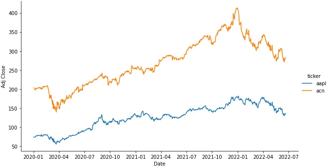
ax = dfp.plot(figsize=(11, 6))

在这里输入图片描述


  • 使用 seaborn,接受长格式数据,因此不需要将数据框重塑为宽格式。
  • seaborn 是一个基于 matplotlib 的高级应用程序接口。

sns.lineplot: 坐标轴级别的绘图

fig, ax = plt.subplots(figsize=(11, 6))
sns.lineplot(data=df, x='Date', y='Adj Close', hue='ticker', ax=ax)

sns.relplot:图表级别绘图

  • 添加 row='ticker'col='ticker' 会生成一个包含两个子图的图表。
g = sns.relplot(kind='line', data=df, x='Date', y='Adj Close', hue='ticker', aspect=1.75)

enter image description here


网页内容由stack overflow 提供, 点击上面的
可以查看英文原文,
原文链接