如何在Python中从数据框绘制正态分布图?

4
我的问题是如何从Python数据帧生成正态分布图。我可以找到很多从随机数生成这样的图表的信息,但我不知道如何从数据帧生成它。
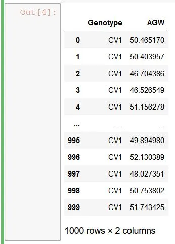
首先,我生成了随机数并创建了一个数据帧。
import numpy as np
import pandas 
from pandas import DataFrame

cv1 = np.random.normal(50, 3, 1000)

source = {"Genotype": ["CV1"]*1000, "AGW": cv1}
Cultivar_1=DataFrame(source)
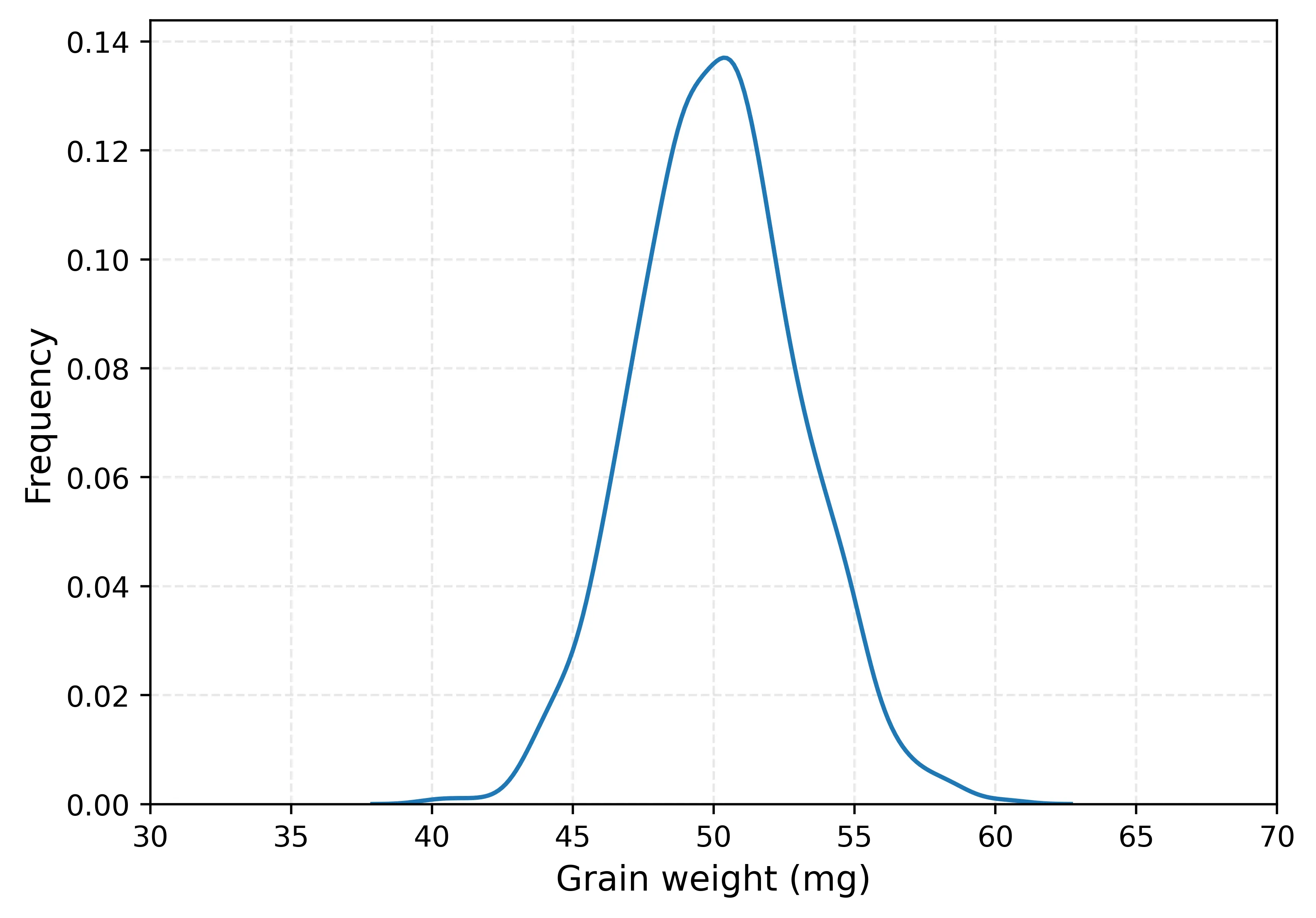
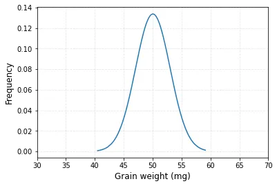
enter image description here

然后,我尝试制作一个正态分布图。

sns.kdeplot(data = Cultivar_1['AGW'])
plt.xlim([30,70])  
plt.xlabel("Grain weight (mg)", size=12)    
plt.ylabel("Frequency", size=12)                
plt.grid(True, alpha=0.3, linestyle="--")     
plt.show()

enter image description here

然而,这是一张密度图,不是使用“平均值”和“标准差”计算出来的正态分布图。请问我需要使用哪些代码才能制作正态分布图呢?谢谢!
2个回答

5

我找到了一种方法,可以从数据框绘制正态分布图。

#Library
import numpy as np
import pandas as pd
import matplotlib.pyplot as plt
import scipy.stats as stats

#Generating data frame
x = np.random.normal(50, 3, 1000)
source = {"Genotype": ["CV1"]*1000, "AGW": x}
df = pd.DataFrame(source)

# Calculating mean and Stdev of AGW
df_mean = np.mean(df["AGW"])
df_std = np.std(df["AGW"])
 
# Calculating probability density function (PDF)
pdf = stats.norm.pdf(df["AGW"].sort_values(), df_mean, df_std)

# Drawing a graph
plt.plot(df["AGW"].sort_values(), pdf)
plt.xlim([30,70])  
plt.xlabel("Grain weight (mg)", size=12)    
plt.ylabel("Frequency", size=12)                
plt.grid(True, alpha=0.3, linestyle="--")
plt.show()

enter image description here


为什么我们在生成 PDF 之前需要先对列中的值进行排序?否则,实际上它是无法工作的。 - mustafa00

0

这是在Python中从数据框创建正态分布图的可能方式之一。

#Loading dependencies
import numpy as np
import pandas as pd
import matplotlib.pyplot as plt
import scipy.stats as stats

# Generating the dataframe
cv1 = np.random.normal(50, 3, 1000)
source = {"Genotype": ["CV1"]*1000, "AGW": cv1}
dataframe = pd.DataFrame(source)

# Calculating the mean and standard deviation of the parameter "AGW":
mean = dataframe["AGW"].mean()
std = dataframe["AGW"].std()
s = np.random.normal(mean, std, 100) 

# This mean and standard deviation will be useful to create the normal distribution graph

# Creating the normal distribution graph for the column "AGW"
count, bins, ignored = plt.hist(s, 100, density=True)

# Mathematical representation/formula of the normal distribution
plt.plot(bins, 1/(std * np.sqrt(2 * np.pi)) *
                       np.exp( - (bins - mean)**2 / (2 * std**2) ),
                 linewidth=2, color='r')

# This is the direct function used in stats
pdf = stats.norm.pdf(dataframe["AGW"].sort_values(), mean, std)
plt.plot(dataframe["AGW"].sort_values(), pdf)
plt.xlabel("Grain weight (mg)", size=12)
plt.ylabel("Frequency", size=12)
plt.xlim([30,70]) 
plt.grid(True, alpha=0.3, linestyle="--")
plt.show()

您的回答可以通过提供更多支持性信息来加强。请编辑以添加进一步的细节,比如引用或文档,以便其他人可以确认您的答案是否正确。您可以在帮助中心找到有关如何撰写好答案的更多信息。 - Community

网页内容由stack overflow 提供, 点击上面的
可以查看英文原文,
原文链接