你可以通过CustomPainter来完成它,而不需要使用任何库。
示例1:
创建Custom Painter类,
class customStyleArrow extends CustomPainter {
  @override
  void paint(Canvas canvas, Size size) {
    final Paint paint = Paint()
      ..color = Colors.white
      ..strokeWidth = 1
      ..style = PaintingStyle.fill;
    final double triangleH = 10;
    final double triangleW = 25.0;
    final double width = size.width;
    final double height = size.height;

    final Path trianglePath = Path()
      ..moveTo(width / 2 - triangleW / 2, height)
      ..lineTo(width / 2, triangleH + height)
      ..lineTo(width / 2 + triangleW / 2, height)
      ..lineTo(width / 2 - triangleW / 2, height);
    canvas.drawPath(trianglePath, paint);
    final BorderRadius borderRadius = BorderRadius.circular(15);
    final Rect rect = Rect.fromLTRB(0, 0, width, height);
    final RRect outer = borderRadius.toRRect(rect);
    canvas.drawRRect(outer, paint);
  }

  @override
  bool shouldRepaint(CustomPainter oldDelegate) => false;
}
用CustomPaint包裹你的文本小部件,
return CustomPaint(
      painter: customStyleArrow(),
      child: Container(
        padding: EdgeInsets.only(left: 15, right: 15, bottom: 20, top: 20),
        child: Text("This is the custom painter for arrow down curve",
            style: TextStyle(
              color: Colors.black,
            )),
      ),
    );

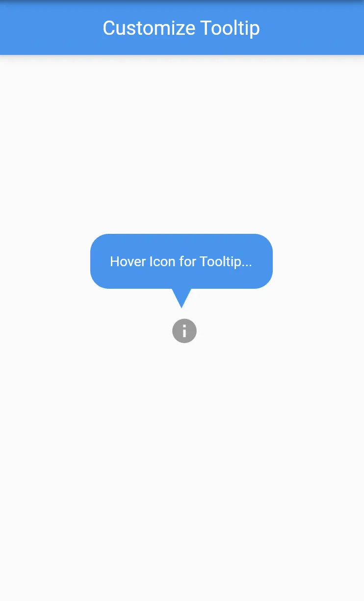
示例2:
查看下面的工具提示形状装饰示例代码
import 'package:flutter/material.dart';

void main() => runApp(MyApp());

class MyApp extends StatelessWidget {
  @override
  Widget build(BuildContext context) {
    return MaterialApp(
      title: 'Flutter Demo',
      debugShowCheckedModeBanner: false,
      theme: ThemeData(
        primarySwatch: Colors.blue,
      ),
      home: const MyHomePage(title: 'Customize Tooltip'),
    );
  }
}

class MyHomePage extends StatefulWidget {
  final String title;

  const MyHomePage({
    Key? key,
    required this.title,
  }) : super(key: key);

  @override
  _MyHomePageState createState() => _MyHomePageState();
}

class _MyHomePageState extends State<MyHomePage> {
  @override
  Widget build(BuildContext context) {
    return Scaffold(
      appBar: AppBar(
        title: Text(widget.title),
      ),
      body: Center(
        child: Tooltip(
          child: const IconButton(
            icon: Icon(Icons.info, size: 30.0),
            onPressed: null,
          ),
          message: 'Hover Icon for Tooltip...',
          padding: const EdgeInsets.all(20),
          showDuration: const Duration(seconds: 10),
          decoration: ShapeDecoration(
            color: Colors.blue,
            shape: ToolTipCustomShape(),
          ),
          textStyle: const TextStyle(color: Colors.white),
          preferBelow: false,
          verticalOffset: 20,
        ),
      ),
    );
  }
}

class ToolTipCustomShape extends ShapeBorder {
  final bool usePadding;

  ToolTipCustomShape({this.usePadding = true});

  @override
  EdgeInsetsGeometry get dimensions =>
      EdgeInsets.only(bottom: usePadding ? 20 : 0);

  @override
  Path getInnerPath(Rect rect, {TextDirection? textDirection}) => Path();

  @override
  Path getOuterPath(Rect rect, {TextDirection? textDirection}) {
    rect =
        Rect.fromPoints(rect.topLeft, rect.bottomRight - const Offset(0, 20));
    return Path()
      ..addRRect(
          RRect.fromRectAndRadius(rect, Radius.circular(rect.height / 3)))
      ..moveTo(rect.bottomCenter.dx - 10, rect.bottomCenter.dy)
      ..relativeLineTo(10, 20)
      ..relativeLineTo(10, -20)
      ..close();
  }

  @override
  void paint(Canvas canvas, Rect rect, {TextDirection? textDirection}) {}

  @override
  ShapeBorder scale(double t) => this;
}
ShapeBorder: https://dev59.com/a7bna4cB1Zd3GeqPZFM1#57943257 - pskink