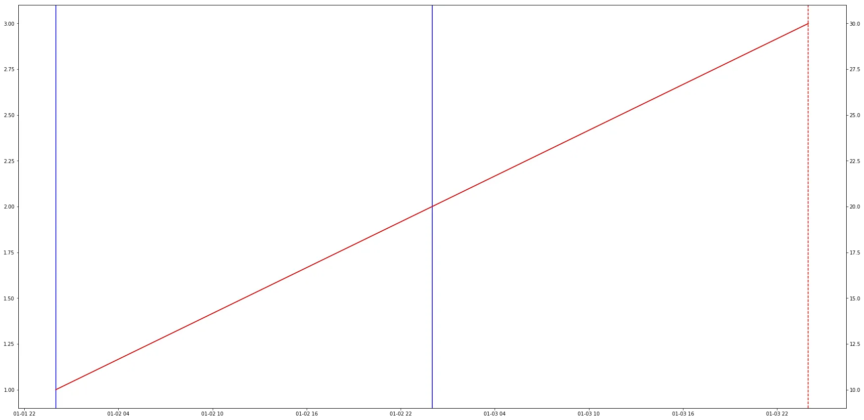
如何使竖直线条接触图表边界?

3
我希望使用ax.vlines创建的竖线能够像axvline一样与图表的上下边界相接触。
考虑以下简单示例:
import pandas as pd
import matplotlib.pyplot as plt

df = pd.DataFrame({'time' : [pd.to_datetime('2016-01-02'), pd.to_datetime('2016-01-03'), pd.to_datetime('2016-01-04')],
                   'value1' : [1, 2, 3],
                   'value2' : [10, 20, 30]})

df.set_index('time', inplace = True)

df
Out[95]: 
            value1  value2
time                      
2016-01-02       1      10
2016-01-03       2      20
2016-01-04       3      30

现在的图表如下:
fig, ax = plt.subplots(figsize=(30, 15))

ax.plot(df.index, df["value1"], color = 'black')

ax2 = ax.twinx()
ax2.plot(df.index, df["value2"], color = 'red')

#axvline stretches nicely
ax.axvline( pd.to_datetime('2016-01-04'), color = 'red',  alpha = 1,  linestyle = '--')

#vlines stops before touching the upper and lower boundaries
ymin, ymax = ax2.get_ylim()
ax.vlines([pd.to_datetime('2016-01-02'), pd.to_datetime('2016-01-03')],  ymin = ymin, ymax = ymax, color = 'blue', linestyle = '-')

提供的内容:

enter image description here

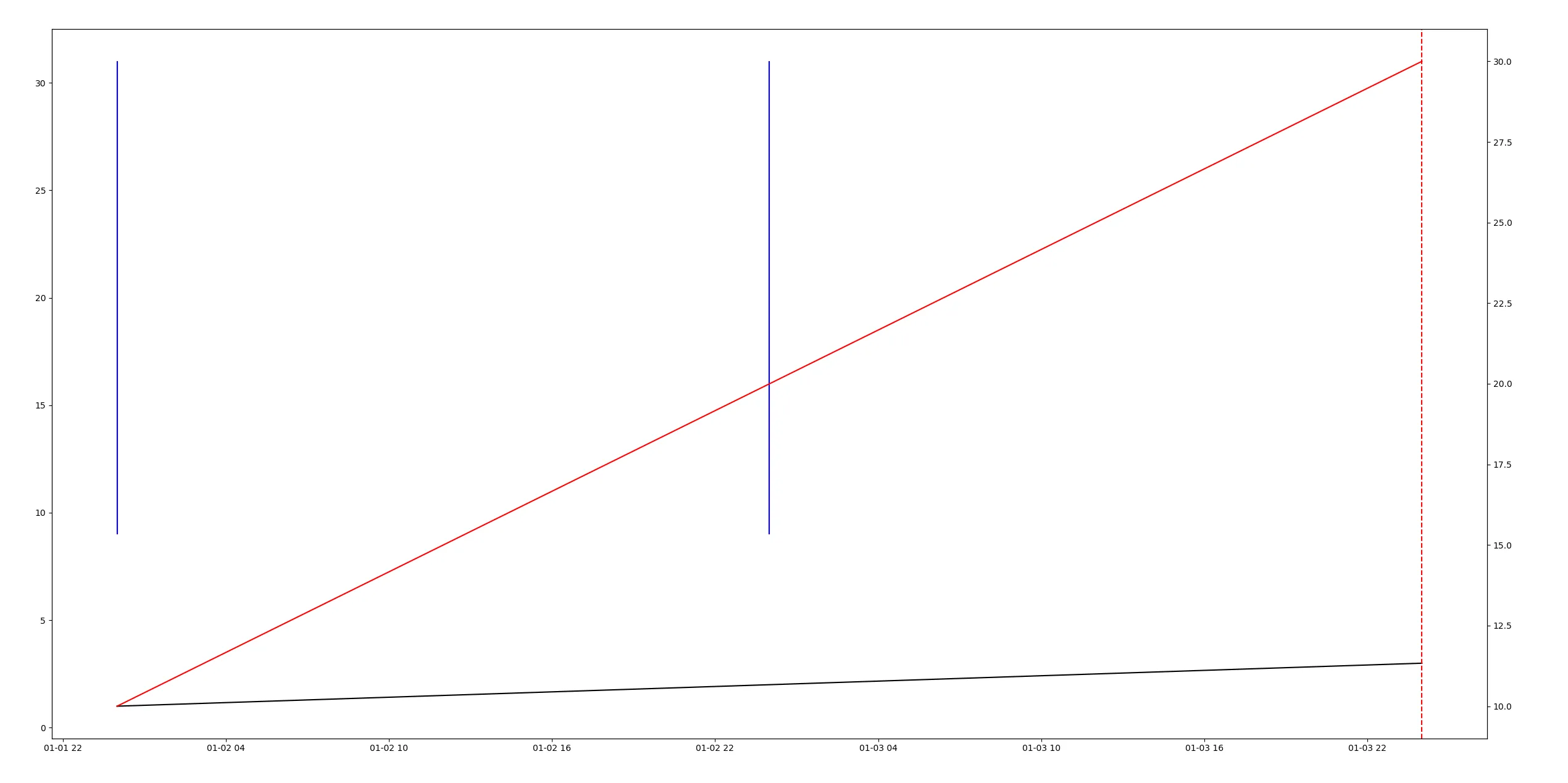
您可以看到那些蓝色线条仍然悬浮在空中,而漂亮的红色垂直线则完全延伸。我该如何实现这一点?

谢谢!

2个回答

7

您可能想要做的是使蓝线在y方向上独立于数据。这可以使用xaxis_transform来完成,并将ymin和ymax分别设置为0和1。

ax.vlines([pd.to_datetime('2016-01-02'), pd.to_datetime('2016-01-03')],  
           ymin = 0, ymax = 1, color = 'blue', linestyle = '-', 
           transform=ax.get_xaxis_transform())

我们模仿了axvline的确切行为,即使用数据转换的x值和轴转换的y值。轴坐标在轴内从0到1变化,因此使用这些值将始终使线条从y轴的一端开始,并延伸到另一端,无论其数据范围如何。

另一个疯狂的matplotlib魔术技巧,谢谢!这里到底发生了什么? - ℕʘʘḆḽḘ
我添加了一点解释。基本上,它与axvline的作用相同,因为它在垂直方向上使用轴坐标。 - ImportanceOfBeingErnest
@ImportanceOfBeingErnest 很棒的回答!我对这个“transform”概念很感兴趣。我在哪里可以找到相关文档?我可以问一下为什么这里使用xaxis而不是yaxis transform吗?那是因为它们是x轴网格线吗? - Y. Luo
1
@Y.Luo xaxis是具有数据沿其范围的轴,以axes坐标系中y=0的位置定位。这也是在此处使用的内容。Matplotlib transformations tutorial可以覆盖您需要了解的大部分内容。 - ImportanceOfBeingErnest
当未提供ymin和ymax时,这不是默认行为吗?! - ashman
哇,又有一个神奇的咒语了 :) 谢谢! - Rune Kaagaard

3
您需要使用set_ylim设置y轴范围,这样当您绘制vlines时轴不会改变。在ax.vlines(...)代码行之前添加ax.set_ylim(ymin, ymax)
另外一点是,由于您使用了ax2ymin, ymax,您可能希望在ax2上绘制vlines。因此,我将您的代码更新如下:
import pandas as pd
import matplotlib.pyplot as plt

df = pd.DataFrame({'time': [pd.to_datetime('2016-01-02'),
                            pd.to_datetime('2016-01-03'),
                            pd.to_datetime('2016-01-04')],
                   'value1': [1, 2, 3],
                   'value2': [10, 20, 30]})
df.set_index('time', inplace=True)

fig, ax = plt.subplots(figsize=(30, 15))
ax.plot(df.index, df["value1"], color='black')
ax2 = ax.twinx()
ax2.plot(df.index, df["value2"], color='red')

#axvline stretches nicely
ax.axvline(pd.to_datetime('2016-01-04'), color = 'red',
           alpha = 1,  linestyle = '--')

#vlines stretches nicely
ymin, ymax = ax2.get_ylim()
ax2.set_ylim(ymin, ymax)
ax2.vlines([pd.to_datetime('2016-01-02'), pd.to_datetime('2016-01-03')],
           ymin=ymin, ymax=ymax, color='blue', linestyle='-')

plt.show()

enter image description here


这个能在双轴上工作吗?在这个例子中它能用吗? - ℕʘʘḆḽḘ
是的,它在 ax2 上运行。我更新了我的答案,请检查。谢谢。 - Y. Luo
它实际上并不起作用,因为黑线现在从图表中消失了。 - ℕʘʘḆḽḘ
@ℕʘʘḆḽḘ 上传了关于ax2的新图表。黑线与红线重叠,因此我怀疑您想在ax2上绘制vlines,而不是在ax上,因为ax.set_ylim(ymin, ymax)将隐藏黑线。 - Y. Luo

网页内容由stack overflow 提供, 点击上面的
可以查看英文原文,
原文链接