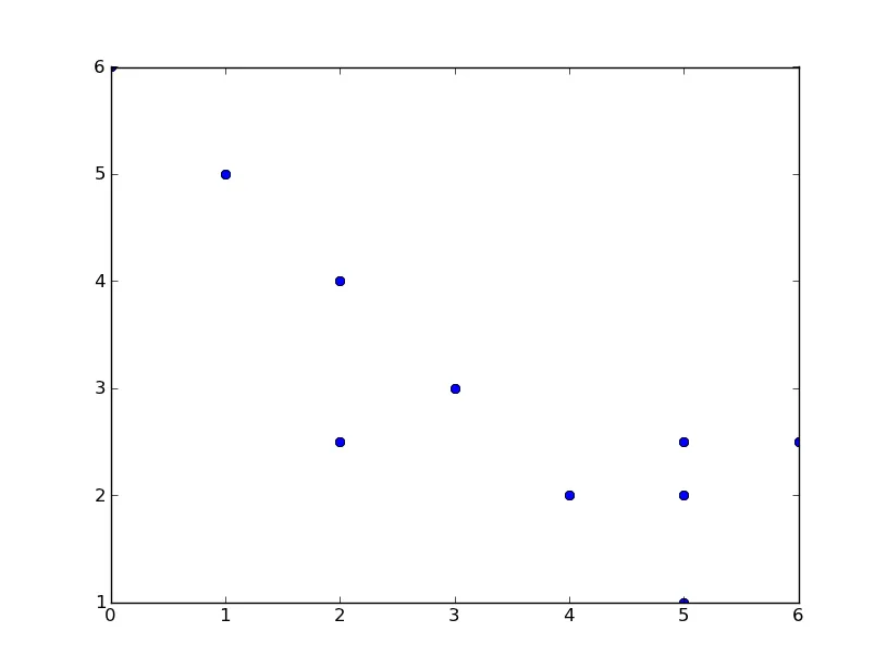
如何在Matplotlib中为x轴分配相等的比例缩放?

6
我目前拥有的是这个:
x = [3.0, 4.0, 5.0, 5.0, 6.0, 7.0, 9.0, 9.0, 9.0, 11.0]
y = [6.0, 5.0, 4.0, 2.5, 3.0, 2.0, 1.0, 2.0, 2.5, 2.5]

这将产生以下图表:

enter image description here

我希望我的轴能够等比例缩放。因此,不要像7和9以及9和11之间那样存在如此大的间隔,而是应该像其他所有间隔一样相等。它应该看起来像这样:

enter image description here

为了从图表中消除8和10,我使用了刻度线。以下是相关代码:
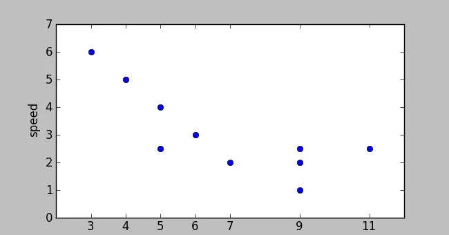
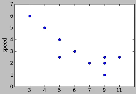
ax=fig.add_subplot(111, ylabel="speed")
ax.plot(x, y, 'bo')
ax.set_xticks(x) 

这个matplotlib页面上的所有示例都不符合我的要求。我已经查看了文档,但与“缩放”相关的所有内容都无法满足我的需求。

这能做到吗?


你可以在 x = 3,4..9 上绘制图形,然后将第6和第7个刻度标签更改为“9”和“11”。 - Chris
@Chris 我猜是这样,但这只适用于这种情况。这只是一个简单的例子,但应用程序将会增长到可能由更大空格分隔的数百个数字。 - SaiyanGirl
1
你的x值总是整数吗? - tacaswell
我的评论是针对你在问题中提供的示例,但它也适用于更一般的问题,如果你的x坐标表现得合理。请参考我的答案,其中包含一个可能的解决方案。 - Chris
@tcaswell 是的,我的x值将始终是整数(不会是双精度)。 - SaiyanGirl
1个回答

4

在我对原帖的评论中,您可以针对自然数1到n绘制图表,其中n是数据集中唯一横坐标值的数量。然后,您可以将x刻度标签设置为这些唯一值。我在实施时遇到的唯一问题是如何处理重复的横坐标值。为了保持通用性,我想出了以下解决方案:

from collections import Counter # Requires Python > 2.7

# Test abscissa values
x = [3.0, 4.0, 5.0, 5.0, 6.0, 7.0, 9.0, 9.0, 9.0, 11.0]

# Count of the number of occurances of each unique `x` value
xcount = Counter(x)

# Generate a list of unique x values in the range [0..len(set(x))]

nonRepetitive_x = list(set(x)) #making a set eliminates duplicates
nonRepetitive_x.sort()         #sets aren't ordered, so a sort must be made
x_normalised = [_ for i, xx in enumerate(set(nonRepetitive_x)) for _ in xcount[xx]*[i]]    

目前为止,我们得到了print x_normalised的结果:

[0, 1, 2, 2, 3, 4, 5, 5, 5, 6]

所以,将y绘制在已标准化的x_normalised上:

from matplotlib.figure import Figure
fig=Figure()
ax=fig.add_subplot(111)

y = [6.0, 5.0, 4.0, 2.5, 3.0, 2.0, 1.0, 2.0, 2.5, 2.5]

ax.plot(x_normalised, y, 'bo')

提供

使用matplotlib绘制的解决方案结果图

最后,我们可以使用set_xticklabels更改x轴刻度标签,以反映我们原始x数据的实际值。

ax.set_xticklabels(nonRepetitive_x)

编辑 为了使最终的图表看起来像原始帖子中期望的输出结果,可以使用以下方法:

x1,x2,y1,y2 = ax.axis()
x1 = min(x_normalised) - 1 
x2 = max(x_normalised) + 1
ax.axis((x1,x2,(y1-1),(y2+1))) 

#If the above is done, then before set_xticklabels, 
#one has to add a first and last value. eg:

nonRepetitive_x.insert(0,x[0]-1) #for the first tick on the left of the graph
nonRepetitive_x.append(x[-1]+1) #for the last tick on the right of the graph 

如果有人知道matplotlib是否可以自己完成此操作,我会保持问题的开放状态。如果不能,则您的答案是最好的 :) - SaiyanGirl
谢谢。Matplotlib 几乎肯定无法自行完成此操作,因为它仅支持线性轴比例尺(除对数比例尺外),而您需要的是任意的非线性 X 轴比例尺。 - Chris
有没有想法可以在不使用 pyplot 而是用 figure 的情况下完成最后一行的操作(重命名刻度)?我是使用 matplotlib.figure 初始化图形和使用 ax=fig.add_subplot 初始化轴。如果我将 fig=Figure(etc) 替换为 fig=plt.figure(etc)(这样我就可以使用 plt),那么使用这些图形的站点将无法加载它们,只会卡住 =/ - SaiyanGirl
2
请查看matplotlib.axes API,特别是set_xticksset_xticklabels方法。 - Chris
太棒了,非常感谢!我确实查看了API并且之前尝试了set_xticks,但那不是我想要的(给了我http://img707.imageshack.us/img707/6439/graphqg.png)。标签这个我没试过,因为它似乎需要文本,但那个是可行的!谢谢! - SaiyanGirl
没问题。很高兴你解决了它。 - Chris

网页内容由stack overflow 提供, 点击上面的
可以查看英文原文,
原文链接