Matplotlib PyPlot 堆叠直方图 - 在每个条形图中堆叠不同属性

3

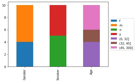
我有以下代码用于绘制数据库中某些主题的直方图:

import matplotlib.pyplot as plt

attr_info = {
    'Gender': ['m', 'f', 'm', 'm', 'f', 'm', 'm', 'f', 'm', 'f'],
    'Age': [9, 43, 234, 23, 2, 95, 32, 63, 58, 42],
    'Smoker': ['y', 'n', 'y', 'y', 'n', 'n', 'n', 'n', 'y', 'y']
}
bin_info = {key: None for key in attr_info}
bin_info['Age'] = 10

for name, a_info in attr_info.items():
    plt.figure(num=name)
    counts, bins, _ = plt.hist(a_info, bins=bin_info[name], color='blue', edgecolor='black')

    plt.margins(0)
    plt.title(name)
    plt.xlabel(name)
    plt.ylabel("# Subjects")
    plt.yticks(range(0, 11, 2))
    plt.grid(axis='y')
    plt.tight_layout(pad=0)

    plt.show()

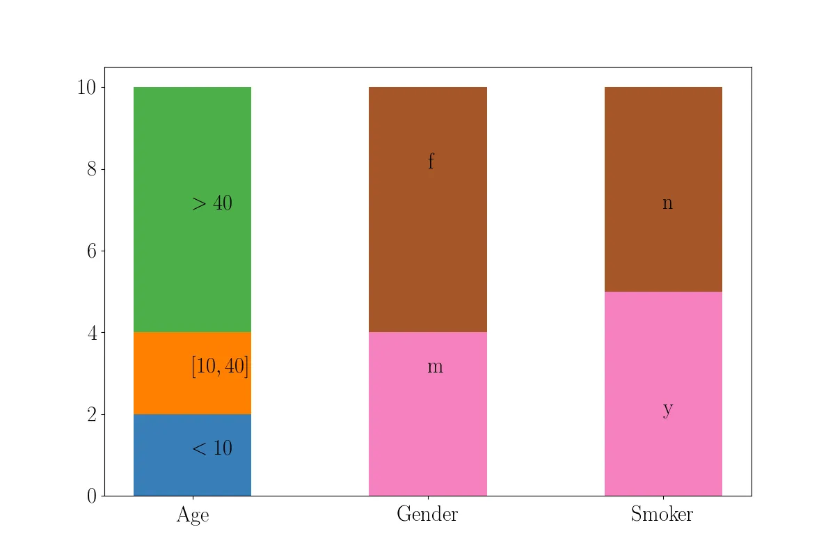
这段代码可以运行,但它会在单独的直方图中绘制每个属性的分布。我想实现的是类似于这样的效果:层叠直方图 我知道plt.hist有一个堆叠参数,但那似乎是用于稍微不同的用途,即将相同的属性叠放在不同的主题类型上。例如,你可以绘制一个直方图,其中每个整个条代表某个年龄范围,而条本身则是吸烟者和非吸烟者在不同颜色中的堆栈。我还没有能够弄清楚如何使用它来将不同的属性叠放在每个条形图中,并正确标记为图像中的那样。
2个回答

3

您需要稍微处理一下您的数据,但这并不需要使用 pandas。此外,您想要的是堆叠条形图,而不是直方图:

import matplotlib.pyplot as plt

attr_info = {
'Gender': ['m', 'f', 'm', 'm', 'f', 'm', 'm', 'f', 'm', 'f'],
'Age': [9, 43, 234, 23, 2, 95, 32, 63, 58, 42],
'Smoker': ['y', 'n', 'y', 'y', 'n', 'n', 'n', 'n', 'y', 'y']
}

# Filter your data for each bar section that you want
ages_0_10 = [x for x in attr_info['Age'] if x < 10]
ages_10_40 = [x for x in attr_info['Age'] if x >= 10 and x < 40]
ages_40p = [x for x in attr_info['Age'] if x > 40]

gender_m = [x for x in attr_info['Gender'] if 'm' in x]
gender_f = [x for x in attr_info['Gender'] if 'f' in x]

smoker_y = [x for x in attr_info['Smoker'] if 'y' in x]
smoker_n = [x for x in attr_info['Smoker'] if 'n' in x]

# Locations for each bin (you can move them around)
locs = [0, 1, 2]

# I'm going to plot the Ages bin separate than the Smokers and Gender ones, 
# since Age has 3 stacked bars and the other have just 2 each
plt.bar(locs[0], len(ages_0_10), width=0.5)  # This is the bottom bar

# Second stacked bar, note the bottom variable assigned to the previous bar
plt.bar(locs[0], len(ages_10_40), bottom=len(ages_0_10), width=0.5) 

# Same as before but now bottom is the 2 previous bars    
plt.bar(locs[0], len(ages_40p), bottom=len(ages_0_10) + len(ages_10_40), width=0.5)

# Add labels, play around with the locations
#plt.text(x, y, text)
plt.text(locs[0], len(ages_0_10) / 2, r'$<10$')
plt.text(locs[0], len(ages_0_10) + 1, r'$[10, 40]$')
plt.text(locs[0], len(ages_0_10) + 5, r'$>40$')


# Define the top bars and bottom bars for the Gender and Smokers stack
# In both cases is just 2 stacked bars,
# so we can use a list for this instead of doing it separate as for Age
tops = [len(gender_m), len(smoker_y)]
bottoms = [len(gender_f), len(smoker_n)]

plt.bar(locs[1:], bottoms, width=0.5)
plt.bar(locs[1:], tops, bottom=bottoms, width=0.5)

# Labels again
# Gender
plt.text(locs[1], len(gender_m) / 2, 'm')
plt.text(locs[1], len(gender_m) + 2, 'f')

# Smokers
plt.text(locs[2], len(smoker_y) / 2, 'y')
plt.text(locs[2], len(smoker_n) + 2, 'n')

# Set tick labels
plt.xticks(locs, ('Age', 'Gender', 'Smoker'))
plt.show()

结果: 输入图像描述

请查看 pyplot.bar文档 和这个 示例


2

尝试使用 pandas 如何:

import pandas as pd

attr_info = {
    'Gender': ['m', 'f', 'm', 'm', 'f', 'm', 'm', 'f', 'm', 'f'],
    'Age': [9, 43, 234, 23, 2, 95, 32, 63, 58, 42],
    'Smoker': ['y', 'n', 'y', 'y', 'n', 'n', 'n', 'n', 'y', 'y']
}

df =  pd.DataFrame(attr_info)

bins = [0,32,45,300] #bins can be adjusted to your liking

#deselect "Age" and select all remaining columns
counts = df.filter(regex="[^Age]").apply(pd.Series.value_counts) 
#bin age data and count
age_data = df.groupby(pd.cut(df['Age'], bins=bins))["Age"].count()

fig, ax = plt.subplots()
pd.concat([counts,age_data]).rename(columns={0:"Age"}).T.plot(kind="bar", stacked=True, ax=ax)
ax.legend(loc='center left', bbox_to_anchor=(1, 0.5))

输出:

在这里输入图片描述

这种方法的优势在于其通用性,无论你要绘制多少列。


1
仍然不太符合我的要求。这仍然基于“年龄”属性拆分每个条形图。我希望每个条形图的高度相同(为10)并根据不同的属性进行拆分(并适当标记)。 - Mate de Vita
@MatedeVita 对于误解我很抱歉,我已经更新了代码。 - Fourier

网页内容由stack overflow 提供, 点击上面的
可以查看英文原文,
原文链接