这是我在CSS中创建的一个按钮的独立示例。它具有带渐变的1像素边框和背景渐变。背景渐变被实现为伪元素,以允许在悬停时淡化其不透明度。
https://codepen.io/anon/pen/wbYoeo?editors=1100
.Button
{
  width: 200px;
  height: 30px;
  cursor: pointer;
    padding: 0.8rem;
    border-style: solid;
    border-image: linear-gradient(
        to right,
        green 0%,
        blue 100%);
    border-image-slice: 1;
    border-width: 1px;
    position: relative;
  margin-top: 10px;
    transition: color 0.2s;
}

.Button::before
{
    content: '';
    position: absolute;
    left: 0;
    right: 0;
    top: 0;
    bottom: 0;
    background-image: linear-gradient(
        to right,
        green 0%,
        blue 100%);
    opacity: 0.5;
    transition: opacity 0.2s;
}
该按钮在不同DPI的显示器上呈现效果不同。以下是在Windows上使用Chrome渲染的按钮截图,DPI比例不同:
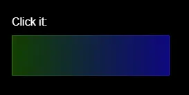
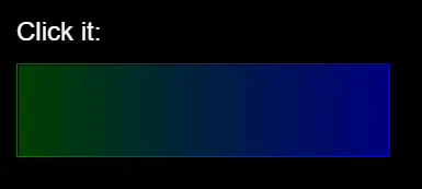
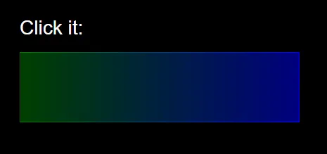
我尝试了几种策略来呈现该按钮,但它们都会导致间隙出现:
- 尝试使用带有渐变的image代替
linear-gradient用于border-image和background-image。 - 尝试使用显式来创建背景渐变,而非伪元素。
- 尝试使用显式来创建背景渐变,而非伪元素,并且对于上下边框使用具有线性渐变背景的实心左右边框和::before和::after伪元素。