这个问题的灵感来自于以下问题和解决方案:Highlighting individual axis labels in bold using ggplot2
我希望根据满足特定条件来选择性地调整水平轴标签的对齐方式。因此,借鉴上述问题和答案,我设置了一个示例:
require(ggplot2)
require(dplyr)
set.seed(36)
xx<-data.frame(YEAR=rep(c("X", "Y"), each=20),
CLONE=rep(c("A", "B", "C", "D", "E"), each=4, 2),
TREAT=rep(c("T1", "T2", "T3", "C"), 10),
VALUE=sample(c(1:10), 40, replace=T))
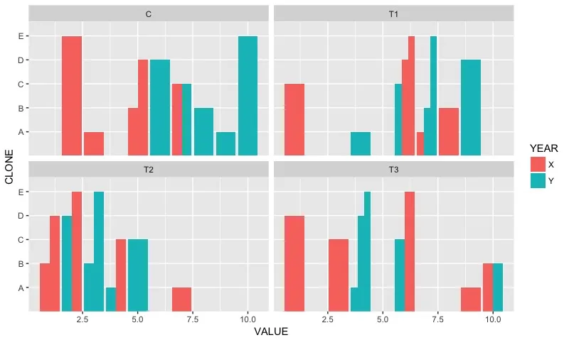
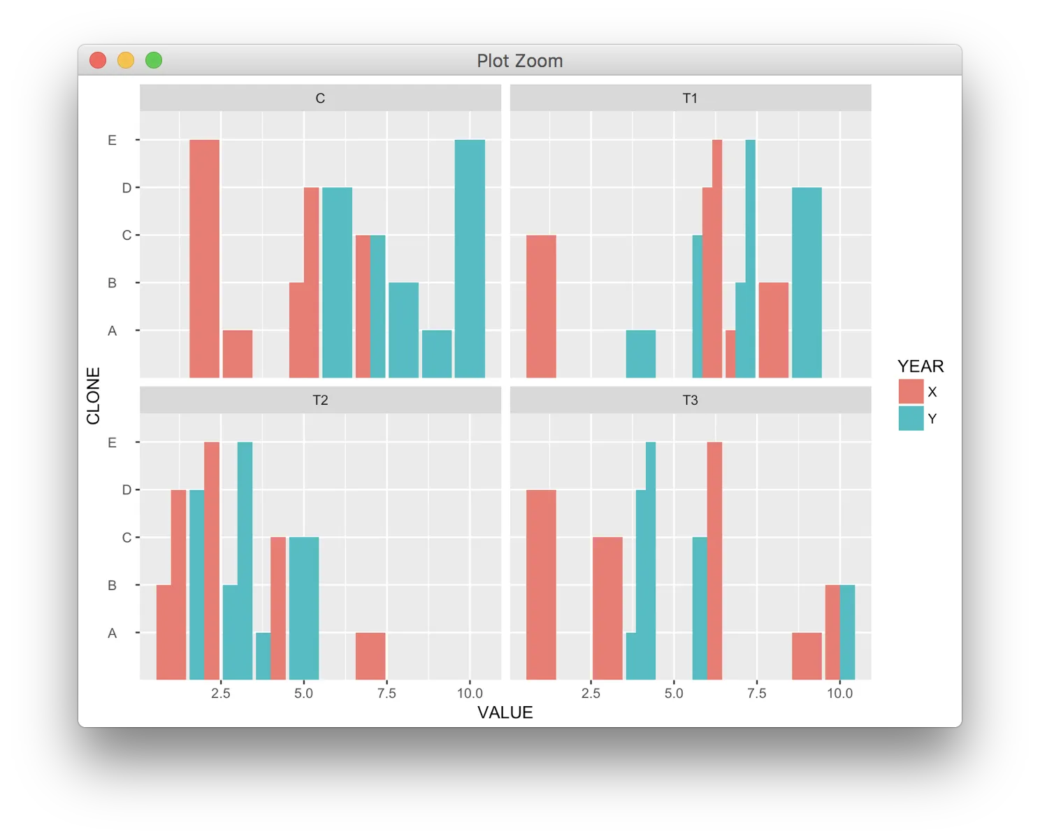
# Simple plot with factors on y axis
ggplot(xx, aes(x = VALUE, y=CLONE, fill=YEAR)) +
geom_bar(stat="identity", position="dodge") +
facet_wrap(~TREAT)
好的,我采用了上面问题和答案中的函数来生成一个仅包含理由的向量:
# Modify to control justification
colorado2 <- function(src, boulder) {
    if (!is.factor(src)) src <- factor(src)
    src_levels <- levels(src)
    brave <- boulder %in% src_levels
    if (all(brave)) {
        b_pos <- purrr::map_int(boulder, ~which(.==src_levels))
        b_vec <- rep(0.2, length(src_levels))
        b_vec[b_pos] <- 0.9
        b_vec
    } else {
        stop("All elements of 'boulder' must be in src")
    }
}

# Redraw the plot with modifcation
ggplot(xx, aes(x = VALUE, y=CLONE, fill=YEAR)) +
    geom_bar(stat="identity", position="dodge") +
    facet_wrap(~TREAT) +
    theme(axis.text.y=element_text(hjust=colorado2(xx$CLONE, c("A", "B", "E"))))
我遇到了这个不幸的问题:
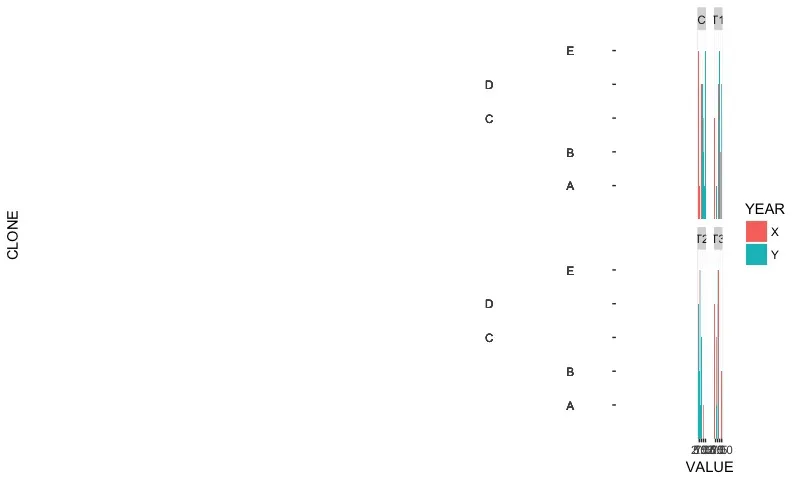 标签在我想要的方向上是对齐的,但占用了太多的绘图空间,原因我无法理解。如何解决这个问题?
c("啤酒", "喜力", "健力士", "红酒", "梅洛", "霞多丽", "威士忌", "米德尔顿", "詹姆森"),我想让啤酒、红酒和威士忌左对齐,其他的右对齐 - 它们需要左或右对齐。 - user2498193