library(tidyverse)
library(lubridate)
date <- seq(ymd('2018-08-01'), ymd('2018-08-31'), by = '1 day')
c <- 21.30
x1 <- runif(length(date), 0, 20)
x2 <- rnorm(length(date), 10, 3)
x3 <- abs(rnorm(length(date), 40, 10))
data <- data.frame(c, x1, x2, x3) %>%
t() %>% as.data.frame() %>% rownames_to_column('var')
data <- data %>%
mutate(category1 = c('catA', 'catB', 'catB', 'catC') %>% as.factor(),
category2 = c('catAA', 'catBA', 'catBB', 'catCA') %>% as.factor())
names(data) <- c('var', as.character(date), 'category1', 'category2')
data_long <- data %>%
gather(date, value, -var, -category1, -category2) %>%
mutate(date = ymd(date))
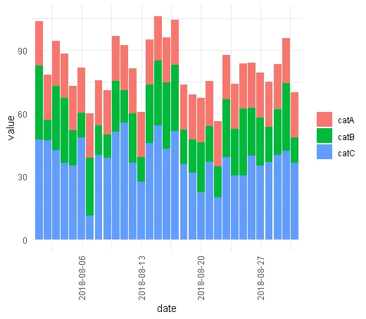
data_long %>%
ggplot(aes(date, value, fill = category1)) +
geom_col(position = 'stack') +
scale_x_date(breaks = '1 week', date_labels = '%Y-%m-%d', expand = c(.01, .01)) +
theme_minimal() +
theme(axis.text.x = element_text(angle = 90, vjust = .4)) +
labs(fill = '')
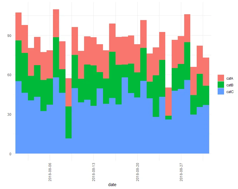
使用上述示例数据和代码生成以下图表:
 我需要做的是删除列之间的空白。我发现了一些类似的话题,但它们建议使用
position_dodge(),然而在我的情况下无法使用,因为我已经有position = 'stack',不能替换。那么我怎样才能让列相邻呢?编辑
设置
width = 1,如@camille所建议,对原始数据似乎可以正常工作,但对于按周或月聚合的数据则不行,请参见下面的代码:data_long %>%
mutate(date = floor_date(date, unit = 'week', week_start = 1)) %>%
group_by(category1, date) %>%
summarise(value = sum(value, na.rm = TRUE)) %>%
ungroup() %>%
ggplot(aes(date, value, fill = category1, width = 1)) +
geom_col(position = 'stack') +
scale_x_date(breaks = '1 month', date_labels = '%Y-%m', expand = c(.01, .01)) +
theme_minimal() +
theme(axis.text.x = element_text(angle = 90, vjust = .4)) +
labs(fill = '')
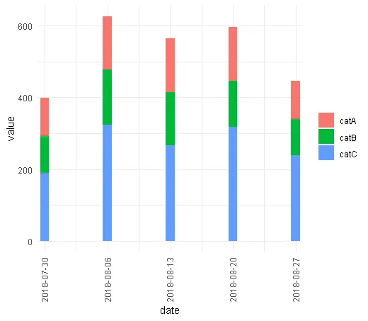
编辑2。
正如@Camille指出的那样,在日期刻度的情况下,宽度为1可能是指1天。然而,以下操作未能产生预期输出并返回警告消息:position_stack requires non-overlapping x intervals
 data_long %>%
    mutate(date = floor_date(date, unit = 'month', week_start = 1)) %>%
    group_by(category1, date) %>%
    summarise(value = sum(value, na.rm = TRUE),
              n = n()) %>%
    ungroup() %>%
    ggplot(aes(date, value, fill = category1, width = n)) +
    geom_col(position = 'stack') +
    scale_x_date(breaks = '1 month', date_labels = '%Y-%m', expand = c(.01, .01)) +
    theme_minimal() +
    theme(axis.text.x = element_text(angle = 90, vjust = .4)) +
    labs(fill = '')
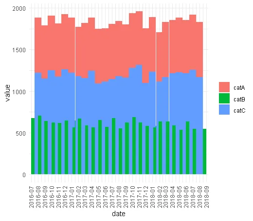


width = 1?根据?geom_col的默认设置,宽度为0.9。 - camilleposition_stack requires non-overlapping x intervals?这真的很让人头疼。 - Death Metal