我想为一个控件添加悬停效果(更改边框或背景颜色即可)。我找到了许多相关的答案,比如这个:
WPF:在鼠标悬停在特定控件上时,增加其大小并重叠在其他控件上
问题是,我正在使用自定义控件(我正在专门为 WPF 使用 materialdesign)。我甚至不知道该在
正如我所说,我不知道该在
TargetType 上放什么。
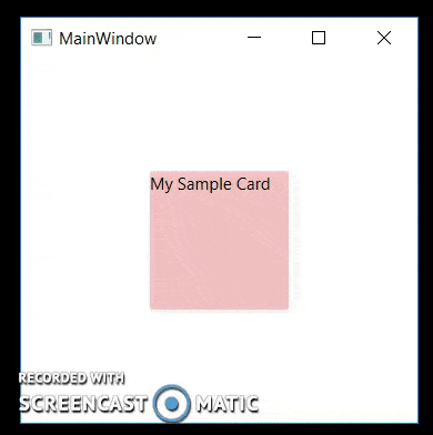
更新: 这是我目前所做的。我已经删除了无关的代码。正如我所说,我不知道该在
TargetType 上放什么,所以我尝试将其放在 Control 上,但它没有起作用。<md:Card
Margin="4 4 4 4"
Width="100"
Height="220"
>
<md:Card.Style>
<Style TargetType="{x:Type Control}">
<Style.Triggers>
<Trigger Property="IsMouseOver" Value="True">
<Setter Property="Background" Value="Red"/>
</Trigger>
</Style.Triggers>
</Style>
</md:Card.Style>
<Grid>
</Grid>
</md:Card>