我有一组地图上的点,每个点都有一个给定的参数值。我想要:
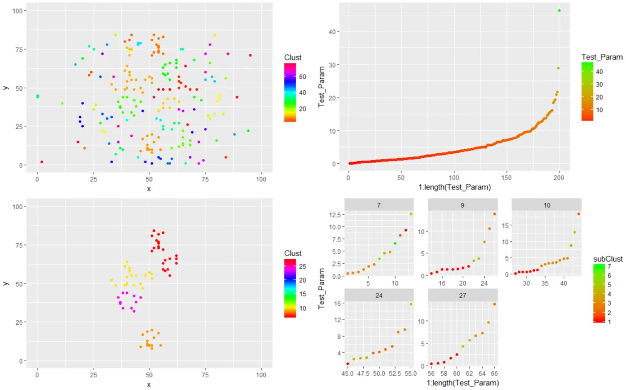
以下是使用循环的解决方法 - 但我真的更想学习如何使用dplyr或其他非循环方法来完成此操作。下面是显示子聚类图案的更新图像。
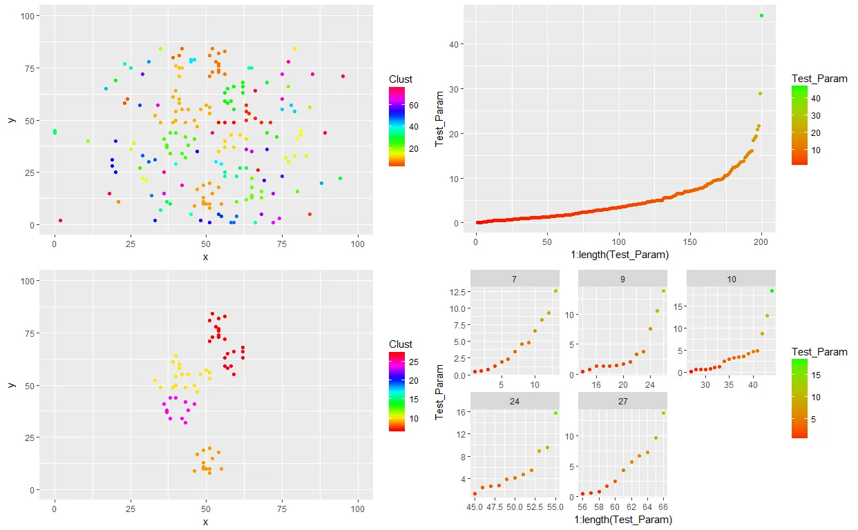
- 将它们在空间上聚类,并忽略任何少于10个点的聚类。我的数据框应该有一个列(Clust),用于表示每个点所属的聚类 [已完成]
- 在每个聚类中对参数值进行子聚类; 添加一个列到我的数据框(subClust),用于按子聚类对每个点进行分类。
除了可能使用循环之外,我不知道如何做第二部分。
图像显示了颜色编码为聚类的一组空间分布点(左上角),并按参数值在右上角绘制。底部行显示具有> 10个点的聚类(左侧)和按参数值排序的每个聚类的面板(右侧)。这些面板是我想能够根据最小聚类分离距离(d = 1)按子聚类进行颜色编码的面板。
欢迎任何指针/帮助。我的可重复代码如下。
# TESTING
library(tidyverse)
library(gridExtra)

# Create a random (X, Y, Value) dataset
set.seed(36)
x_ex <- round(rnorm(200,50,20))
y_ex <- round(runif(200,0,85))
values <- rexp(200, 0.2)
df_ex <- data.frame(ID=1:length(y_ex),x=x_ex,y=y_ex,Test_Param=values)

# Cluster data by (X,Y) location
d = 4
chc <- hclust(dist(df_ex[,2:3]), method="single")

# Distance with a d threshold - used d=40 at one time but that changes...
chc.d40 <- cutree(chc, h=d)
# max(chc.d40)

# Join results
xy_df <- data.frame(df_ex, Clust=chc.d40)

# Plot results
breaks = max(chc.d40)
xy_df_filt <- xy_df %>% dplyr::group_by(Clust) %>% dplyr::mutate(n=n()) %>% dplyr::filter(n>10)# %>% nrow

p1 <- ggplot() +
  geom_point(data=xy_df, aes(x=x, y=y, colour = Clust)) +
  scale_color_gradientn(colours = rainbow(breaks)) +
  xlim(0,100) + ylim(0,100)

p2 <- xy_df %>% dplyr::arrange(Test_Param) %>%
ggplot() +
  geom_point(aes(x=1:length(Test_Param),y=Test_Param, colour = Test_Param)) +
  scale_colour_gradient(low="red", high="green")

p3 <- ggplot() +
  geom_point(data=xy_df_filt, aes(x=x, y=y, colour = Clust)) +
  scale_color_gradientn(colours = rainbow(breaks)) +
  xlim(0,100) + ylim(0,100)

p4 <- xy_df_filt %>% dplyr::arrange(Test_Param) %>%
ggplot() +
  geom_point(aes(x=1:length(Test_Param),y=Test_Param, colour = Test_Param)) +
  scale_colour_gradient(low="red", high="green") +
  facet_wrap(~Clust, scales="free")

grid.arrange(p1, p2, p3, p4, ncol=2, nrow=2)
这个代码片段无法工作——无法在dplyr mutate()中使用管道...
# Second Hierarchical Clustering: Try to sub-cluster by Test_Param within the individual clusters I've already defined above
xy_df_filt %>% # This part does not work
  dplyr::group_by(Clust) %>%
  dplyr::mutate(subClust = hclust(dist(.$Test_Param), method="single") %>%
                  cutree(, h=1))
以下是使用循环的解决方法 - 但我真的更想学习如何使用dplyr或其他非循环方法来完成此操作。下面是显示子聚类图案的更新图像。
sub_df <- data.frame()
for (i in unique(xy_df_filt$Clust)) {
  temp_df <- xy_df_filt %>% dplyr::filter(Clust == i)
  # Cluster data by (X,Y) location
  a_d = 1
  a_chc <- hclust(dist(temp_df$Test_Param), method="single")

  # Distance with a d threshold - used d=40 at one time but that changes...
  a_chc.d40 <- cutree(a_chc, h=a_d)
  # max(chc.d40)

  # Join results to main df
  sub_df <- bind_rows(sub_df, data.frame(temp_df, subClust=a_chc.d40)) %>% dplyr::select(ID, subClust)
}
xy_df_filt_2 <- left_join(xy_df_filt,sub_df, by=c("ID"="ID"))

p4 <- xy_df_filt_2 %>% dplyr::arrange(Test_Param) %>%
ggplot() +
  geom_point(aes(x=1:length(Test_Param),y=Test_Param, colour = subClust)) +
  scale_colour_gradient(low="red", high="green") +
  facet_wrap(~Clust, scales="free")

grid.arrange(p1, p2, p3, p4, ncol=2, nrow=2)