我正在使用这些数据创建线性图。有人知道如何在同一图表中添加另一条线(具有第二组召回率和准确率点)吗?
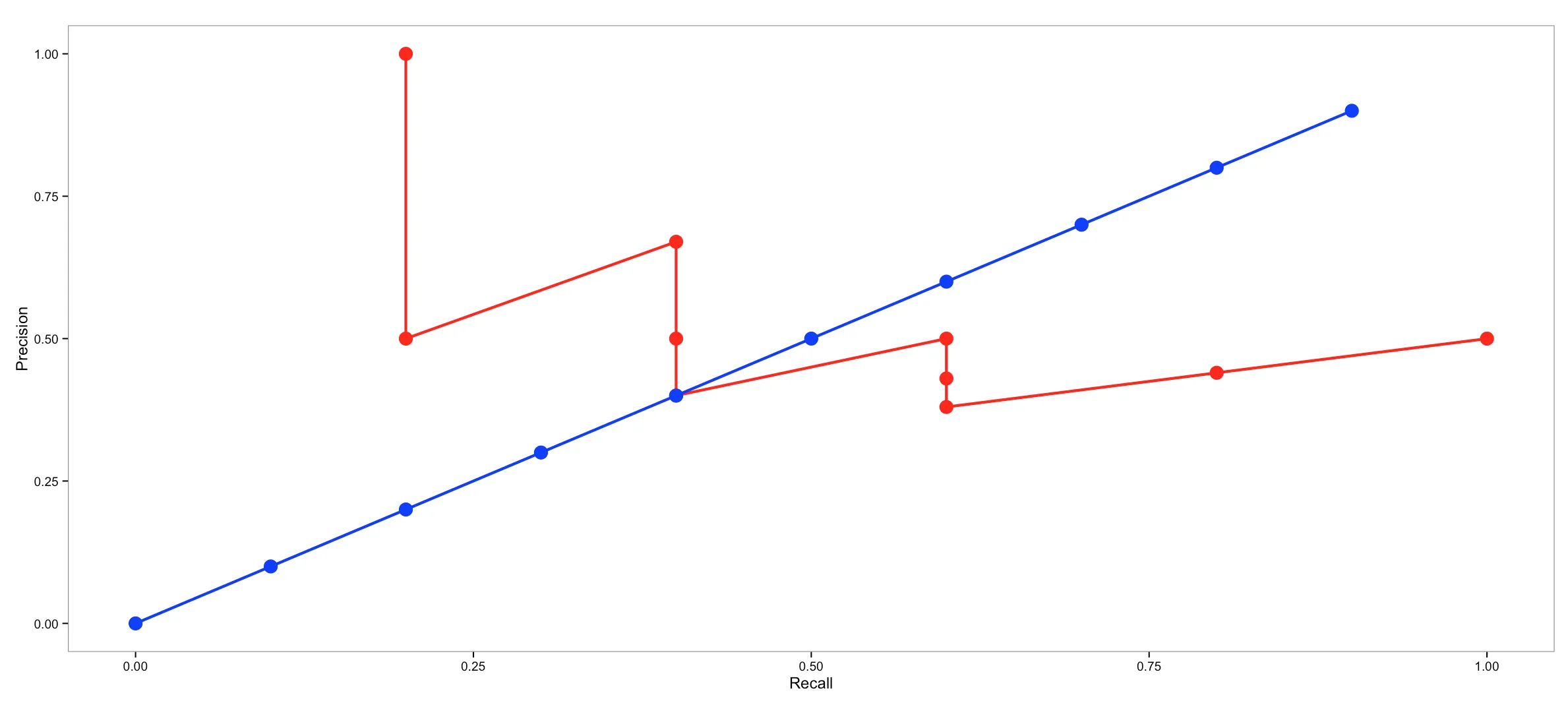
recall11Point    = c(0.2, 0.2, 0.4, 0.4, 0.4, 0.6, 0.6, 0.6, 0.8, 1.0)
precision11Point = c(1.0, 0.5, 0.67, 0.5, 0.4, 0.5,0.43,0.38,0.44,0.5)
d = data.frame("Recall" = recall11Point, "Precision" = precision11Point);

# old fashioned plotting
#plot(y=precision11Point, x=recall11Point, type="l")

ggplot(data=d, aes(x=Recall, y=Precision)) +
  geom_line(size=2, colour="red") +
  geom_point(size=10)