如何在Jupyter Notebook中将数据框和图表并排显示

29

我知道如何在Jupyter Notebook中将两个图表并排(水平地)显示,但我不知道是否有一种方法可以在图表旁边显示一个数据帧。 我想它可能看起来像这样:

enter image description here

然而,我无法做到这一点,每当我打印出数据框时,它都会出现在我的图表下面...

这里有一个类似的问题,但我也要在同一个单元格中输出垂直方向的图表。

我目前有这个:

# line plots
df_plot[['DGO %chg','DLM %chg']].plot(figsize=(15,5),grid=True)
plt.ylim((-ylim,ylim))

df_plot[['Diff']].plot(kind='area',color='lightgrey',figsize=(15,1))
plt.xticks([])
plt.xlabel('')
plt.ylim((0,ylim_diff))
plt.show()

# scatter plots
plt.scatter(x=df_scat[:-7]['DGO'],y=df_scat[:-7]['DLM'])
plt.scatter(x=df_scat[-7:]['DGO'],y=df_scat[-7:]['DLM'],color='red')
plt.title('%s Cluster Last 7 Days'%asset)
plt.show()

# display dataframe
# display(df_scat[['DGO','DLM']][:10]) <-- prints underneath, not working

在红框处,我希望我的数据框出现。有人有关于如何做到这一点的想法吗?

感谢您的思考!

输入图像描述

除了本页上的其他解决方案之外,还有一种方法依赖于Plotly共享,在此处的OP底部 - undefined
5个回答

22

我不知道如何直接控制DataFrame在哪里显示的位置,但我过去使用的一个解决方法是将DataFrame渲染为Matplotlib表格,然后它应该像任何其他Matplotlib图形一样进行操作。您可以使用:

import matplotlib.pyplot as plt
import pandas as pd
import numpy as np

df = pd.DataFrame()
df['x'] = np.arange(0,11)
df['y'] = df['x']*2

fig = plt.figure(figsize=(8,5))

ax1 = fig.add_subplot(121)
ax1.scatter(x=df['x'],y=df['y'])

ax2 = fig.add_subplot(122)
font_size=14
bbox=[0, 0, 1, 1]
ax2.axis('off')
mpl_table = ax2.table(cellText = df.values, rowLabels = df.index, bbox=bbox, colLabels=df.columns)
mpl_table.auto_set_font_size(False)
mpl_table.set_fontsize(font_size)

在这里输入图片描述


有趣,这可能会起作用!出于好奇,您需要将plt保存为图片才能使其起作用吗? - David Yang
我认为您不需要将 plt 保存为图片 - 那只是我设置的方式。如果您愿意,可以删除该行。只需调用函数 "render_mpl_table(df, 'df')" 即可显示 matplotlib 表格。大部分代码都是为了让表格“漂亮”,所以可能并不适合您的需求。 - Charles Parr
这对于将数据框打印为轴非常有效...您知道如何将其包含为子图吗?我正在使用 plt.subplot(1,2,1)plt.subplot(1,2,2),但不确定如何执行相当于 plt.ax 的操作。 - David Yang
好的 @DavidYang,我解决了 - 基本上你只需要将表格从函数中提取出来。我还使表格输出更加简洁明了。 - Charles Parr

3

另一种可能性是使用HTML来排序,可以参考https://dev59.com/XFkT5IYBdhLWcg3wT91f#44923103

这里有一个可行的示例(可能还有更优雅的方法):

prefix = \
"""
 <!DOCTYPE html>
<html>
<head>
<style>
* {
    box-sizing: border-box;
}

.column {
    float: left;
    width: 33.33%;
    padding: 5px;
}

/* Clearfix (clear floats) */
.row::after {
    content: "";
    clear: both;
    display: table;
}
</style>
</head>
<body>

<h2>title</h2>

<div class="row">
  <div class="column">
"""

suffix = \
"""
  </div>
  <div class="column">
    <img src="pic_file.png" alt="Graph" style="width:100%">
  </div>
</div>
</body>
</html>
"""

df = pd.DataFrame(np.arange(36).reshape((6,6)),columns=['A','B','C','D','E','F'])
ax = df.plot(lw=4)
title = "mock data"
fig = ax.get_figure()
fig.savefig(title+".png")
html = prefix.replace('title', title)+df.to_html()+suffix.replace('pic_file.png', title+".png")
display_html(html, raw=True)

enter image description here


3

您可以始终使用ipwidgets:

import numpy as np
import pandas as pd
import matplotlib.pyplot as plt
from scipy.stats import binom

n = 12[enter image description here][1]
p = 0.5
x = np.arange(0, n+1)

binomial_pmf = binom.pmf(x, n, p)
binomial_cdf = binom.cdf(x, n, p)

import ipywidgets as widgets
from ipywidgets import GridspecLayout

out_box1 = widgets.Output(layout={"border":"1px solid green"})
out_box2 = widgets.Output(layout={"border":"1px solid green"})

with out_box1:
    display(pd.DataFrame({'k':x,'binom pmf':np.round(binomial_pmf,4),'binom cdf':np.round(binomial_cdf,4)}).set_index('k'))
    

with out_box2:
    fig, ax1 = plt.subplots(figsize=(10,6))

    ax2 = ax1.twinx()
    ax1.plot(x, binomial_pmf, 'b-')
    ax2.plot(x, binomial_cdf, 'r-')
    plt.title(f"Binomial Distribution (n={n}, p={p})")
    ax1.grid(color = 'green', linestyle = '--', linewidth = 0.5,b=None, which='major', axis='both')

    plt.xticks(np.arange(min(x), max(x)+1, 1.0))
    ax1.set_ylabel('binomial mdf', color='b')
    ax2.set_ylabel('binomial cdf', color='r')

    plt.show()

grid = GridspecLayout(10, 4)
grid[:, 0] = out_box1
grid[:, 1:4] = out_box2

grid

DataFrame - 侧边并排绘图


0
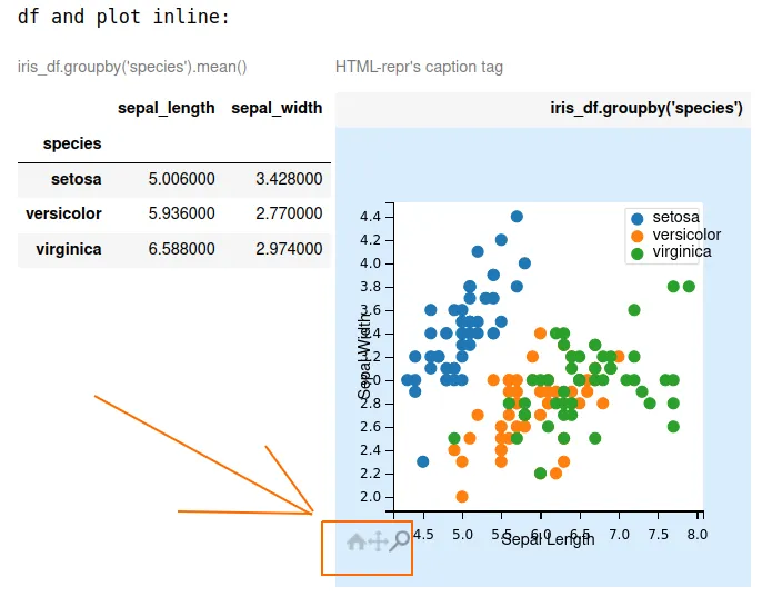
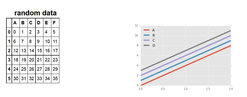
在jupyter-notebook中,我只能将图表限制在表格中,也许有人可以在下面的代码中解决这个问题。至少在下一个截图中展示的那样,可以方便地进行绘图缩放和拖动。

enter image description here

代码:

import pandas as pd
import matplotlib.pyplot as plt
import mpld3
from IPython.display import display_html
from bs4 import BeautifulSoup
import inspect

plt.ioff() # prevent plots from being displayed in the output of Jupyter Notebook

def getFig():
    iris_df = pd.read_csv('https://raw.githubusercontent.com/mwaskom/seaborn-data/master/iris.csv')
    fig, ax = plt.subplots()
    for species, group in iris_df.groupby('species'):
        ax.scatter(group['sepal_length'], group['sepal_width'], label=species)
    ax.set_xlabel('Sepal Length')
    ax.set_ylabel('Sepal Width')
    ax.legend() 
    return fig
    
def get_html_df(caption="iris_df.groupby('species').mean()"):
    iris_df = pd.read_csv('https://raw.githubusercontent.com/mwaskom/seaborn-data/master/iris.csv')
    html_df = iris_df.groupby('species')[['sepal_length','sepal_width']].mean()\
    .style.set_table_attributes("style='display:inline'")\
    .set_caption(caption)._repr_html_()
    return html_df
    
def main(fig,
         term = 3, # 1, 2 or 3,
         head="Plot", file="deleteme.jpg", caption="HTML-repr's caption tag",
         width=300.0, height=300.0
        ):
       
    html_plot = main_mpld3(fig, width=width, height=height) 
    
    frame = inspect.currentframe()
    args, _, _, values = inspect.getargvalues(frame)
    kwargs = {arg: values[arg] for arg in args}
    [kwargs.pop(key, None) for key in ["fig", "term"]]
    
    match term:
        case 1:
            mpld3.enable_notebook()
            # html_plot not modified
        case 2:
            html_plot = fig2file2html(plt=plt, **kwargs)
        case 3:
            html_plot = fig2file2html(html_plot=html_plot, **kwargs)
    plt.close()
    return html_plot

def main_mpld3(fig, width, height):
    html_plot = mpld3.fig_to_html(fig)
    # print(html_plot)
    
    html_plot = editHTML(html_plot, width, height)
    # print(html_plot)
    return html_plot

def editHTML(html_plot, width, height):
    soup = BeautifulSoup(html_plot, 'html.parser')
    aux = soup.prettify()

    toMatch = '"width": 640.0, "height": 480.0'
    toReplace = f'"width": {width}, "height": {height}' # shows plot, but not inline
    # toReplace = f'"width": {width}, "height": {height}, "style"="display:inline;"' # NOT shows plot
    # toReplace = f'"width": {width}, "height": {height}, "display"="inline"' # NOT shows plot
    modified_html = aux.replace(toMatch, toReplace)
    
    # no effect to inline
    toMatch = '"drawstyle": "default"'
    toReplace = '"drawstyle": "inline"'
    modified_html = modified_html.replace(toMatch, toReplace)
    
    # no effect to inline
    toMatch = '<style>\n</style>'
    toReplace = ''
    modified_html = modified_html.replace(toMatch, toReplace)
    
    soup = BeautifulSoup(modified_html, 'html.parser')
    aux = soup.prettify()
    
    return aux

def fig2file2html(plt=None, html_plot=None, head="Plot", file="deleteme.jpg", caption="HTML-repr's caption tag",
                 width=300.0, height=300.0):
    if (plt is None) and (html_plot is None):
        return Error
    if plt is not None:
        plt.savefig(file)
        html_img = f'<img src={file} alt="" border=3 height={height} width={width}></img>'
    if html_plot is not None:
        hr = 4*"&nbsp;"
        html_img = hr + html_plot + hr
    
    # <img> --> no inline
    html_plot= html_img.replace("<img", "<img style='display:inline ")
    
    # <div> --> no inline
    html_plot= f"""<div style='display:inline'>
    {html_img}
    </div>
    """
    
    # <table> --> YES inline
    html_plot= f"""<table style='display:inline'>
    <caption>{caption}</caption>
    <tr><th>{head}</th><tr>
    <tr><td>
    {html_img}
    </td></tr>
    </table>
    """
    return html_plot


def test01():
    fig = getFig()
    html_df = get_html_df()
    html_plot = main(fig)
    
    print("2 dfs inline:")
    display_html(html_df + html_df, raw=True) # YES success!
    print("df and plot inline:")
    display_html(html_df + html_plot, raw=True) # inline if term=3 or term=2

def test02():
    fig = getFig()
    html_df = get_html_df(caption="")
    html_plot = main(fig,
                     term = 3, # 1, 2 or 3
                     head="", file="deleteme.jpg", caption="",
                     width=650.0, height=650.0,
                    )
    display_html(html_df + html_plot, raw=True)
#test01()
test02()

-1
你可以使用 %matplotlib inline,然后只需编写代码,例如 df.head() plt.plot(df['X']),这样 %matplotlib inline 就会在一个单元格中绘制数据框和图形。

1
请对您的代码进行格式化,并添加一个易于理解的示例。谢谢! - mzuther

网页内容由stack overflow 提供, 点击上面的
可以查看英文原文,
原文链接