我实际上已经谷歌搜索了一些信息,但没有找到它。
我的目标是实现类似进度条样式的三角形填充。有什么方法吗?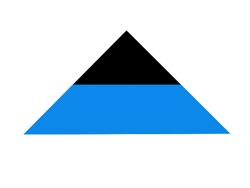
.angle {
    width: 0;
    height: 0;
    border-left: 75px solid transparent;
    border-right: 75px solid transparent;
    border-bottom: 75px solid black;
}
我实际上已经谷歌搜索了一些信息,但没有找到它。
我的目标是实现类似进度条样式的三角形填充。有什么方法吗?
.angle {
width: 0;
height: 0;
border-left: 75px solid transparent;
border-right: 75px solid transparent;
border-bottom: 75px solid black;
}
.amount div 的高度为 %)。
.amount {
  position: absolute;
  height: 0%;
  width: 100%;
  bottom: 0;
  left: 0;
  transition: all 1s;
  background: tomato;
}
.tri {
  position: relative;
  height: 200px;
  width: 200px;
  background: lightgray;
}
.tri:before,
.tri:after {
  content: "";
  position: absolute;
  border-top: 200px solid white;
  top: 0;
  z-index: 8;
}
.tri:before {
  border-left: 100px solid transparent;
  left: 50%;
}
.tri:after {
  border-right: 100px solid transparent;
  left: 0;
}
.tri:hover .amount {
  height: 100%;
}<div class="tri">
<div class="amount"></div>
</div>可能是这样的吗?
.angle {
    position: relative;
    width: 0;
    height: 0;
    border-left: 100px solid transparent;
    border-right: 100px solid transparent;
    border-bottom: 100px solid blue;
}

.angle:after {
    position: absolute;
    content: "";
    top: 0;
    left: 50%;
    margin-left: -50px;
    width: 0;
    height: 0;
    border-left: 50px solid transparent;
    border-right: 50px solid transparent;
    border-bottom: 50px solid black;
}
fiddle: {{链接1:http://jsfiddle.net/bkaxzLnu/3/}}
这里有另一种CSS ONLY,NO-BORDERS,NO AFTER/BEFORE HACKS的选项:
您可以使用clip-path。它允许您仅显示元素的一部分并隐藏其余部分。
因此,您可以像这样做:
  .amount {
    position: absolute;
    height: 100%;
    width: 0%;
    bottom: 0;
    left: 0;
    transition: all 1s;
    background: tomato;
  }

  .tri {
    position: relative;
    width: 500px;
    height: 50px;
    background: #ddd;

    /* triangle */
    clip-path: polygon( 100% 0%,100% 100%, 0% 100%);
  }
  .tri:hover .amount {
    width: 100%;
    background: chartreuse ;
}<div class="tri">
<div class="amount"></div>
</div>