如何在Jetpack Compose中去掉EditText/TextField的下划线并保留光标?

63

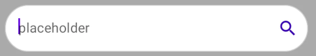
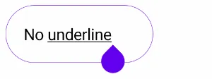
嗨,我需要去掉我的文本字段下划线,因为当文本字段是圆形时,它看起来很丑。我已经将activeColor设置为透明,但是光标不会显示(因为它是透明的)。那么我该如何去除下划线/激活颜色并保持光标呢?

输入图像描述

这是我的圆形文本字段代码:

@Composable
fun SearchBar(value: String) {
    // we are creating a variable for
    // getting a value of our text field.
    val inputvalue = remember { mutableStateOf(TextFieldValue()) }

    TextField(
            // below line is used to get
            // value of text field,
            value = inputvalue.value,

            // below line is used to get value in text field
            // on value change in text field.
            onValueChange = { inputvalue.value = it },

            // below line is used to add placeholder
            // for our text field.
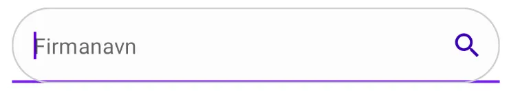
            placeholder = { Text(text = "Firmanavn") },

            // modifier is use to add padding
            // to our text field, and a circular border
            modifier = Modifier.padding(all = 16.dp).fillMaxWidth().border(1.dp, Color.LightGray, CircleShape),

            shape = CircleShape,


            // keyboard options is used to modify
            // the keyboard for text field.
            keyboardOptions = KeyboardOptions(
                    // below line is use for capitalization
                    // inside our text field.
                    capitalization = KeyboardCapitalization.None,

                    // below line is to enable auto
                    // correct in our keyboard.
                    autoCorrect = true,

                    // below line is used to specify our
                    // type of keyboard such as text, number, phone.
                    keyboardType = KeyboardType.Text,
            ),

            // below line is use to specify
            // styling for our text field value.
            textStyle = TextStyle(color = Color.Black,
                    // below line is used to add font
                    // size for our text field
                    fontSize = TextUnit.Companion.Sp(value = 15),

                    // below line is use to change font family.
                    fontFamily = FontFamily.SansSerif),

            // below line is use to give
            // max lines for our text field.
            maxLines = 1,

            // active color is use to change
            // color when text field is focused.
            activeColor = Color.Gray,

            // single line boolean is use to avoid
            // textfield entering in multiple lines.
            singleLine = true,

            // inactive color is use to change
            // color when text field is not focused.
            inactiveColor = Color.Transparent,

            backgroundColor = colorResource(id = R.color.white_light),

                    // trailing icons is use to add
                    // icon to the end of tet field.
            trailingIcon = {
                Icon(Icons.Filled.Search, tint = colorResource(id = R.color.purple_700))
            },
    )

3
不要使用大量修改过的材料组件。相反,使用Compose的基础组件(例如BasicTextField而不是TextField)并对它们进行修改。 - Noah
3个回答

132

您可以定义以下属性来应用透明颜色:

  • focusedIndicatorColor
  • unfocusedIndicatorColor
  • disabledIndicatorColor

类似于:

   TextField(
       //..
       colors = TextFieldDefaults.textFieldColors(
            textColor = Color.Gray,
            disabledTextColor = Color.Transparent,
            backgroundColor = Color.White,
            focusedIndicatorColor = Color.Transparent,
            unfocusedIndicatorColor = Color.Transparent,
            disabledIndicatorColor = Color.Transparent
        )
    )

图片描述在这里输入


1.2.0开始,您还可以使用新的OutlinedTextFieldDecorationBox,结合BasicTextField自定义边框或指示线。

    val interactionSource = remember { MutableInteractionSource() }
    val enabled = true
    val singleLine = true
    val colors = TextFieldDefaults.outlinedTextFieldColors()

    BasicTextField(
        value = value,
        onValueChange = onValueChange,
        modifier = modifier,
        // internal implementation of the BasicTextField will dispatch focus events
        interactionSource = interactionSource,
        enabled = enabled,
        singleLine = singleLine
    ) {
        TextFieldDefaults.OutlinedTextFieldDecorationBox(
            value = value,
            visualTransformation = VisualTransformation.None,
            innerTextField = it,
            // same interaction source as the one passed to BasicTextField to read focus state
            // for text field styling
            interactionSource = interactionSource,
            enabled = enabled,
            singleLine = singleLine,
            // update border thickness and shape
            border = {
                TextFieldDefaults.BorderBox(
                    enabled = enabled,
                    isError = false,
                    colors = colors,
                    interactionSource = interactionSource,
                    shape = CircleShape,
                    unfocusedBorderThickness = 1.dp,
                    focusedBorderThickness = 1.dp
                )
            }
        )
    }

在此输入图片描述

你也可以使用TextFieldDecorationBox,并应用indicatorLine修饰符,指定focusedIndicatorLineThicknessunfocusedIndicatorLineThickness值:

   val colors = TextFieldDefaults.textFieldColors(
        backgroundColor = White,
        focusedIndicatorColor = Gray)

    BasicTextField(
        modifier = Modifier
            .border(1.dp, Color.LightGray, CircleShape)
            .indicatorLine(
                enabled = enabled,
                isError = false,
                colors = colors,
                interactionSource = interactionSource,
                focusedIndicatorLineThickness = 0.dp,
                unfocusedIndicatorLineThickness = 0.dp
            )
            .background(colors.backgroundColor(enabled).value, CircleShape),
    ) {
        TextFieldDecorationBox(
            //...
            colors = colors
        )
    }

5
对于使用Material3的任何人,这里有一个快速提示,即backgroundColor已更改为containerColor - netcyrax

3
如果您不需要TextField的参数/函数,如收缩标签、占位符等,可以使用一层Text / BasicTextField来创建SearchField(这是一个建议的解决方法,根据issue FilledTextField: can't remove bottom indicator)。
@Composable
fun Search(
        hint: String,
        endIcon: ImageVector? = Icons.Default.Cancel,
        onValueChanged: (String) -> Unit,
) {
    var textValue by remember { mutableStateOf(TextFieldValue()) }

    Surface(
        shape = RoundedCornerShape(50),
        color = searchFieldColor
    ) {
        Box(
            modifier = Modifier
                .preferredHeight(40.dp)
                .padding(start = 16.dp, end = 12.dp),
            contentAlignment = Alignment.CenterStart
        )
        {
            if (textValue.text.isEmpty()) {
                Text(
                    text = "Search...",
                    style = MaterialTheme.typography.body1.copy(color = MaterialTheme.colors.onSurface.copy(ContentAlpha.medium)),
                    )
            }

            Row(
                verticalAlignment = Alignment.CenterVertically
            ) {
                BasicTextField(
                    modifier = Modifier.weight(1f),
                    value = textValue,
                    onValueChange = { textValue = it; onValueChanged(textValue.text) },
                    singleLine = true,
                    cursorColor = YourColor,
                )
                endIcon?.let {
                    AnimatedVisibility(
                        visible = textValue.text.isNotEmpty(),
                        enter = fadeIn(),
                        exit = fadeOut()
                    ) {
                        Image(
                            modifier = Modifier
                                .preferredSize(24.dp)
                                .clickable(
                                    onClick = { textValue = TextFieldValue() },
                                    indication = null
                                ),
                            imageVector = endIcon,
                            colorFilter = iconColor
                        )
                    }
                }
            }
        }
    }
}

0
不要使用已弃用的TextFieldDefaults.textFieldColors,我认为最好的解决方案是使用OutlinedTextField组件,并尽量使其与您的设计相同。
OutlinedTextField(
    value = searchText,
    onValueChange = { searchText = it },
    label = { Text("Search") },
    modifier = Modifier
        .fillMaxWidth()
        .padding(8.dp),
    keyboardOptions = KeyboardOptions.Default.copy(imeAction = ImeAction.Search),
    keyboardActions = KeyboardActions(onSearch = { onSearch(searchText) }),
    shape = MaterialTheme.shapes.large,
    leadingIcon = {
        Icon(
            imageVector = Icons.Filled.Search,
            contentDescription = "Search Icon"
        )
    },
)

网页内容由stack overflow 提供, 点击上面的
可以查看英文原文,
原文链接