我使用另一个脚本输入数据来创建许多R中的图表,每个变量都存储在不同的变量中。我将变量放入字符串中并强制换行
以下是可重现的代码片段:
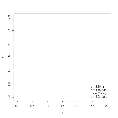
\n。这可以按预期工作,但图例没有对齐。 xjust和yjust似乎没有起到任何作用。此外,将图例放置在右下角时,它会延伸到图表的边缘之外。有什么办法可以将我的图例正确地放置在图表角落处并对齐吗?以下是可重现的代码片段:
plot(c(0,3), c(0,3), type="n", xlab="x", ylab="y")

a <- 2.3456
b <- 3.4567
c <- 4.5678
d <- 5.6789

Corner_text <- function(text, location = "bottomright"){
  legend(location, legend = text, bty = "o", pch = NA, cex = 0.5, xjust = 0)
}
Corner_text(sprintf("a = %3.2f m\n b = %3.2f N/m\UB2\n c = %3.2f deg\n d = %3.2f perc", a, b, c, d))