在Usercontrol中填充Stackpanel

4

我已经搜索了几个小时,但仍然找不到正确的方法来做这件事。

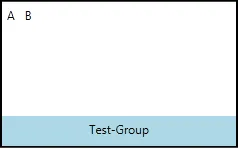
我建立了一个名为“MyToolbarGroup”的UserControl,其中包含一个GroupText和一个空的Stackpanel。

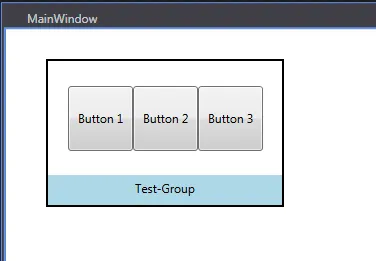
现在,我想在我的另一个UserControl“ MyUserControl”上使用MyToolbarGroup控件,并在MyToolbarGroup控件的Stackpanel中创建一些按钮

MyToolbarGroup-XAML

<UserControl x:Class="TestUi.MyToolbarGroup"
             xmlns="http://schemas.microsoft.com/winfx/2006/xaml/presentation"
             xmlns:x="http://schemas.microsoft.com/winfx/2006/xaml"
             xmlns:mc="http://schemas.openxmlformats.org/markup-compatibility/2006" 
             xmlns:d="http://schemas.microsoft.com/expression/blend/2008" 
             mc:Ignorable="d" d:DesignWidth="153" d:DesignHeight="103">
    <Grid>
        <Border BorderBrush="Black" BorderThickness="2">
            <Grid>
                <Grid.RowDefinitions>
                    <RowDefinition Height="*" />
                    <RowDefinition Height="30" />
                </Grid.RowDefinitions>
                <StackPanel Grid.Row="0" Orientation="Horizontal" HorizontalAlignment="Center" Margin="5,5,5,5" />
                <Label Grid.Row="1" HorizontalContentAlignment="Center" Content="{Binding Path=GroupText}" Background="LightBlue" />
            </Grid>
        </Border>
    </Grid>
</UserControl>

MyToolbarGroup-Code

public partial class MyToolbarGroup : UserControl
{
    public static readonly DependencyProperty GroupTextProperty = DependencyProperty.Register("GroupText", typeof(string), typeof(MyToolbarGroup));

    public String GroupText
    {
        get { return (String)GetValue(GroupTextProperty); }
        set { SetValue(GroupTextProperty, value); }
    }

    public MyToolbarGroup()
    {
        InitializeComponent();
        DataContext = this;
    }
}

MyUserControl-XAML

<UserControl
             xmlns="http://schemas.microsoft.com/winfx/2006/xaml/presentation"
             xmlns:x="http://schemas.microsoft.com/winfx/2006/xaml"
             xmlns:mc="http://schemas.openxmlformats.org/markup-compatibility/2006" 
             xmlns:d="http://schemas.microsoft.com/expression/blend/2008" 
             xmlns:local="clr-namespace:TestUi" x:Class="TestUi.MyUserControl" 
             mc:Ignorable="d" 
             d:DesignHeight="224" d:DesignWidth="343">
    <Grid>
        <local:MyToolbarGroup HorizontalAlignment="Left" Margin="40,30,0,0" VerticalAlignment="Top" Height="148" Width="238" GroupText="Test-Group">
            <!-- Something like that
            <Stackpanel-Inside-MyToolbarGroup>
                <Button  HorizontalAlignment="Center" VerticalAlignment="Center" Height="65" Width="65" Content="Button 1"/>
            </Stackpanel-Inside-MyToolbarGroup>
            -->
        </local:MyToolbarGroup>
    </Grid>
</UserControl>

有什么方法可以在stackpanel中设置一些按钮吗?

感谢任何帮助!


创建按钮并不困难,但是你想用这些按钮做什么呢?你想让它们执行一些命令吗? - Nitin
是的,按钮将用于执行命令。但是稍后还应该有标签或其他UI控件。但主要是按钮。 - jaz
3个回答

1
在MyToolbarGroup模板中包含一个ContentPresenter,以接受用户内容。
<UserControl x:Class="TestUi.MyToolbarGroup"
             xmlns="http://schemas.microsoft.com/winfx/2006/xaml/presentation"
             xmlns:x="http://schemas.microsoft.com/winfx/2006/xaml"
             xmlns:mc="http://schemas.openxmlformats.org/markup-compatibility/2006" 
             xmlns:d="http://schemas.microsoft.com/expression/blend/2008"
             xmlns:testUi="clr-namespace:TestUi"
             mc:Ignorable="d" d:DesignWidth="153" d:DesignHeight="103">
    <UserControl.Template>
        <ControlTemplate TargetType="UserControl">
            <Grid>
                <Border BorderBrush="Black" BorderThickness="2">
                    <Grid>
                        <Grid.RowDefinitions>
                            <RowDefinition Height="*" />
                            <RowDefinition Height="30" />
                        </Grid.RowDefinitions>

                        <ContentPresenter Content="{TemplateBinding Content}"/>

                        <Label Grid.Row="1" HorizontalContentAlignment="Center"
                               Content="{Binding GroupText, RelativeSource={RelativeSource AncestorType=testUi:MyToolbarGroup}}"
                               Background="LightBlue" />
                    </Grid>
                </Border>
            </Grid>
        </ControlTemplate>
    </UserControl.Template>
</UserControl>

然后像这样使用它:
<testUi:MyToolbarGroup Grid.Row="2"
    HorizontalAlignment="Left" 
    VerticalAlignment="Top" 
    Height="148" Width="238" GroupText="Test-Group">
    <!--any content, e.g. -->
    <StackPanel Orientation="Horizontal">
        <TextBlock Text="A" Margin="5"/>
        <TextBlock Text="B"  Margin="5"/>
    </StackPanel>
</testUi:MyToolbarGroup>

结果:

example


1
是的,这是正确的选项。您想要定义您的 UserControl.Template,而不是 UserControl.Content。当您尝试使用其他内容时,UserControl.Content 将被覆盖,但是 UserControl.Template 定义了如何包装控件给定的 .Content - Rachel

1

如果我理解正确,堆栈面板没有你想要的功能。你想要的是基于某些数据的动态控件集合,对吗?

你需要的是一个ItemsControl:

<ItemsControl ItemsSource="{Binding MyButtonDataCollection}"  >
    <ItemsControl.ItemTemplate >
        <DataTemplate >
            <Button Content="{Binding ButtonName}"
                    Command="{Binding ButtonClick}"
        </DataTemplate>
    </ItemsControl.ItemTemplate>
</ItemsControl>

绑定到一个数据对象集合,这些数据对象具有您想要绑定的属性和命令:

class MyButtonData : INotifyPropertyChanged
{
    String ButtonName { get; set; } //notify property changed and all that

    public ICommand ButtonClick
    {
        get;
        internal set;
    }

    private bool CanExecuteButtonClick()
    {
        //can this execute?
        return true;
    }

    private void CreateButtonClick()
    {
        ButtonClick = new RelayCommand(SaveExecute, CanExecuteSaveCommand);
    }

    public void ButtonClickExecute()
    {
        //do my logic for click
    }
}

1
如果您希望在“ MyToolbarGroup”中预定义布局,则需要使用具有“ StackPanel”作为“ ItemsPanel”的“ ItemsControl”替换“ StackPanel”。
以下是“ MyToolbarGroup”XAML:
<UserControl x:Class="WpfApplication2.MyToolbarGroup"
             xmlns="http://schemas.microsoft.com/winfx/2006/xaml/presentation"
             xmlns:x="http://schemas.microsoft.com/winfx/2006/xaml"
             xmlns:local="clr-namespace:WpfApplication2">
    <Border BorderBrush="Black" BorderThickness="2">
        <Grid>
            <Grid.RowDefinitions>
                <RowDefinition Height="*" />
                <RowDefinition Height="30" />
            </Grid.RowDefinitions>
            <ItemsControl Grid.Row="0" HorizontalAlignment="Center" Margin="5,5,5,5"
                          ItemsSource="{Binding GroupItems, RelativeSource={RelativeSource Mode=FindAncestor, AncestorType={x:Type UserControl}}}">
                <ItemsControl.ItemsPanel>
                    <ItemsPanelTemplate>
                        <StackPanel Orientation="Horizontal" />
                    </ItemsPanelTemplate>
                </ItemsControl.ItemsPanel>
            </ItemsControl>

            <Label Grid.Row="1" HorizontalContentAlignment="Center"
                   Content="{Binding GroupText, RelativeSource={RelativeSource Mode=FindAncestor, AncestorType={x:Type UserControl}}}"
                   Background="LightBlue" />
        </Grid>
    </Border>
</UserControl>

以及代码后台:

public partial class MyToolbarGroup : UserControl
{
    public MyToolbarGroup()
    {
        InitializeComponent();
    }

    public string GroupText
    {
        get { return (string)GetValue(GroupTextProperty); }
        set { SetValue(GroupTextProperty, value); }
    }

    public static readonly DependencyProperty GroupTextProperty =
        DependencyProperty.Register("GroupText", typeof(string), typeof(MyToolbarGroup), new PropertyMetadata(null));

    public IEnumerable GroupItems
    {
        get { return (IEnumerable)GetValue(GroupItemsProperty); }
        set { SetValue(GroupItemsProperty, value); }
    }

    public static readonly DependencyProperty GroupItemsProperty =
        DependencyProperty.Register("GroupItems", typeof(IEnumerable), typeof(MyToolbarGroup), new PropertyMetadata(null));
}

现在,您可以像这样使用它:

<Window x:Class="WpfApplication2.MainWindow"
        xmlns="http://schemas.microsoft.com/winfx/2006/xaml/presentation"
        xmlns:x="http://schemas.microsoft.com/winfx/2006/xaml"
        xmlns:sys="clr-namespace:System;assembly=mscorlib"
        xmlns:local="clr-namespace:WpfApplication2"
        Title="MainWindow">
    <Grid>
        <local:MyToolbarGroup HorizontalAlignment="Left" Margin="40,30,0,0" VerticalAlignment="Top" Height="148" Width="238" GroupText="Test-Group">
            <local:MyToolbarGroup.GroupItems>
                <x:Array Type="{x:Type sys:Object}">
                    <Button HorizontalAlignment="Center" VerticalAlignment="Center" Height="65" Width="65" Content="Button 1"/>
                    <Button HorizontalAlignment="Center" VerticalAlignment="Center" Height="65" Width="65" Content="Button 2"/>
                    <Button HorizontalAlignment="Center" VerticalAlignment="Center" Height="65" Width="65" Content="Button 3"/>
                </x:Array>
            </local:MyToolbarGroup.GroupItems>
        </local:MyToolbarGroup>
    </Grid>
</Window>

结果截图:

enter image description here


网页内容由stack overflow 提供, 点击上面的
可以查看英文原文,
原文链接