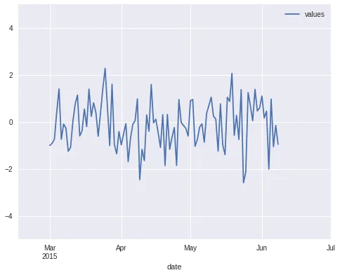
如何在绘制时间序列数据后设置xlim和xticks

33
fig = plt.figure()
ax = fig.gca()
ts.plot(ax=ax)

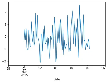
我知道在pandas绘图例程中可以设置xlim:ts.plot(xlim = ...),但是在pandas绘图完成后如何更改它呢?

ax.set_xlim(( t0.toordinal(), t1.toordinal() )

有时候有效,但如果pandas将x轴格式化为自纪元以来的月份而不是天数,则会失败。

有没有办法知道pandas如何将日期转换为x轴,然后以相同的方式转换我的xlim?

2个回答

47

如果我使用 pd.Timestamp 值设置 x 轴限制,它适用于我(使用 pandas 0.16.2)。

示例:

import pandas as pd

# Create a random time series with values over 100 days
# starting from 1st March.
N = 100
dates = pd.date_range(start='2015-03-01', periods=N, freq='D')
ts = pd.DataFrame({'date': dates,
                   'values': np.random.randn(N)}).set_index('date')

# Create the plot and adjust x/y limits. The new x-axis
# ranges from mid-February till 1st July.
ax = ts.plot()
ax.set_xlim(pd.Timestamp('2015-02-15'), pd.Timestamp('2015-07-01'))
ax.set_ylim(-5, 5)

结果:

手动调整x轴限制的时间序列绘图。

请注意,如果您在同一图中绘制多个时间序列,请确保在最后一个ts.plot()命令之后设置xlim/ylim,否则pandas会自动重置限制以匹配内容。


那个关于“after”的列表位很重要!谢谢。Matplotlib非常挑剔。 - Z_D

0

如果要更加“动态”地设置轴限制,可以从日期时间中减去/添加Timedelta。例如,要在x轴限制的两侧各有1天的填充,可以使用以下代码。

dates = pd.date_range(start='2015-03-01', periods=100, freq='h')
ts = pd.DataFrame({'date': dates, 'values': np.random.randn(len(dates))})

# plot the time-series
ax = ts.plot(x='date', y='values', legend=False)
# set x-axis limits with the extra day padding
ax.set(xlim=(ts['date'].min() - pd.Timedelta('1d'), ts['date'].max() + pd.Timedelta('1d')));

你也可以在plot()函数中设置坐标轴的限制。

ts.plot(x='date', y='values', 
        xlim=(ts['date'].min() - pd.Timedelta('1d'), ts['date'].max() + pd.Timedelta('1d')));

result image


网页内容由stack overflow 提供, 点击上面的
可以查看英文原文,
原文链接