如何使用ggplot2在次坐标轴上绘制反向条形图的多个时间序列?

5
我有一个数据框,其中包含四列,如下所示(这里只放出了我的实际数据框的标题):
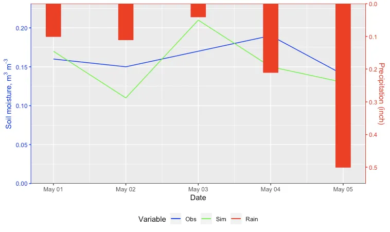
df <- tibble(Date=c("2007-05-01", "2007-05-02","2007-05-03", "2007-05-04", "2007-05-05"), Obs = c(0.16,0.15,0.17,0.19,0.14), Sim = c(0.17, 0.11, 0.21, 0.15, 0.13), Rain = c(0.1, 0.11, 0.04,0.21,0.5))

我该如何绘制数据图表,以便在主轴上绘制变量ObsSim,并将Rain绘制为反向次要轴上的条形图?以下是到目前为止我尝试过的代码:
ggplot(df, aes(x=as.Date(Date))) + 
  geom_line(aes(y=Obs, color="red")) +
  geom_line(aes(y=Sim, color="green")) +
  geom_bar(mapping = aes(y = Rain), stat = "identity") +
  scale_y_continuous(name = expression('Soil moisture, m'^"3"*' m'^"-3"), 
                     sec.axis = sec_axis(~ 3 - .*0.5, name = "Precipitation (inch)")) 

这是我期望的输出结果:

enter image description here

编辑:此外,我如何插入与每条线对应的图例(即Obs、Sim和Rain)?

2个回答

3

您也可以制作两个单独的图表,并将它们堆叠在一起。这对于那些不喜欢使用双轴图表的人(包括我自己)非常有用。

library(tidyverse)
library(lubridate)
library(scales)

df <- tibble(Date = c("2007-05-01", "2007-05-02", "2007-05-03", "2007-05-04", "2007-05-05"), 
             Obs  = c(0.16, 0.15, 0.17, 0.19, 0.14), 
             Sim  = c(0.17, 0.11, 0.21, 0.15, 0.13), 
             Rain = c(0.10, 0.11, 0.04, 0.21, 0.5))
             
# convert data to long format
df_long <- df %>% 
  mutate(Date = as.Date(Date)) %>% 
  pivot_longer(-Date, 
               names_to = 'key',
               values_to = 'value')

土壤湿度图

sm1 <- ggplot(data = df_long %>% filter(key != 'Rain'), 
              aes(x = Date, y = value,
                  group = key,
                  shape = key,
                  linetype = key,
                  col = key)) +
  xlab("") +
  ylab(expression('Soil moisture, m'^"3"*' m'^"-3")) +
  geom_line(lwd = 0.5) +
  geom_point(size = 3, alpha = 0.6) +
  scale_color_brewer("", palette = 'Dark2') +
  scale_linetype_manual("", values = c(NA, 'solid')) +
  scale_shape_manual("", values = c(19, NA)) +
  theme_bw(base_size = 16) +
  theme(legend.position = "bottom") +
  theme(panel.border = element_blank(),
        panel.grid.minor = element_blank(),
        axis.line = element_line()) +
  theme(axis.title.x = element_blank()) +
  theme(legend.key.size = unit(3, 'lines')) +
  guides(color = guide_legend(override.aes = list(linetype = c(NA, 1),
                                                  alpha    = 1.0,
                                                  shape    = c(19, NA)),
                              nrow = 1, byrow = TRUE))

降水图

prec_long <- df_long %>%
  filter(key == 'Rain') %>% 
  rename(Precipitation = matches("Rain"))

maxPrec <- 1.1 * max(prec_long$value, na.rm = TRUE)

p1 <- ggplot(data = prec_long, aes(x = Date, y = value)) +
  # use `geom_linerange` to mimic `type = h` in Base R plot
  # https://dev59.com/14Pba4cB1Zd3GeqPyeKk
  geom_linerange(aes(x = Date,
                     ymin = 0,
                     ymax = value),
                 color = "#2c7fb8",
                 size = 10) +
  xlab("") +
  ylab(paste("Precipitation (mm)", sep = "")) +
  scale_x_date(position = "top") +
  scale_y_reverse(expand = c(0, 0), limits = c(maxPrec, 0)) +
  theme_bw(base_size = 16) +
  theme(panel.border = element_blank(),
        panel.grid.minor = element_blank(),
        axis.line = element_line()) +
  theme(axis.text.x = element_blank(),
        axis.ticks.x = element_blank()) +
  theme(legend.position = "none")

将两个图叠加在一起

### `cowplot` or `egg` package would work too
# install.packages("patchwork", dependencies = TRUE)
library(patchwork)
p1 / sm1 +
  plot_layout(nrow = 2, heights = c(1, 2)) +
  plot_annotation(title = "My plot",
                  subtitle = "Precipitation and Soil moisture")

2020年7月26日由reprex软件包(v0.3.0)创建

注:本文涉及IT技术相关内容。

1
这使我在更改每个单独的绘图面板方面拥有更多的自由。谢谢。 - Tung

2
以下是使用geom_rect的一种方法:
  1. 计算主轴和次轴的最大值之间的比率。

  2. 存储次轴反向轴的最大值。

  3. 使用ymin绘制矩形,其中的最大值为减去该值乘以比率。

  4. 将次轴刻度设置为最大值减去值除以比率。

如果您需要在次轴底部增加一些额外的空间,则可以调整BottomOffset参数。我还添加了代码来更改轴的颜色。
编辑:现在带有图例。
Ratio <- max(c(df$Obs, df$Sim), na.rm = TRUE) / max(df$Rain)
RainMax <- max(df$Rain,na.rm = TRUE)
BottomOffset <- 0.05

ggplot(df, aes(x=as.Date(Date))) + 
  geom_line(aes(y=Obs, color="1")) +
  geom_line(aes(y=Sim, color="2")) +
  geom_rect(aes(xmin=as.Date(Date) - 0.1,
                xmax = as.Date(Date) + 0.1,
                ymin = (BottomOffset + RainMax - Rain) * Ratio,
                ymax = (BottomOffset + RainMax) * Ratio,
                color = "3"),
            fill = "red", show.legend=FALSE) + 
  geom_hline(yintercept = (BottomOffset + RainMax) * Ratio, color = "red") +
  geom_hline(yintercept = 0, color = "black") +
  labs(x = "Date", color = "Variable") +
  scale_y_continuous(name = expression('Soil moisture, m'^"3"*' m'^"-3"), 
                     sec.axis = sec_axis(~ BottomOffset + RainMax  - . / Ratio, name = "Precipitation (inch)"),
                     expand = c(0,0)) +
  scale_color_manual(values = c("1" = "blue", "2" = "green", "3" = "red"),
                     labels = c("1" = "Obs", "2" = "Sim", "3"= "Rain")) +
  theme(axis.line.y.right = element_line(color = "red"), 
        axis.ticks.y.right = element_line(color = "red"),
        axis.text.y.right = element_text(color = "red"),
        axis.title.y.right = element_text(color = "red"),
        axis.line.y.left = element_line(color = "blue"), 
        axis.ticks.y.left = element_line(color = "blue"),
        axis.text.y.left = element_text(color = "blue"),
        axis.title.y.left = element_text(color = "blue"),
        legend.position = "bottom")

enter image description here


@Campbell - 如何在上面的图中插入与每条线对应的图例(即Obs、Sim和Rain)? - raghav
你可以尝试使用 facet_grid 或者结合 ggpubr::ggarrangepatchwork 包来实现。我认为这可能需要新开一个问题,因为它显著扩展了范围。 - Ian Campbell
@Campbell- 如果我想在单页上放置多个图(例如四个图),并且这些图具有公共的x和y标签以及公共的图例,使用上述代码如何实现?此外,当x轴为日期时间时,我们如何在每个图的左下角插入文本(例如“test1”,“test2”,“test3”,“test4”)? - raghav
我建议您使用提问按钮发布一个新问题。请包含您的样本数据、使用此答案开发的代码、指向此问题的链接,并使用模拟说明您遇到的困难。我今晚没有时间查看,但其他人可能会。 - Ian Campbell

网页内容由stack overflow 提供, 点击上面的
可以查看英文原文,
原文链接