nav {
text-align: center;
padding-right: 1em;
}
ul {
display: inline;
margin: 0;
padding: 0;
}
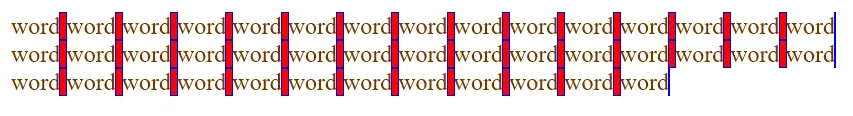
li {
display: inline;
}
li::before {
content: ' ';
}
li::after {
content: ' ';
white-space: normal;
word-spacing: 1em;
background-image: radial-gradient(circle, black, black 7%, transparent 15%, transparent 35%, black 45%, black 48%, transparent 55%);
background-size: 1em 1em;
background-repeat: no-repeat;
background-position: center center;
opacity: 0.5;
}
a {
white-space: nowrap;
display: inline-block;
padding: 1em;
text-decoration: none;
color: black;
transition-property: background-color;
transition-duration: 500ms;
}
a:hover {
background-color: #ccc;
}
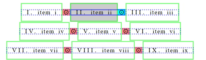
nav:hover > ul > li {
outline: 3px dotted rgba(0,0,255,.5);
outline-offset: -3px;
}
nav:hover > ul > li::after {
opacity: 1;
background-color: rgba(255, 0, 0, .5);
}
nav:hover > ul > li:hover {
outline-style: solid;
}
nav:hover > ul > li:hover::after {
background-color: cyan;
}
nav:hover > ul > li > a {
outline: 3px solid rgba(0,255,0,.5);
outline-offset: -3px;
}
nav > ul {
counter-reset: c;
}
nav > ul > li {
counter-increment: c;
}
nav > ul > li > a::before {
content: counter(c, upper-roman) '. ';
letter-spacing: .3em;
}
nav > ul > li > a::after {
content: ' item ' counter(c, lower-roman);
word-spacing: .3em;
letter-spacing: .1em;
transform: translatex(.1em);
display: inline-block;
}
<nav>
<ul><li><a href="#"></a></li><li><a href="#"></a></li><li><a href="#"></a></li><li><a href="#"></a></li><li><a href="#"></a></li><li><a href="#"></a></li><li><a href="#"></a></li><li><a href="#"></a></li><li><a href="#"></a></li><li><a href="#"></a></li><li><a href="#"></a></li><li><a href="#"></a></li><li><a href="#"></a></li><li><a href="#"></a></li><li><a href="#"></a></li><li><a href="#"></a></li><li><a href="#"></a></li><li><a href="#"></a></li><li><a href="#"></a></li><li><a href="#"></a></li><li><a href="#"></a></li>
</ul>
</nav>