响应式网格布局纵向仪表板100%高和宽CSS?

3

我有一个针对 @media (orientation: landscape) { 的仪表板,现在我希望制作一个 @media (orientation: portrait) { 版本的。

这是横屏版本:http://jsfiddle.net/FhKEx/
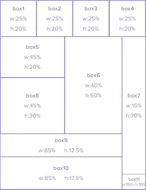
以下是纵向格局:

enter image description here

我觉得第一排应该是(100%w,20%h),第二排应该是(100%w,80%h),但不确定如何使第二排正确地浮动。

<div class="dashboard">
    <div class="row1">
        <div class="box1">"w:25%; h:20%;</div>
        <div class="box2">w:25%; h:20%;</div>
        <div class="box3">w:25%; h:20%;</div>
        <div class="box4">w:25%; h:20%;</div>
    </div>
    <div class="row2">
        <div class="box5">"w:45%; h:20%;</div>
        <div class="box8">"w:45%; h:30%;</div>
        <div class="box6">"w:40%; h:50%;</div>
        <div class="box9">w:85%; h:12.5%;</div>
        <div class="box10">w:85%; h:17.5%;</div>
        <div class="box7">w:15%; h:70%;</div>
        <div class="box11">"w:15%; h:10%;</div>
    </div>
</div>

这里的问题是要确定哪个盒子从横向变为纵向。您能否在纵向的网格表示中添加盒子的编号? - web-tiki
@Web-Tiki 刚刚把盒子名称添加到了网格图像中...非常感谢您看这个。 - StackThis
1个回答

3

好的,我成功地使它们像您的图片一样浮动,而不改变HTML标记。

.col2元素的高度/宽度可能需要进行微调,以完全匹配所需的高度/宽度。

FIDDLE

CSS:

html,body,.dashboard{
    width:100%;
    height:100%;
    margin:0;
}

.col1{
    width:100%;
    height:20%;
}
.col1 > div{
    width:25%;
    height:100%;
    float:left;
}
.col2{
    width: 85%;
    height:80%;
    float:left;
}
.col2 > div{
    float:left;
}
.col2 .box6{
    float:right;
    width: 45%;
    height:70%;
}
.box5,.box8{
    width:55%;
}
.box5{
    height:30%;
}
.box8{
    height:40%;
}
.box9{
    height:12%;
    width:100%;
}
.box10{
    height:18%;
    width:100%;
}
.box7,.box11{
    width:15%;

}
.box7{
    height:70%;
    width:15%;
    float:left;
}
.box11{
    height:10%;
    width:15%;
    float:left;
}

.border {
  background-color: white;
  box-sizing:border-box;
  -moz-box-sizing:border-box;
  -webkit-box-sizing:border-box;
  border:1px solid #000;
}

再次感谢!太棒了,真的非常棒。 - StackThis

网页内容由stack overflow 提供, 点击上面的
可以查看英文原文,
原文链接