如何使用响应式设计将我的导航栏转换为移动端的汉堡菜单?

4

我该如何将我使用CSS制作的导航栏转换为移动端汉堡菜单?它需要具有响应性。我最初尝试使用Bootstrap,但我希望它使用CSS。

这是我的CodePen链接:https://codepen.io/Softee/pen/WNZpXGa

非常感谢您的帮助!

这是代码:

header {
    background: #583760;
}

header::after {
    content:  '';
    display: table;
    clear: both;
}
.logo {
    max-height: 90px;
    margin-left: 60px;
    float: left;
    padding: 10px;
}

nav {
    margin-right: 60px;
    float: right;
}

nav ul {
    margin: 0;
    padding: 0;
    list-style: none;
}

nav li {
    display: inline-block;
    margin-left: 40px;
    padding-top: 50px;
}

nav a {
    color: white;
    font-weight: bold;
    text-decoration: none;
    text-transform: uppercase;
}

nav a:hover {
    color: black;
}

#nav:not(:target) {
    right: -100%;
    transition: right 1.5s;
}

#nav:target {
    right: 0;
    transition: right 1s;
}
    <header>
        <div class="container">
            <img src="images/GameStar-Blanc.png" alt="logo" class="logo">

            <nav>
                <ul>
                    <li><a href="#">A LA UNE </a></li>
                    <li><a href="#">L'ACTUALITE</a></li>
                    <li><a href="#">GUIDES ET ASTUCES</a></li>
                    <li><a href="#">PROCHAINEMENT</a></li>
                </ul>
            </nav>

    </header>


你尝试过什么?你可能不应该使用浮点数。它们通常已经过时了。 - isherwood
相关链接:https://dev59.com/9Ljoa4cB1Zd3GeqPDr7a - Jesse Nickles
这个回答解决了你的问题吗?如何在移动端将导航栏转换为汉堡菜单? - Jesse Nickles
4个回答

5

首先,您需要使用flex和grid重构全局CSS,这是响应式设计的标准。它比使用浮动和其他古老的东西更简单而且更强大:

<header class="header">
  <img src="..." />
  <nav> ... </nav>
</header>

.header {
  display: flex;
  width: 100%;
  justify-content: space-between;
  align-items: center;
  padding: 20px 60px;
}

使用 justify-content: space-between 属性可以告诉容器内部的元素(.logo 和 nav)如何排列,第一个元素(logo)在左侧,第二个元素(nav)在右侧,无需使用浮动。这个属性只有在设置了 display: flex 后才能生效。使用 align-items: center; 可以告诉 flex 容器如何垂直对齐元素。

enter image description here

然后,您可以给 ul 分配一个类,并按以下方式填充它:
.list {
  display: grid;
  grid-auto-flow: column;
  list-style-type: none;
  column-gap: 20px;
  padding: 0;
}

这里是告诉<ul>元素,其中所有的<li>元素应该组成一个n列的网格,每个<li>元素之间要有20px的空间。属性column-gap仅在设置display: grid时才起作用。填充应始终为0或浏览器将默认添加一些填充。您不希望它,因此指定为0。

enter image description here

现在,您可以使用一个强大的组合来设置列表项的宽度,只需创建一个类并将其分配给您的<li>元素即可:
.listItem {
  width: min-content;
  white-space: nowrap;
}

这里你只需告诉列表项宽度应基于单词长度自动调整。使用white-space: nowrap,你告诉列表项永远不要在空格后开始新的一行。例如,“GUIDES ET ASTUCES”始终位于单独一行。同时,你还为之前创建的网格的每个列设置了宽度。
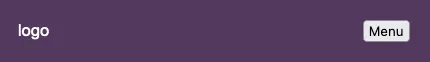
现在,创建一个按钮并将其与标志一起包装在一个新的div中:
    <div class="mobileHeader">
      <img src="images/GameStar-Blanc.png" alt="logo" class="logo">
      <button class="hamburger">Menu</button>
    </div>

基本上,这将是您的移动标题,左侧带有标志,右侧带有按钮。菜单将放置在下方。

创建全局CSS规则,并告诉按钮您永远不想显示它:

.hamburger {
  display: none;
}

现在针对移动菜单,您应该更改 <nav> 容器及其所有要更改的子元素的外观。从现在开始,您的代码应该包含在媒体查询中,在 CSS 文件底部或至少在之前定义的规则下方放置媒体查询。
@media screen and (max-width: 800px) {
  // CSS code
}

创建另一个CSS规则,目标是所有最大分辨率为800px的设备:
@media screen and (max-width: 800px) {
    .hamburger {
      display: block;
    }
}

简单来说,你刚才说:“菜单按钮应该始终隐藏,但当设备的宽度从0到800像素时,我想要显示它。”
现在,在媒体查询@media screen and (max-width: 800px)内创建另一个规则,并执行与标题相同的操作:
.mobileHeader {
  width: 100%;
  display: flex;
  justify-content: space-between;
}

基本上,您希望在特定宽度下,标题类似于:

enter image description here

现在你的 <header> 里应该有两个元素,分别是 <div><nav>,我们需要设置一条规则告诉 header 把这两个元素垂直排列。
.header {
  flex-direction: column;
  padding: 20px;
}

基本上,它就像网格布局中的 grid-auto-flow: row 一样。

现在对于列表也做同样的事情,这次你需要相反的效果,你希望所有项目组成一个具有 n 行和只有一列的网格:

.list {
  grid-auto-flow: row;
  list-style-type: none;
  row-gap: 40px;
  column-gap: 0;
  justify-items: center;
}

使用justify-items: center,您可以指示列表将列表项居中。它仅适用于display: grid,由于您在全局规则中设置了display: grid,因此只要您不需要更改它,就不需要再次编写它。
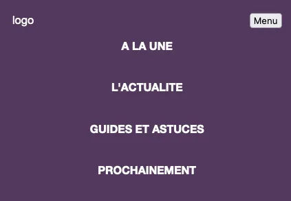
enter image description here

现在给你的<nav>分配一个类,并在媒体查询中输入另一条规则:
.menu {
   display: none;
}

当用户在移动设备上访问网站时,菜单应该是隐藏的,默认情况下应该设置为display: none

现在,设置一个规则,只针对宽度大于或等于801像素的设备使用(min-width: 801px)

@media screen and (min-width: 801px) {
  .menu {
    display: block !important;
  }
}

无论如何,您总是希望菜单显示在分辨率大于800px的设备上。
现在,如果您缩小窗口,则移动菜单应该消失,此时您需要一些JS来打开和关闭它,我不会深入讨论,因为您的问题完全与CSS相关,如果深入讨论只会使您更加困惑,但您可以在我为您制作的pen中找到所有内容。

https://codepen.io/alienopolis/pen/NWapXWZ

最后,我建议你参加这个免费的教程,它涵盖了使用CSS实现响应式设计所需的所有知识:

https://www.freecodecamp.org/news/css-flexbox-and-grid-tutorial/

HTML

<header class="header">
  <div class="mobileHeader">
    <img src="images/GameStar-Blanc.png" alt="logo" class="logo">
    <button onclick={openMenu()} class="hamburger">Menu</button>
  </div>
  <nav class="menu">
    <ul class="list">
      <li class="listItem"><a href="#">A LA UNE </a></li>
      <li><a href="#">L'ACTUALITE</a></li>
      <li><a href="#">GUIDES ET ASTUCES</a></li>
      <li><a href="#">PROCHAINEMENT</a></li>
    </ul>
  </nav>
</header>

CSS

body {
  width: 90%;
  height: 800px;
}

.header {
  display: flex;
  width: 100%;
  justify-content: space-between;
  background: #583760;
  align-items: center;
  padding: 20px 60px;
}


.logo {
  color: white;
}

.list {
  display: grid;
  grid-auto-flow: column;
  list-style-type: none;
  column-gap: 40px;
}

.listItem {
  width: min-content;
  white-space: nowrap;
}

nav a {
  color: white;
  font-weight: bold;
  text-decoration: none;
  text-transform: uppercase;
}

nav a:hover {
  color: black;
}

.hamburger {
  display: none;
}

@media screen and (min-width: 801px) {
  .menu {
    display: block !important;
  }
}

@media screen and (max-width: 800px) {

  .header {
    flex-direction: column;
    padding: 20px;
  }

  .mobileHeader {
    width: 100%;
    display: flex;
    justify-content: space-between;
  }

  .hamburger {
    display: block;
  }

  .menu {
    display: none;
  }

  .list {
    grid-auto-flow: row;
    list-style-type: none;
    row-gap: 40px;
    column-gap: 0;
    justify-items: center;
  }
}

JS

const menu = document.querySelector(".menu");
let open;

function openMenu() {
  if (open) {
    menu.style.display = "none";
    open = false;
  } else if (!open) {
    menu.style.display = "block";
    open = true;
  }
}

1

响应式设计意味着你将使用媒体查询。

如果你当前的CSS代表了你想要菜单在桌面上的样子,那么你可以将与菜单相关的CSS代码包裹在一个媒体查询中,该媒体查询匹配你定义的桌面设备。

例如:

/* not-menu-related generic css here ... */

/* menu-related css that should be used on both desktop/mobile here ... */

@media screen and (min-width:240px) and (max-width:480px) {
    /* all your current (desktop) menu-related css here */
}

之后,您可以为移动设备创建类似的@media .... { ... }块,并在其中添加相关CSS,使其在移动设备上呈现出您喜欢的外观。


0

使用@media和display:block、display:none快速搭建了这个,希望能对您有所帮助。

header {
  background: #583760;
}

header::after {
  content: '';
  display: table;
  clear: both;
}

.logo {
  max-height: 90px;
  margin-left: 60px;
  float: left;
  padding: 10px;
}

nav {
  margin-right: 60px;
  float: right;
}

nav ul {
  margin: 0;
  padding: 0;
  list-style: none;
}

nav li {
  display: inline-block;
  margin-left: 40px;
  padding-top: 50px;
}

nav a {
  color: white;
  font-weight: bold;
  text-decoration: none;
  text-transform: uppercase;
}

nav a:hover {
  color: black;
}

#nav:not(:target) {
  right: -100%;
  transition: right 1.5s;
}

#nav:target {
  right: 0;
  transition: right 1s;
}

.hamburgerIcon {
  display: none;
}

@media only screen and (max-width: 600px) {
  .hamburgerIcon {
    display: block;
  }
  .hamburgerIcon div {
    width: 35px;
    height: 5px;
    background-color: black;
    margin: 6px 0;
  }
  nav a {
    display: none;
  }
}
<header>
  <div class="container">
    <img src="https://via.placeholder.com/60" alt="logo" class="logo">

    <nav>
      <ul>
        <li><a href="#">A LA UNE </a></li>
        <li><a href="#">L'ACTUALITE</a></li>
        <li><a href="#">GUIDES ET ASTUCES</a></li>
        <li><a href="#">PROCHAINEMENT</a></li>
        <li>
          <div class='hamburgerIcon'>
            <div></div>
            <div></div>
            <div '></div>
</div>
                </ul>
            </nav>

    </header>

此外,如需帮助构建导航栏,请参阅w3schools.com/howto/howto_js_mobile_navbar.asp。

如果需要帮助构建导航栏,请参阅 https://www.w3schools.com/howto/howto_js_mobile_navbar.asp。 - spotexx
所有信息和参考链接应包含在您的答案中。 - isherwood

0

这里有一个最小化JS的解决方案。

您需要调整CSS以适应较小的屏幕尺寸,并使用媒体查询来处理较大的屏幕尺寸样式,例如:@media only screen and (min-width: 768px)

然后,您需要为导航添加一个点击事件来切换“打开”类并相应地进行样式设置:

document.getElementById('navigation').onclick = () => {
  document.body.classList.toggle('nav-open')
}
:root {
  --header-height: 100px;
}

* {
  box-sizing: border-box;
}

body {
  margin: 0;
  padding: 0;
}

header {
  position: relative;
  background: #583760;
  height: var( --header-height);
}

header::after {
  content:  '';
  display: table;
  clear: both;
}

.container {
  display: flex;
  justify-content: space-between;
  align-items: center;
  padding: 10px;
  height: 100%;
}

.container img {
  height: 100%;
}

.hamburger {
  color: white;
  font-size: 36px;
  user-select: none;
}

nav {
  cursor: pointer;
}

nav a {
  color: white;
  font-weight: bold;
  text-decoration: none;
  text-transform: uppercase;
}

nav ul {
  position: fixed;
  top: 100px;
  right: 0;
  height: 100%;
  width: 100%;
  text-align: center;
  flex-direction: column;
  justify-content: center;
  align-items: center;
  padding: 30px;
  margin: 0;
  list-style: none;
  background: #583760;
  display: none;
}

nav ul li {
  padding: 10px 0;
}

.nav-open nav ul {
  display: flex;
}

@media only screen and (min-width: 768px) {
  .logo {
    max-height: 90px;
    margin-left: 60px;
    float: left;
    padding: 10px;
  }

  .hamburger {
    display: none;
  }

  nav {
    margin-right: 60px;
    float: right;
  }

  nav ul {
    display: block;
    padding: 0;
    position: relative;
    top: unset;
    right: unset;
    height: unset;
  }

  nav li {
    display: inline-block;
    margin-left: 40px;
  }

  nav a:hover {
    color: black;
  }

  #nav:not(:target) {
    right: -100%;
    transition: right 1.5s;
  }

  #nav:target {
    right: 0;
    transition: right 1s;
  }
}
<header>
        <div class="container">
            <img src="https://via.placeholder.com/150" alt="logo" class="logo">

            <nav id="navigation">
        <div class="hamburger">&equiv;</div>
                <ul id="navigationItems">
                    <li><a href="#">A LA UNE </a></li>
                    <li><a href="#">L'ACTUALITE</a></li>
                    <li><a href="#">GUIDES ET ASTUCES</a></li>
                    <li><a href="#">PROCHAINEMENT</a></li>
                </ul>
            </nav>

    </header>


网页内容由stack overflow 提供, 点击上面的
可以查看英文原文,
原文链接