按钮的多边形边界/边界半径

6

我正在尝试制作如下图所示的多边形边框形状。
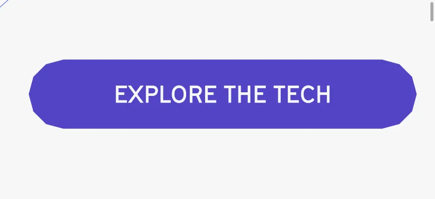
poygon border button background

我尝试过的代码如下。

@import url('https://fonts.googleapis.com/css2?family=Poppins&display=swap');

.p-button{
  background: transparent;
  text-decoration: none;
  background: #5344c6;
  color: white;
  padding: 15px 50px;
  border-radius: 27px;
  text-transform: uppercase;
  font-family: "Poppins";
  letter-spacing: 0.5px;
}

body{
  display: flex;
  height: 100vh;
  align-items: center;
  justify-content: center;
  
}
<a class="p-button" href="">Explore The Tech</a>


请查看 https://bennettfeely.com/clippy/,它可以帮助您创建 clip-path CSS 规则。 - G-Cyrillus
1个回答

4

使用 clip-path:

@import url('https://fonts.googleapis.com/css2?family=Poppins&display=swap');

.p-button{
  background: transparent;
  text-decoration: none;
  background: #5344c6;
  color: white;
  padding: 15px 50px;
  text-transform: uppercase;
  font-family: "Poppins";
  font-size:40px;
  --h:45px; /* this is half the height, adjust it based on your code */
  clip-path:polygon(
    0 50%,
    calc(0.134*var(--h))  25%,   /* 0.134 = 1 - cos(30)   */
    calc(  0.5*var(--h))  6.7%,  /* 6.7% = 0.134/2 * 100% */
    var(--h) 0,
    calc(100% - var(--h)) 0,
    calc(100% - 0.5*var(--h))   6.7%,
    calc(100% - 0.134*var(--h)) 25%,
    100% 50%,
    calc(100% - 0.134*var(--h)) 75%,
    calc(100% - 0.5*var(--h))   93.3%, /* 93.3% = 100% - 6.7% */
    calc(100% - var(--h)) 100%,
    var(--h) 100%,
    calc(  0.5*var(--h))  93.3%,
    calc(0.134*var(--h))  75%);
}

body{
  display: flex;
  height: 100vh;
  align-items: center;
  justify-content: center;
  
}
<a class="p-button" href="">Explore The Tech</a>


1
我从来不知道可以通过clip-path实现这个效果。谢谢,它起作用了。有没有办法理解代码是如何实现的? - Foss Bytes
1
@FossBytes,你的形状由14个点组成,因此我只需在剪辑路径内指定每个点,其他所有内容都与数学有关。我已经添加了一些特定值的详细信息。不确定你是否熟悉数学,但如果你按照代码逐点跟踪,你可以轻松理解逻辑。 - Temani Afif
如果我们需要一个透明背景,并且具有 var(--borderwidth) 的精确多边形边框,我该怎么做? - Foss Bytes
@FossBytes,你需要完全不同的代码,上面那个代码对你没有帮助。 - Temani Afif

网页内容由stack overflow 提供, 点击上面的
可以查看英文原文,
原文链接