您可以修改
plot.decomposed.ts函数(这是在类为
decomposed.ts的对象上运行
plot时调度的
plot“方法”(即
td的类))。请注意,保留HTML标签。
getAnywhere(plot.decomposed.ts)
function (x, ...)
{
    xx <- x$x
    if (is.null(xx))
        xx <- with(x, if (type == "additive")
            random + trend + seasonal
        else random * trend * seasonal)
    plot(cbind(observed = xx, trend = x$trend, seasonal = x$seasonal, random = x$random),
         main = paste("Decomposition of", x$type, "time series"), ...)
}
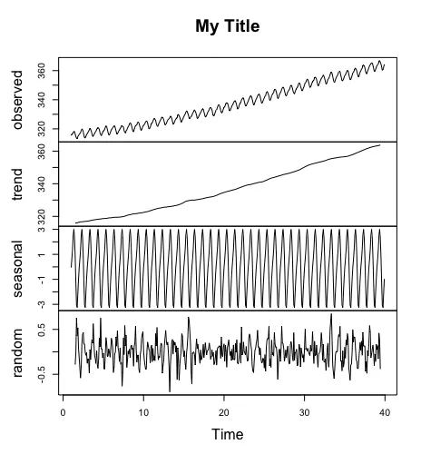
请注意上面的代码中,函数硬编码了标题。因此,让我们修改它,以便我们可以选择自己的标题:
my_plot.decomposed.ts = function(x, title="", ...) {
  xx <- x$x
  if (is.null(xx))
    xx <- with(x, if (type == "additive")
      random + trend + seasonal
      else random * trend * seasonal)
  plot(cbind(observed = xx, trend = x$trend, seasonal = x$seasonal, random = x$random),
       main=title, ...)
}

my_plot.decomposed.ts(td, "My Title")
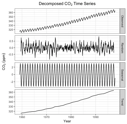
这是一个ggplot版本的图表。ggplot需要一个数据框,因此第一步是将分解的时间序列转换为数据框形式,然后绘制它。
library(tidyverse)
Time = attributes(co2)[[1]]
Time = seq(Time[1],Time[2], length.out=(Time[2]-Time[1])*Time[3])
dat = cbind(Time, with(td, data.frame(Observed=x, Trend=trend, Seasonal=seasonal, Random=random)))
ggplot(gather(dat, component, value, -Time), aes(Time, value)) +
facet_grid(component ~ ., scales="free_y") +
geom_line() +
theme_bw() +
labs(y=expression(CO[2]~(ppm)), x="Year") +
ggtitle(expression(Decomposed~CO[2]~Time~Series)) +
theme(plot.title=element_text(hjust=0.5))