我想在Zeppelin中以直方图的形式显示我的结果。我发现了plotly。我的代码是用Scala编写的,我想知道如何使用Scala将plotly纳入Zeppelin。或者是否有更好的方法(库)可以用于在Zeppelin(Scala)中绘制直方图?
4个回答
5
如果您有一个名为plotTemp的数据帧,包含两列"id"和"degree",则可以执行以下操作:
- 在scala窗口中将数据帧注册为临时表
plotTemp.registerTempTable("plotTemp")
Then switch to the SQL interpreter in a new window
%sql
select degree, count(1) nInBin
from plotTemp
group by degree
order by degree
您可以点击条形图图标,然后您应该能看到您想要的内容。
- Charles Copley
1
X轴的刻度在没有对应X值的地方被压缩了。只需查看您自己的图表,比较102和43828的x值位置即可。 - vak
4
在尝试了几乎所有现有的解决方案之后,我最终选择了vegas-viz。如果您查看他们在GitHub上的项目页面,他们声称是“Scala + Spark的遗失MatPlotLib”。尽管这在目前听起来有点夸张,但该库确实有效且表现良好。
这是我建议在Zeppelin的Spark解释器中绘制条形图(基本上就是直方图所需)的步骤:
import dependencies (please check the vegas maven repository for the latest versions)
%dep
z.load("org.vegas-viz:vegas_2.11:0.3.11")
z.load("org.vegas-viz:vegas-spark_2.11:0.3.11")
import packages
import vegas._
import vegas.render.WindowRenderer._
draw chart
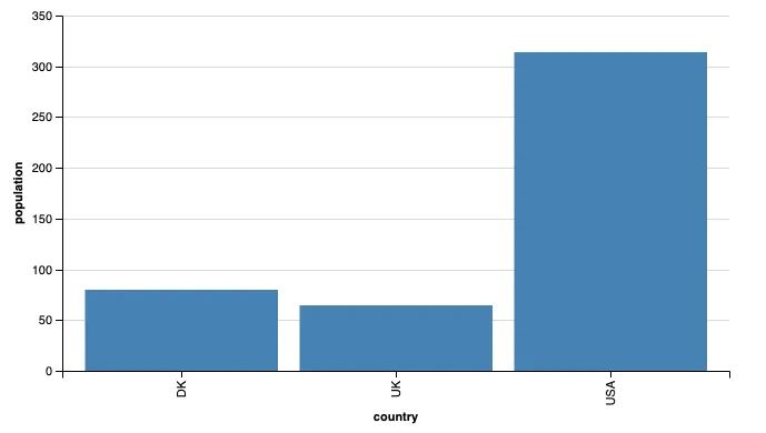
val plot = Vegas("Sample Column Chart")
  .withData(
    Seq(
      Map("country" -> "USA", "population" -> 314),
      Map("country" -> "UK", "population" -> 64),
      Map("country" -> "DK", "population" -> 80)
    )
  )
  .encodeX("country", Nom)
  .encodeY("population", Quant)
  .mark(Bar)
plot.show
The result should be similar to the image below:
you can even draw an image directly from a DataFrame if you have added vegas-spark among the dependencies (see point 1.) but you also need an extra import for this to work:
import vegas.sparkExt._

val df = Seq(
  ("USA", 314),
  ("UK", 64),
  ("DK", 80)
).toDF("country", "population")

val plot = Vegas("Sample Column Chart", width=600, height=320)
  .withDataFrame(df)
  .encodeX("country", Nom)
  .encodeY("population", Quant)
  .mark(Bar)
plot.show
- Sal Borrelli
1
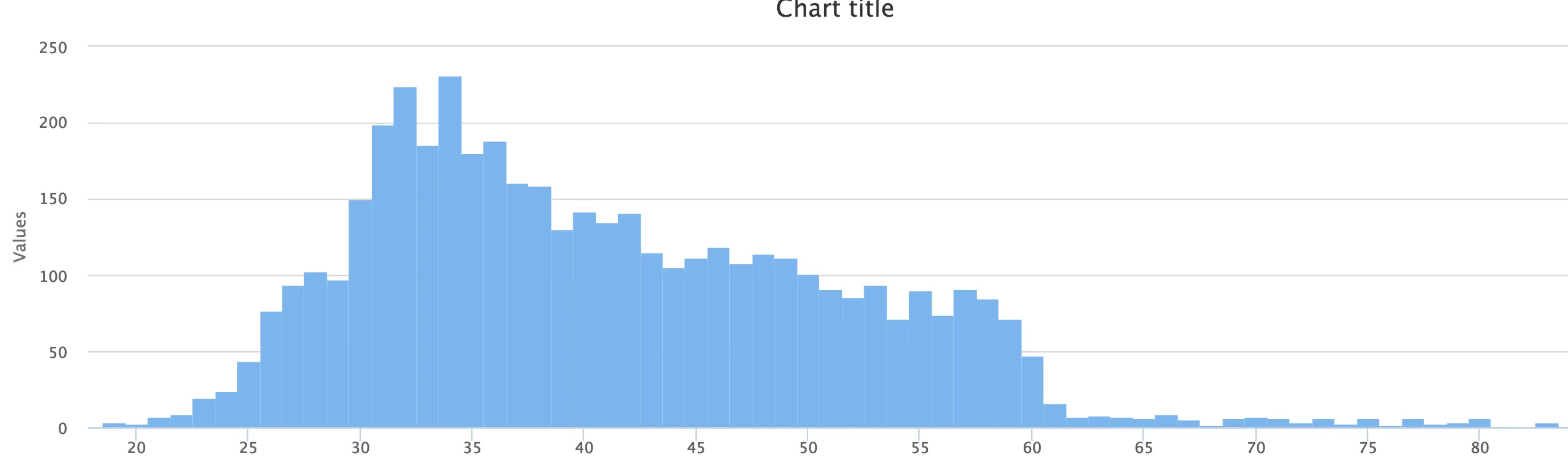
我刚刚发布了spark-highcharts。使用以下代码,您可以创建一个直方图。
import com.knockdata.spark.highcharts._
import com.knockdata.spark.highcharts.model._
highcharts(bank
    .series("x" -> "age", "y" -> count("*"))
    .orderBy(col("age"))
  )
  .chart(Chart.column)
  .plotOptions(new plotOptions.Column().groupPadding(0).pointPadding(0).borderWidth(0))
  .plot()
- Rockie Yang
1
导入不起作用。也许可以留下一个评论,说明如何将Highcharts引入环境中。 - wayneeusa
0
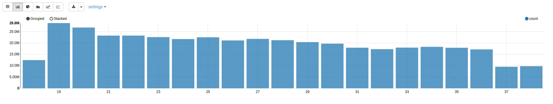
补充之前的答案,如果您有一个名为tmp的数据框,您可以运行以下操作
z.show(tmp)
这将产生以下结果,您可以通过点击左上角的按钮更改图表
- Niko
网页内容由stack overflow 提供, 点击上面的可以查看英文原文,
原文链接
原文链接
- 相关问题
- 8 如何在Zeppelin中使用Plotly
- 4 Scala中如何解析导入的名称?(Spark / Zeppelin)
- 20 如何在Zeppelin中检查Spark和Scala的版本?
- 25 如何在Zeppelin/Spark/Scala中美观地打印数据框?
- 7 在Zeppelin Scala中读取大型JSON文件时出现了org.apache.thrift.transport.TTransportException错误。
- 20 Zeppelin:如何在Zeppelin中重新启动sparkContext
- 8 将Spark DataFrame从Python移植到Zeppelin中的Scala
- 9 Apache Zeppelin - 如何在Apache Zeppelin中使用Helium框架
- 3 在Scala中,是否可以使用Plotly的Scatter3d?
- 6 使用Apache Zeppelin重新运行带有-deprecation的Scala代码