Pandas:基于聚合列的多个条形图

3
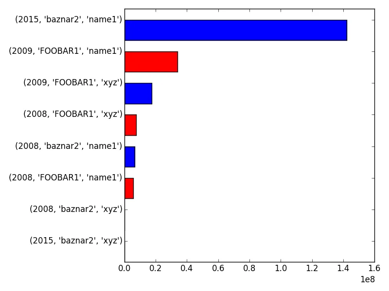
在Python的pandas中,我创建了一个数据框,每年有一个值和两个子类,即一个参数三元组的指标。
import pandas, requests, numpy
import matplotlib.pyplot as plt

df

       Metric    Tag_1  Tag_2  year
0     5770832  FOOBAR1  name1  2008
1     7526436  FOOBAR1    xyz  2008
2    33972652  FOOBAR1  name1  2009
3    17491416  FOOBAR1    xyz  2009
...
16    6602920  baznar2  name1  2008
17       6608  baznar2    xyz  2008
...
30  142102944  baznar2  name1  2015
31          0  baznar2    xyz  2015

我希望制作一个条形图,y轴的度量标准是基于x轴(年份、标签1、标签2),首先按年份排序,其次按标签1排序,并根据标签1对条形进行颜色着色。就像这样:

(2008,FOOBAR,name1)   --> 5770832  *RED*
(2008,baznar2,name1)  --> 6602920  *BLUE*
(2008,FOOBAR,xyz)     --> 7526436  *RED*
(2008,baznar2,xyz)    --> ...      *BLUE*
(2008,FOOBAR,name1)   --> ...      *RED*

我试着从一组列开始,例如

df.plot.bar(x=['year','tag_1','tag_2']

但是我还没有找到一种方法将选择项分成两个并列的条形图集。

如果我们能够通过复制和粘贴创建一个示例数据框,那么您更有可能得到答案。 - andrew
2个回答

1
这应该能帮助您上路:

df = pd.read_csv('path_to_file.csv')

# Group by the desired columns
new_df = df.groupby(['year', 'Tag_1', 'Tag_2']).sum()
# Sort descending
new_df.sort('Metric', inplace=True)


# Helper function for generation sequence of 'r' 'b' colors
def get_color(i):
    if i%2 == 0:
        return 'r'
    else:
        return 'b'

colors = [get_color(j) for j in range(new_df.shape[0])]

# Make the plot
fig, ax = plt.subplots()
ind = np.arange(new_df.shape[0])
width = 0.65
a = ax.barh(ind, new_df.Metric, width, color = colors) # plot a vals
ax.set_yticks(ind + width)  # position axis ticks
ax.set_yticklabels(new_df.index.values)  # set them to the names
fig.tight_layout()
plt.show()

enter image description here


1
您也可以这样做:

fig, ax = plt.subplots()
df.groupby(['year', 'Tag_1', 'Tag_2']).sum().plot.barh(color=['r','b'], ax=ax)
fig.tight_layout()
plt.show()

如果您不喜欢科学计数法,可以将其去除:

ax.get_xaxis().get_major_formatter().set_scientific(False)

enter image description here


网页内容由stack overflow 提供, 点击上面的
可以查看英文原文,
原文链接