Flutter - 改变OutlineInputBorder的边框颜色

84

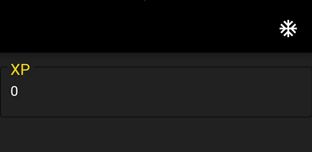
我正在尝试更改OutlineInputBorder的边框颜色,但尝试了无数种方法都失败了。

我通过buildDarkTheme()函数创建了整个主题配置,但无法将边框颜色更改为黄色。

以下是图片和代码:

输入图片说明

import 'package:flutter/material.dart';

void main() => runApp(new MyApp());

const kBlackHalf = const Color(0xFF212121);
const kBlackLight = const Color(0xFF484848);
const kBlack = const Color(0xFF000000);
const kYellow = const Color(0xFFffd600);
const kYellowLight = const Color(0xFFffff52);
const kYellowDark = const Color(0xFFc7a500);
const kWhite = Colors.white;

ThemeData buildDarkTheme() {
  final ThemeData base = ThemeData();
  return base.copyWith(
    primaryColor: kBlack,
    accentColor: kYellow,
    scaffoldBackgroundColor: kBlackHalf,
    primaryTextTheme: buildTextTheme(base.primaryTextTheme, kWhite),
    primaryIconTheme: base.iconTheme.copyWith(color: kWhite),
    buttonColor: kYellow,
    textTheme: buildTextTheme(base.textTheme, kWhite),    
    inputDecorationTheme: InputDecorationTheme(
      border: OutlineInputBorder(
        borderSide: BorderSide(color: kYellow)
      ),
      labelStyle: TextStyle(
        color: kYellow,
        fontSize: 24.0
      ),
    ),
  );
}

TextTheme buildTextTheme(TextTheme base, Color color) {
  return base.copyWith(
    body1: base.headline.copyWith(color: color, fontSize: 16.0),
    caption: base.headline.copyWith(color: color),
    display1: base.headline.copyWith(color: color),
    button: base.headline.copyWith(color: color),
    headline: base.headline.copyWith(color: color),
    title: base.title.copyWith(color: color),
  );
}

class MyApp extends StatelessWidget {
  @override
  Widget build(BuildContext context) {
    return new MaterialApp(
      theme: buildDarkTheme(),
      home: new HomePage(),
    );
  }
}

class HomePage extends StatefulWidget {
  @override
  _HomePageState createState() => new _HomePageState();
}

class _HomePageState extends State<HomePage> {
  String xp = '0';

  @override
  Widget build(BuildContext context) {
    return new Scaffold(
      appBar: new AppBar(
        actions: <Widget>[
          new IconButton(
            icon: Icon(Icons.ac_unit),
            onPressed: () {},
          )
        ],
      ),
      body: new Container(
        padding: new EdgeInsets.only(top: 16.0),
        child: new ListView(
          children: <Widget>[
            new InkWell(
              onTap: () {},
              child: new InputDecorator(
                decoration: new InputDecoration(          
                  labelText: 'XP',
                  border: OutlineInputBorder()
                ),
                child: new Row(
                  mainAxisAlignment: MainAxisAlignment.spaceBetween,
                  mainAxisSize: MainAxisSize.min,
                  children: <Widget>[
                    new Text(this.xp),
                  ],
                ),
              ),
            )
          ],
        ),
      )
    );
  }
}

更多参考资料:

无法更改TextField边框颜色

https://github.com/flutter/flutter/issues/17592


作为建议,我可能是错的,但这个边框颜色是基于你的主题主要颜色的,如果你的主要颜色是黑色,那么它将始终是黑色。因此,请尝试使用除了“OutlineInputBorder”之外的其他小部件。祝编码愉快! - Jani Devang
9个回答

111

从7月份开始,您现在可以使用 enabledBorder

new TextField(
  decoration: new InputDecoration(
    enabledBorder: const OutlineInputBorder(
      // width: 0.0 produces a thin "hairline" border
      borderSide: const BorderSide(color: Colors.grey, width: 0.0),
    ),
    border: const OutlineInputBorder(),
    labelStyle: new TextStyle(color: Colors.green),
    ...
  ),
)

查看 新装饰器的完整文档


6
没问题,这个有效,只设置边框并不能改变颜色和大小,但实际上它将其改为了圆角边框!这种奇怪的行为让我感到困惑! - Daniel
这个解决方案对我没有用。我正在使用Flutter 2.5版本。非常感谢。 - Kamlesh

48
这是解决所提到的问题的方法:如果用户没有点击文本框,则使用enabledBorder;如果用户点击了文本框,则使用focusedBorder。
 enabledBorder: OutlineInputBorder(
        borderRadius: BorderRadius.circular(25.0),
        borderSide:  BorderSide(color: Colors.pinkAccent),
      ),
 focusedBorder: OutlineInputBorder(
        borderRadius: BorderRadius.circular(25.0),
        borderSide:  BorderSide(color: Colors.pinkAccent),
      ),

focusedBorder 默认使用应用程序的主要颜色。 - markhorrocks

38

像这样将 hintColor 添加到您的主题中,它应该会更改 OutlineInputBorder 的颜色。

ThemeData buildDarkTheme() {
  final ThemeData base = ThemeData();
  return base.copyWith(
    primaryColor: kBlack,
    accentColor: kYellow,
    scaffoldBackgroundColor: kBlackHalf,
    primaryTextTheme: buildTextTheme(base.primaryTextTheme, kWhite),
    primaryIconTheme: base.iconTheme.copyWith(color: kWhite),
    buttonColor: kYellow,
    hintColor: YOUR_COLOR,
    textTheme: buildTextTheme(base.textTheme, kWhite),    
    inputDecorationTheme: InputDecorationTheme(
      border: OutlineInputBorder(),
      labelStyle: TextStyle(
        color: kYellow,
        fontSize: 24.0
      ),
    ),
  );
}

它还会改变提示文本。 - guillaumearnx

12

您只需要在InputDecoration中提供"enabledBorder"参数即可。

enabledBorder: OutlineInputBorder(
                borderSide: BorderSide(color: Colors.yellow),
              ),

5
这将会把按钮的轮廓颜色改为蓝色。
new OutlineButton(
   borderSide: BorderSide(color: Colors.blue),
) 

11
这个方案从未奏效,为什么还要建议使用它?你有测试过吗? - Axes Grinds

2

将你的TextField包裹在Theme小部件中。

Theme(
  data: Theme.of(context).copyWith(accentColor: Colors.white), // set color here
  child: TextField(),
)

1
只需更改 ThemeData 中的 hintColor 属性,就像这样:
Theme(
    data: ThemeData(
      primaryColor: kYellowDark,
      hintColor: kYellow,
    ),
    child: Material(....),
);

0
最具体且最容易回答原问题的答案是:
 Theme(
          data: Theme.of(context).copyWith(primaryColor: Colors.blue),
          child: TextField(
            decoration: InputDecoration(
                border: OutlineInputBorder(), labelText: 'Some Label'),
          ),
        ),

主要颜色定义了 OutlineInputBorder 小部件的边框颜色。只需使用 Theme 小部件包装您的 TextField 并覆盖主要颜色即可。


0

要更改卡片的边框颜色,请使用以下代码

new Card(
      shape: const RoundedRectangleBorder(
        side: BorderSide(color: Colors.blue),
        borderRadius: BorderRadius.all(Radius.circular(15.0)),
      ),
      child: Container(new Text("Text in a card"))

网页内容由stack overflow 提供, 点击上面的
可以查看英文原文,
原文链接