更改primaryColor和primaryColorDark的代码不会更改边框的初始颜色,只有在点击后颜色才会变为黑色。
必须更改的属性是hintColor。
BorderSide不能用于此操作,需要更改主题。
要使红色成为默认颜色,请将主题放置在MaterialApp(theme: ...)中。要更改特定小部件的主题(例如将默认的红色更改为该小部件的黄色),请在小部件周围使用:
new Theme(
  data: new ThemeData(
    hintColor: Colors.yellow
  ),
  child: ...
)
以下是代码和 GIF:
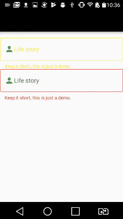
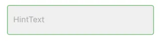
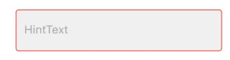
请注意,如果我们将 primaryColor 颜色定义为黑色,则点击小部件时它会以黑色选择
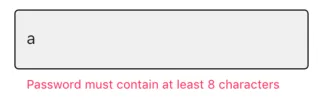
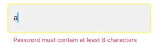
但是要更改小部件内部的标签和文本,我们需要将主题设置为 InputDecorationTheme
从黄色开始的小部件具有自己的主题,而从红色开始的小部件具有使用函数 buildTheme() 定义的默认主题
import 'package:flutter/material.dart';
void main() => runApp(new MyApp());
ThemeData buildTheme() {
final ThemeData base = ThemeData();
return base.copyWith(
hintColor: Colors.red,
primaryColor: Colors.black,
inputDecorationTheme: InputDecorationTheme(
hintStyle: TextStyle(
color: Colors.blue,
),
labelStyle: TextStyle(
color: Colors.green,
),
),
);
}
class MyApp extends StatelessWidget {
@override
Widget build(BuildContext context) {
return new MaterialApp(
theme: buildTheme(),
home: new HomePage(),
);
}
}
class HomePage extends StatefulWidget {
@override
_HomePageState createState() => new _HomePageState();
}
class _HomePageState extends State<HomePage> {
String xp = '0';
@override
Widget build(BuildContext context) {
return new Scaffold(
appBar: new AppBar(),
body: new Container(
padding: new EdgeInsets.only(top: 16.0),
child: new ListView(
children: <Widget>[
new InkWell(
onTap: () {},
child: new Theme(
data: new ThemeData(
hintColor: Colors.yellow
),
child: new TextField(
decoration: new InputDecoration(
border: new OutlineInputBorder(),
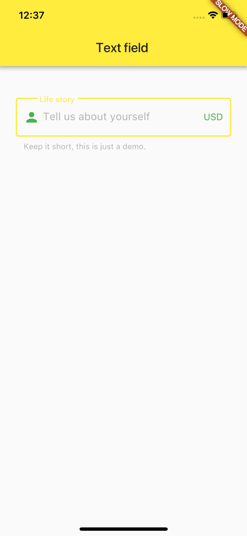
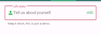
hintText: 'Tell us about yourself',
helperText: 'Keep it short, this is just a demo.',
labelText: 'Life story',
prefixIcon: const Icon(Icons.person, color: Colors.green,),
prefixText: ' ',
suffixText: 'USD',
suffixStyle: const TextStyle(color: Colors.green)),
)
)
),
new InkWell(
onTap: () {},
child: new TextField(
decoration: new InputDecoration(
border: new OutlineInputBorder(
borderSide: new BorderSide(color: Colors.teal)
),
hintText: 'Tell us about yourself',
helperText: 'Keep it short, this is just a demo.',
labelText: 'Life story',
prefixIcon: const Icon(Icons.person, color: Colors.green,),
prefixText: ' ',
suffixText: 'USD',
suffixStyle: const TextStyle(color: Colors.green)),
)
)
],
),
)
);
}
}
var outlineInputBorder = OutlineInputBorder( borderSide: BorderSide(color: Colors.black87, width: 1.5)); var outlineInputBorder2 = OutlineInputBorder( borderSide: BorderSide(color: Colors.indigoAccent,width: 2), ); =======> child: TextFormField(decoration: InputDecoration( focusedBorder: outlineInputBorder2, enabledBorder: outlineInputBorder, border: OutlineInputBorder( borderSide: BorderSide(color: Colors.deepPurple)), hintText: '信息',),)- lava