如何使matplotlib图表看起来像专业人士制作的一样?

21

默认的matplotlib图形看起来非常不吸引人甚至不够专业。我尝试了一些包,包括seaborn和prettyplotlib,但两者都仅仅改进了样式。

到目前为止,使用seaborn包,我已经做到了以下这些:

enter image description here

下面是我想要的外观,与上面相差甚远:

enter image description here

请注意第二个示例中的以下美观之处:

  1. 图形下方填充了更加令人愉悦的颜色。
  2. 图形线条更粗,更加突出。
  3. 轴线更粗,同样很显眼。
  4. 曲线下的区域是透明的。
  5. X轴刻度线更密集。

我的问题是:您是否将上述内容识别为可以快速在matplotlib中使用的某种流行主题或样式?或者我可以从某个包中使用吗?如果失败,是否有任何方法将此样式设置为我的全局首选项?如果失败,是否可能在matlibplot中实现这一点?

谢谢!


13
我不会称呼最底下那个是专业制作的。看起来像是从 Excel 中导出的东西。 - tacaswell
1
雇用(或成为)一名平面设计师。 - TylerH
请尝试访问https://seaborn.pydata.org。 - 11t
4个回答

29

这实际上是个品味问题,也是针对受众的问题。 matplotlib 试图为科学目的制作清晰的插图。这是必然的妥协,这些插图不适合在杂志上打印或在广告中展示。

关于这一点,matplotlib 有好消息和坏消息。

坏消息:

  • 没有单一神奇的命令或软件包可以使用 matplotlib 创建美丽的图形。

好消息:

  • 有简单的方法可以更改默认设置,请参见:http://matplotlib.org/users/customizing.html
  • 对象模型使用户能够更改几乎所有内容并引入复杂的新功能。
  • 源代码可用,并且用户甚至可以比较容易地进行更改。

在我看来,最困难的事情是决定你想要什么。然后做你想做的事情会更容易,尽管一开始可能需要花费一些时间学习。
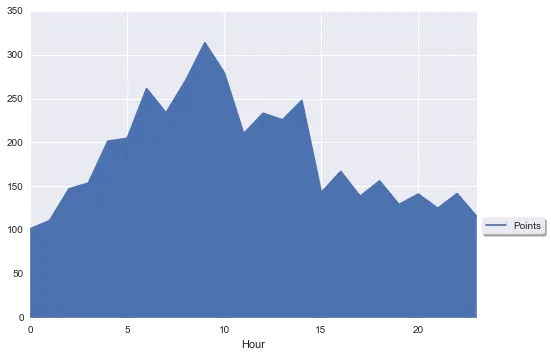
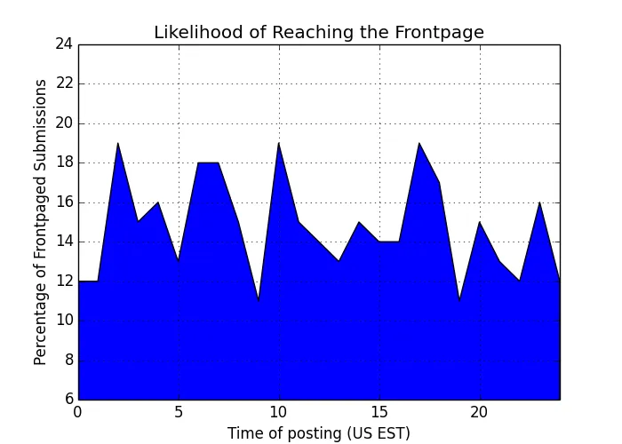
只是一个例子:

import numpy as np
import matplotlib.pyplot as plt


# create some fictive access data by hour
xdata = np.arange(25)
ydata = np.random.randint(10, 20, 25)
ydata[24] = ydata[0]

# let us make a simple graph
fig = plt.figure(figsize=[7,5])
ax = plt.subplot(111)
l = ax.fill_between(xdata, ydata)

# set the basic properties
ax.set_xlabel('Time of posting (US EST)')
ax.set_ylabel('Percentage of Frontpaged Submissions')
ax.set_title('Likelihood of Reaching the Frontpage')

# set the limits
ax.set_xlim(0, 24)
ax.set_ylim(6, 24)

# set the grid on
ax.grid('on')

(仅供参考:原始图像中的X轴限制没有考虑数据的周期性。)

这将给我们带来类似于这样的东西:

enter image description here

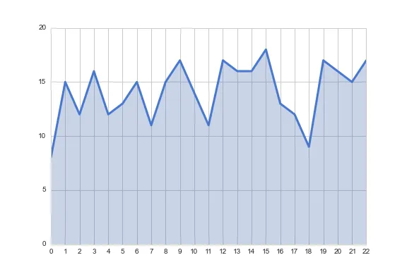
很容易理解,为了向非工程背景的观众展示这个图表,我们需要做很多改变,至少包括:

  • 使填充透明并且颜色不那么刺眼
  • 增加线条粗度
  • 更改线条颜色
  • 在X轴上添加更多刻度
  • 更改标题的字体

# change the fill into a blueish color with opacity .3
l.set_facecolors([[.5,.5,.8,.3]])

# change the edge color (bluish and transparentish) and thickness
l.set_edgecolors([[0, 0, .5, .3]])
l.set_linewidths([3])

# add more ticks
ax.set_xticks(np.arange(25))
# remove tick marks
ax.xaxis.set_tick_params(size=0)
ax.yaxis.set_tick_params(size=0)

# change the color of the top and right spines to opaque gray
ax.spines['right'].set_color((.8,.8,.8))
ax.spines['top'].set_color((.8,.8,.8))

# tweak the axis labels
xlab = ax.xaxis.get_label()
ylab = ax.yaxis.get_label()

xlab.set_style('italic')
xlab.set_size(10)
ylab.set_style('italic')
ylab.set_size(10)

# tweak the title
ttl = ax.title
ttl.set_weight('bold')

现在我们有:

enter image description here

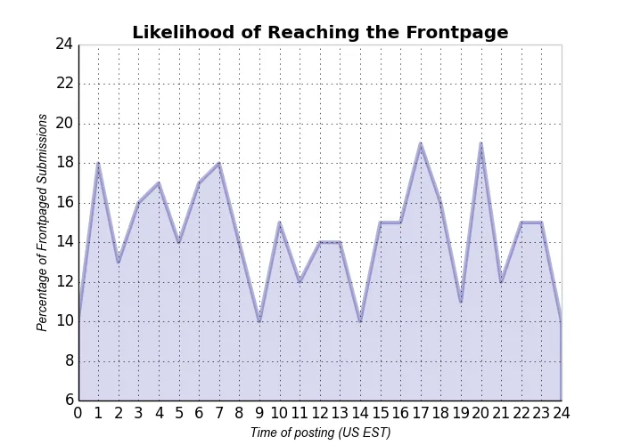
这与问题中的情况不完全一样,但是可以将所有内容调整到该方向。这里设置的许多内容都可以设置为matplotlib的默认值。也许这可以给出如何在图表中更改内容的想法。


谢谢。有没有办法使盒子的顶部和右侧边缘像示例中一样变灰? - Shital Shah
2
@ShitalShah:在这里,看代码。关键字是“spine”(可能有点难猜)。 - DrV
1
这个答案在某种程度上已经过时了,特别是“坏消息”部分,因为自那以后matplotlib引入了样式。请参阅官方matplotlib文档有关绘图自定义的内容 - fabianegli

15

要更接近您喜欢的样式,您可以在seaborn中使用whitegrid样式。正如其他答案所指出的那样,您可以通过alpha参数控制填充的透明度到fill_between

import numpy as np
import seaborn as sns
import matplotlib.pyplot as plt
sns.set_style("whitegrid")

blue, = sns.color_palette("muted", 1)

x = np.arange(23)
y = np.random.randint(8, 20, 23)

fig, ax = plt.subplots()
ax.plot(x, y, color=blue, lw=3)
ax.fill_between(x, 0, y, alpha=.3)
ax.set(xlim=(0, len(x) - 1), ylim=(0, None), xticks=x)

enter image description here

有关seaborn样式的更多信息,请参阅文档


5
matplotlib是非常灵活的,几乎可以做任何事情,如果没有现成的功能,您也可以自己编写!显然,默认设置很单调,这是因为每个人都有自己的"好看"的想法,所以强加一个预定义的样式是毫无意义的。
下面是一个非常简单的例子,涉及到您提出的4个问题。
import matplotlib.pyplot as plt
import numpy as np
from matplotlib.ticker import MultipleLocator, FormatStrFormatter

x = np.linspace(-10, 10, 1000)
y = 1+np.sinc(x)

ax = plt.subplot(111)
ax.plot(x, y, lw=2)
ax.fill_between(x, 0, y, alpha=0.2)
ax.grid()

majorLocator   = MultipleLocator(1)
ax.xaxis.set_major_locator(majorLocator)

plt.show()

enter image description here

如果您想设置默认值,使所有绘图看起来都一样,那么您应该生成自定义的matplotlibrc文件或使用style。这里有一个有用的指南。要查看所有可用选项的列表,只需从交互式终端调用print plt.rcParams即可。

其他一些功能,例如填充,需要在每个绘图中进行。您可以通过创建一个函数来标准化这些操作,该函数将根据给定的输入(例如轴实例和数据)添加填充。


3
您可以按照以下方式自定义绘图样式:
import numpy as np
import matplotlib.pyplot as plt
plt.use_style('ggplot') # customize your plots style
x = np.linspace(0,2*np.pi,100)
y = np.sin(x)
plt.fill_between(x,y)
plt.show()

网页内容由stack overflow 提供, 点击上面的
可以查看英文原文,
原文链接