我想让我的ImageView中的任何图像都带有圆形边框。
我搜索了但没有找到有用的信息(任何我尝试的方法都不起作用)。
如何通过XML实现这一点:
创建一个具有特定src的ImageView并使其成为圆形边框?
我想让我的ImageView中的任何图像都带有圆形边框。
我搜索了但没有找到有用的信息(任何我尝试的方法都不起作用)。
如何通过XML实现这一点:
创建一个具有特定src的ImageView并使其成为圆形边框?
实际上,您可以使用Google提供的支持库RoundedBitmapDrawableFactory类(这里和这里),而不是使用第三方库:
Gradle:
implementation 'androidx.appcompat:appcompat:1.0.0-beta01'
MainActivity.kt
class MainActivity : AppCompatActivity() {

    override fun onCreate(savedInstanceState: Bundle?) {
        super.onCreate(savedInstanceState)
        setContentView(R.layout.activity_main)
        val originalDrawable = ContextCompat.getDrawable(this, R.drawable.avatar_1)!!
        val bitmap = convertDrawableToBitmap(originalDrawable)
        val drawable = RoundedBitmapDrawableFactory.create(resources, bitmap)
        drawable.setAntiAlias(true)
        drawable.cornerRadius = Math.max(bitmap.width, bitmap.height) / 2.0f
        avatarImageView.setImageDrawable(drawable)
    }

    companion object {
        @JvmStatic
        fun convertDrawableToBitmap(drawable: Drawable): Bitmap {
            if (drawable is BitmapDrawable)
                return drawable.bitmap
            // We ask for the bounds if they have been set as they would be most
            // correct, then we check we are  > 0
            val bounds = drawable.bounds
            val width = if (!bounds.isEmpty) bounds.width() else drawable.intrinsicWidth
            val height = if (!bounds.isEmpty) bounds.height() else drawable.intrinsicHeight
            // Now we check we are > 0
            val bitmap = Bitmap.createBitmap(if (width <= 0) 1 else width, if (height <= 0) 1 else height,
                    Bitmap.Config.ARGB_8888)
            val canvas = Canvas(bitmap)
            drawable.setBounds(0, 0, canvas.width, canvas.height)
            drawable.draw(canvas)
            return bitmap
        }
    }
}
res/layout/activity_main.xml
<FrameLayout
    xmlns:android="http://schemas.android.com/apk/res/android" xmlns:app="http://schemas.android.com/apk/res-auto"
    xmlns:tools="http://schemas.android.com/tools" android:layout_width="match_parent"
    android:layout_height="match_parent" tools:context=".MainActivity">

    <androidx.appcompat.widget.AppCompatImageView
        android:id="@+id/avatarImageView" android:layout_width="100dp" android:layout_height="100dp"
        android:layout_gravity="center"/>

</FrameLayout>
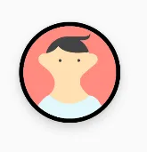
res/drawable/avatar_1.xml
<vector xmlns:android="http://schemas.android.com/apk/res/android" android:width="128dp" android:height="128dp"
        android:viewportHeight="128.0" android:viewportWidth="128.0">
    <path
        android:fillColor="#FF8A80" android:pathData="M0 0h128v128h-128z"/>
    <path
        android:fillColor="#FFE0B2"
        android:pathData="M36.3 94.8c6.4 7.3 16.2 12.1 27.3 12.4 10.7,-.3 20.3,-4.7 26.7,-11.6l.2.1c-17,-13.3,-12.9,-23.4,-8.5,-28.6 1.3,-1.2 2.8,-2.5 4.4,-3.9l13.1,-11c1.5,-1.2 2.6,-3 2.9,-5.1.6,-4.4,-2.5,-8.4,-6.9,-9.1,-1.5,-.2,-3 0,-4.3.6,-.3,-1.3,-.4,-2.7,-1.6,-3.5,-1.4,-.9,-2.8,-1.7,-4.2,-2.5,-7.1,-3.9,-14.9,-6.6,-23,-7.9,-5.4,-.9,-11,-1.2,-16.1.7,-3.3 1.2,-6.1 3.2,-8.7 5.6,-1.3 1.2,-2.5 2.4,-3.7 3.7l-1.8 1.9c-.3.3,-.5.6,-.8.8,-.1.1,-.2 0,-.4.2.1.2.1.5.1.6,-1,-.3,-2.1,-.4,-3.2,-.2,-4.4.6,-7.5 4.7,-6.9 9.1.3 2.1 1.3 3.8 2.8 5.1l11 9.3c1.8 1.5 3.3 3.8 4.6 5.7 1.5 2.3 2.8 4.9 3.5 7.6 1.7 6.8,-.8 13.4,-5.4 18.4,-.5.6,-1.1 1,-1.4 1.7,-.2.6,-.4 1.3,-.6 2,-.4 1.5,-.5 3.1,-.3 4.6.4 3.1 1.8 6.1 4.1 8.2 3.3 3 8 4 12.4 4.5 5.2.6 10.5.7 15.7.2 4.5,-.4 9.1,-1.2 13,-3.4 5.6,-3.1 9.6,-8.9 10.5,-15.2m-14.4,-49.8c.9 0 1.6.7 1.6 1.6 0 .9,-.7 1.6,-1.6 1.6,-.9 0,-1.6,-.7,-1.6,-1.6,-.1,-.9.7,-1.6 1.6,-1.6zm-25.7 0c.9 0 1.6.7 1.6 1.6 0 .9,-.7 1.6,-1.6 1.6,-.9 0,-1.6,-.7,-1.6,-1.6,-.1,-.9.7,-1.6 1.6,-1.6z"/>
    <path
        android:fillColor="#E0F7FA"
        android:pathData="M105.3 106.1c-.9,-1.3,-1.3,-1.9,-1.3,-1.9l-.2,-.3c-.6,-.9,-1.2,-1.7,-1.9,-2.4,-3.2,-3.5,-7.3,-5.4,-11.4,-5.7 0 0 .1 0 .1.1l-.2,-.1c-6.4 6.9,-16 11.3,-26.7 11.6,-11.2,-.3,-21.1,-5.1,-27.5,-12.6,-.1.2,-.2.4,-.2.5,-3.1.9,-6 2.7,-8.4 5.4l-.2.2s-.5.6,-1.5 1.7c-.9 1.1,-2.2 2.6,-3.7 4.5,-3.1 3.9,-7.2 9.5,-11.7 16.6,-.9 1.4,-1.7 2.8,-2.6 4.3h109.6c-3.4,-7.1,-6.5,-12.8,-8.9,-16.9,-1.5,-2.2,-2.6,-3.8,-3.3,-5z"/>
    <path
        android:fillColor="#444" android:pathData="M76.3,47.5 m-2.0, 0 a 2.0,2.0 0 1,1 4.0,0 a2.0,2.0 0 1,1 -4.0,0"/>
    <path
        android:fillColor="#444" android:pathData="M50.7,47.6 m-2.0, 0 a 2.0,2.0 0 1,1 4.0,0 a2.0,2.0 0 1,1 -4.0,0"/>
    <path
        android:fillColor="#444"
        android:pathData="M48.1 27.4c4.5 5.9 15.5 12.1 42.4 8.4,-2.2,-6.9,-6.8,-12.6,-12.6,-16.4 17.2 1.5 14.1,-9.4 14.1,-9.4,-1.4 5.5,-11.1 4.4,-11.1 4.4h-18.8c-1.7,-.1,-3.4 0,-5.2.3,-12.8 1.8,-22.6 11.1,-25.7 22.9 10.6,-1.9 15.3,-7.6 16.9,-10.2z"/>
</vector>
结果:

假设你想在它的顶部添加一个边框,你可以使用以下代码:
stroke_drawable.xml
<shape xmlns:android="http://schemas.android.com/apk/res/android" android:shape="oval">
    <stroke
        android:width="4dp" android:color="@android:color/black"/>
</shape>
android:foreground="@drawable/stroke_drawable"添加到ImageView中,你就可以得到这个效果:

我不确定如何添加阴影(适用于较旧的Android版本)。尽管使用FloatingActionButton(来自"com.google.android.material:material"依赖), 但是我无法使位图填充FAB本身。如果它能正常工作,那么使用它可能会更好。
编辑:如果您希望添加高程阴影(从API 21可用),您可以稍微更改我所写的内容:
在布局XML文件中:
<androidx.appcompat.widget.AppCompatImageView android:padding="4dp"
    android:id="@+id/avatarImageView" android:layout_width="100dp" android:layout_height="100dp" android:elevation="8dp"
    android:layout_gravity="center" android:background="@drawable/stroke_drawable" tools:srcCompat="@drawable/avatar_1"/>
CircularShadowViewOutlineProvider.kt
@TargetApi(Build.VERSION_CODES.LOLLIPOP)
class CircularShadowViewOutlineProvider : ViewOutlineProvider() {
    override fun getOutline(view: View, outline: Outline) {
        val size = Math.max(view.width, view.height)
        outline.setRoundRect(0, 0, size, size, size / 2f)
    }
}
在代码中:
    if (Build.VERSION.SDK_INT >= Build.VERSION_CODES.LOLLIPOP)
        avatarImageView.outlineProvider = CircularShadowViewOutlineProvider()
结果:
试一试。
public class RoundedImageView extends android.support.v7.widget.AppCompatImageView {

    private int borderWidth = 4;
    private int viewWidth;
    private int viewHeight;
    private Bitmap image;
    private Paint paint;
    private Paint paintBorder;
    private BitmapShader shader;

    public RoundedImageView(Context context)
    {
        super(context);
        setup();
    }

    public RoundedImageView(Context context, AttributeSet attrs)
    {
        super(context, attrs);
        setup();
    }

    public RoundedImageView(Context context, AttributeSet attrs, int defStyle)
    {
        super(context, attrs, defStyle);
        setup();
    }

    private void setup()
    {
        paint = new Paint();
        paint.setAntiAlias(true);

        paintBorder = new Paint();
        setBorderColor(Color.WHITE);
        paintBorder.setAntiAlias(true);
        this.setLayerType(LAYER_TYPE_SOFTWARE, paintBorder);

        paintBorder.setShadowLayer(4.0f, 0.0f, 2.0f, Color.WHITE);
    }

    public void setBorderWidth(int borderWidth)
    {
        this.borderWidth = borderWidth;
        this.invalidate();
    }

    public void setBorderColor(int borderColor)
    {
        if (paintBorder != null)
            paintBorder.setColor(borderColor);

        this.invalidate();
    }

    private void loadBitmap()
    {
        BitmapDrawable bitmapDrawable = (BitmapDrawable) this.getDrawable();

        if (bitmapDrawable != null)
            image = bitmapDrawable.getBitmap();
    }

    @SuppressLint("DrawAllocation")
    @Override
    public void onDraw(Canvas canvas)
    {
        loadBitmap();

        if (image != null)
        {
            shader = new BitmapShader(Bitmap.createScaledBitmap(image, canvas.getWidth(), canvas.getHeight(), false), Shader.TileMode.CLAMP, Shader.TileMode.CLAMP);
            paint.setShader(shader);
            int circleCenter = viewWidth / 2;
            canvas.drawCircle(circleCenter + borderWidth, circleCenter + borderWidth, circleCenter + borderWidth - 4.0f, paintBorder);
            canvas.drawCircle(circleCenter + borderWidth, circleCenter + borderWidth, circleCenter - 4.0f, paint);
        }
    }

    @Override
    protected void onMeasure(int widthMeasureSpec, int heightMeasureSpec)
    {
        int width = measureWidth(widthMeasureSpec);
        int height = measureHeight(heightMeasureSpec, widthMeasureSpec);

        viewWidth = width - (borderWidth * 2);
        viewHeight = height - (borderWidth * 2);

        setMeasuredDimension(width, height);
    }

    private int measureWidth(int measureSpec)
    {
        int result = 0;
        int specMode = MeasureSpec.getMode(measureSpec);
        int specSize = MeasureSpec.getSize(measureSpec);

        if (specMode == MeasureSpec.EXACTLY)
        {
            result = specSize;
        }
        else
        {
            // Measure the text
            result = viewWidth;
        }

        return result;
    }

    private int measureHeight(int measureSpecHeight, int measureSpecWidth)
    {
        int result = 0;
        int specMode = MeasureSpec.getMode(measureSpecHeight);
        int specSize = MeasureSpec.getSize(measureSpecHeight);

        if (specMode == MeasureSpec.EXACTLY)
        {
            result = specSize;
        }
        else
        {
            result = viewHeight;
        }

        return (result + 2);
     }
 }
然后在布局中使用这个 ImageView:
<com.app.Demo.RoundedImageView
     android:id="@+id/iv_profileImage"
     android:layout_width="70dp"
     android:layout_height="70dp"
     android:layout_centerHorizontal="true"
    />
这个类是自定义的圆形ImageView,带有阴影、描边和饱和度功能。使用这个自定义的圆形ImageView,你可以将你的图片变成圆形,并设置半径。小伙子们,对于圆形阴影ImageView,不需要Github,只需要这个类就足够了。
将CircularImageView添加到你的布局中
CircularImageView c=new CircularImageView(this,screen width,screen height,Bitmap myimage);
yourLayout.addView(c);**


public class CircularImageView extends android.support.v7.widget.AppCompatImageView
{
    private final Context context;
    private final int width, height;
    private final Paint paint;
    private final Paint paintBorder,imagePaint;
    private final Bitmap bitmap2;
    private final Paint paint3;
    private Bitmap bitmap;
    private BitmapShader shader;
    private float radius = 4.0f;
    float x = 0.0f;
    float y = 8.0f;
    private float stroke;
    private float strokeWidth = 0.0f;
    private Bitmap bitmap3;
    private int corner_radius=50;


    public CircularImageView(Context context, int width, int height, Bitmap bitmap)     {
        super(context);
        this.context = context;
        this.width = width;
        this.height = height;

   //here "bitmap" is the square shape(width* width) scaled bitmap ..

        this.bitmap = bitmap;


        paint = new Paint(Paint.ANTI_ALIAS_FLAG);
        paint.setAntiAlias(true);
        paint.setFilterBitmap(true);
        paint.setDither(true);


        paint3=new Paint();
        paint3.setStyle(Paint.Style.STROKE);
        paint3.setColor(Color.WHITE);
        paint3.setAntiAlias(true);

        paintBorder = new Paint();
        imagePaint= new Paint();

        paintBorder.setColor(Color.WHITE);
        paintBorder.setAntiAlias(true);
        this.setLayerType(LAYER_TYPE_SOFTWARE, paintBorder);


        this.bitmap2 = Bitmap.createScaledBitmap(bitmap, (bitmap.getWidth() - 40), (bitmap.getHeight() - 40), true);


        imagePaint.setAntiAlias(true);


        invalidate();
    }

    @Override
    protected void onDraw(Canvas canvas)
    {
        super.onDraw(canvas);
        Shader b;
         if (bitmap3 != null)
            b = new BitmapShader(bitmap3, Shader.TileMode.CLAMP, Shader.TileMode.CLAMP);
         else
            b = new BitmapShader(bitmap2, Shader.TileMode.CLAMP, Shader.TileMode.CLAMP);
        imagePaint.setShader(b);
        canvas.drawBitmap(maskedBitmap(), 20, 20, null);
    }

    private Bitmap maskedBitmap()
    {
        Bitmap l1 = Bitmap.createBitmap(width,width, Bitmap.Config.ARGB_8888);
        Canvas canvas = new Canvas(l1);
        paintBorder.setShadowLayer(radius, x, y, Color.parseColor("#454645"));
        paint.setXfermode(new PorterDuffXfermode(PorterDuff.Mode.SRC_IN));
        final RectF rect = new RectF();
        rect.set(20, 20, bitmap2.getWidth(), bitmap2.getHeight());

        canvas.drawRoundRect(rect, corner_radius, corner_radius, paintBorder);

        canvas.drawRoundRect(rect, corner_radius, corner_radius, imagePaint);

        if (strokeWidth!=0.0f)
        {
            paint3.setStrokeWidth(strokeWidth);
            canvas.drawRoundRect(rect, corner_radius, corner_radius, paint3);
        }

         paint.setXfermode(null);
        return l1;
    }


     // use seekbar here, here you have to pass  "0 -- 250"  here corner radius will change

    public void setCornerRadius(int corner_radius)
    {
        this.corner_radius = corner_radius;
        invalidate();
    }


    -------->use seekbar here, here you have to pass  "0 -- 10.0f"  here shadow radius will change

    public void setShadow(float radius)
    {
        this.radius = radius;
        invalidate();
    }

   // use seekbar here, here you have to pass  "0 -- 10.0f"  here stroke size  will change

    public void setStroke(float stroke)
    {
        this.strokeWidth = stroke;
        invalidate();
    }

    private Bitmap updateSat(Bitmap src, float settingSat)
    {

        int w = src.getWidth();
        int h = src.getHeight();

        Bitmap bitmapResult =
                Bitmap.createBitmap(w, h, Bitmap.Config.ARGB_8888);
        Canvas canvasResult = new Canvas(bitmapResult);
        Paint paint = new Paint();
        ColorMatrix colorMatrix = new ColorMatrix();
        colorMatrix.setSaturation(settingSat);
        ColorMatrixColorFilter filter = new ColorMatrixColorFilter(colorMatrix);
        paint.setColorFilter(filter);
        canvasResult.drawBitmap(src, 0, 0, paint);

        return bitmapResult;
    }


  // use seekbar here, here you have to pass  "0 -- 2.0f"  here saturation  will change

    public void setSaturation(float sat)
    {
        System.out.println("qqqqqqqqqq            "+sat);
        bitmap3=updateSat(bitmap2, sat);

        invalidate();
    }


}


        // Seekbar to change radius

                  radius_seekbar.setOnSeekBarChangeListener(new SeekBar.OnSeekBarChangeListener() {
                        @Override
                        public void onProgressChanged(SeekBar seekBar, int progress, boolean fromUser)
                        {
                            text_radius.setText(""+progress);
                            circularImageView.setCornerRadius(progress);
                        }

                        @Override
                        public void onStartTrackingTouch(SeekBar seekBar) {

                        }

                        @Override
                        public void onStopTrackingTouch(SeekBar seekBar) {

                        }
                    });


     // Seekbar to change shadow

                    shadow_seekbar.setOnSeekBarChangeListener(new SeekBar.OnSeekBarChangeListener() {
                        @Override
                        public void onProgressChanged(SeekBar seekBar, int progress, boolean fromUser)
                        {
                            float f= 4+progress/10.0f;
                            text_shadow.setText(""+progress);
                            circularImageView.setShadow(f);
                        }

                        @Override
                        public void onStartTrackingTouch(SeekBar seekBar) {

                        }

                        @Override
                        public void onStopTrackingTouch(SeekBar seekBar) {

                        }
                    });


           // Seekbar to change saturation

                    saturation_seekbar.setOnSeekBarChangeListener(new SeekBar.OnSeekBarChangeListener() {
                        @Override
                        public void onProgressChanged(SeekBar seekBar, int progress, boolean fromUser)
                        {
                            int progressSat = saturation_seekbar.getProgress();
                            float sat = (float) ((progressSat*4 / 100.0f)-1.0f);
                            circularImageView.setSaturation(sat);

                            text_saturation.setText(""+progressSat);
                        }

                        @Override
                        public void onStartTrackingTouch(SeekBar seekBar) {

                        }

                        @Override
                        public void onStopTrackingTouch(SeekBar seekBar) {

                        }
                    });


    // Seekbar to change stroke

                    stroke_seekbar.setOnSeekBarChangeListener(new SeekBar.OnSeekBarChangeListener() {
                        @Override
                        public void onProgressChanged(SeekBar seekBar, int progress, boolean fromUser)
                        {
                            if (progress==0)
                            {
                                float f=(progress*10.0f/100.0f);
                                circularImageView.setStroke(f);
                            }
                            else
                            {
                                float f=(progress*10.0f/100.0f);
                                circularImageView.setStroke(f);
                            }

                            text_stroke.setText(""+progress);
                        }

                        @Override
                        public void onStartTrackingTouch(SeekBar seekBar) {

                        }

                        @Override
                        public void onStopTrackingTouch(SeekBar seekBar) {

                        }
                    });


             //radius seekbar in xml file

             <SeekBar
                android:layout_width="match_parent"
                android:layout_gravity="center"
                android:progress="50"
                android:max="250"
                android:id="@+id/radius_seekbar"
                android:layout_height="wrap_content" />


          //saturation seekbar in xml file

             <SeekBar
                android:layout_width="match_parent"
                android:layout_gravity="center"
                android:progress="50"
                android:max="100"
                android:id="@+id/saturation_seekbar"
                android:layout_height="wrap_content" />


    //shadow seekbar in xml file

             <SeekBar
                android:layout_width="match_parent"
                android:layout_gravity="center"
                android:progress="0"
                android:max="100"
                android:id="@+id/shadow_seekbar"
                android:layout_height="wrap_content" />


         //stroke seekbar in xml file

             <SeekBar
                android:layout_width="match_parent"
                android:layout_gravity="center"
                android:progress="0"
                android:max="100"
                android:id="@+id/stroke _seekbar"
                android:layout_height="wrap_content" />
<ImageView
        android:layout_width="100dp"
        android:layout_height="100dp"
        android:src="@mipmap/img_round"/>
你的预览可能仍然显示为矩形图像。但是如果在你的设备上运行应用程序,它将会是圆形的。
public static Bitmap getCircularBitmap(Bitmap bitmap) {
        Bitmap output;

        if (bitmap.getWidth() > bitmap.getHeight()) {
            output = Bitmap.createBitmap(bitmap.getHeight(), bitmap.getHeight(), Bitmap.Config.ARGB_8888);
        } else {
            output = Bitmap.createBitmap(bitmap.getWidth(), bitmap.getWidth(), Bitmap.Config.ARGB_8888);
        }

        Canvas canvas = new Canvas(output);

        final int color = 0xff424242;
        final Paint paint = new Paint();
        final Rect rect = new Rect(0, 0, bitmap.getWidth(), bitmap.getHeight());

        float r = 0;

        if (bitmap.getWidth() > bitmap.getHeight()) {
            r = bitmap.getHeight() / 2;
        } else {
            r = bitmap.getWidth() / 2;
        }

        paint.setAntiAlias(true);
        canvas.drawARGB(0, 0, 0, 0);
        paint.setColor(color);
        canvas.drawCircle(r, r, r, paint);
        paint.setXfermode(new PorterDuffXfermode(PorterDuff.Mode.SRC_IN));
        canvas.drawBitmap(bitmap, rect, rect, paint);
        return output;
    }
if you want to set edit icon on to circle imageview than put this below code.

 <FrameLayout
                android:layout_width="@dimen/_100sdp"
                android:layout_height="@dimen/_100sdp"
                android:layout_gravity="center"
                android:layout_marginTop="10dp">

                <de.hdodenhof.circleimageview.CircleImageView
                    android:id="@+id/profilePic"
                    android:layout_width="@dimen/_100sdp"
                    android:layout_height="@dimen/_100sdp"
                    android:layout_gravity="bottom|center_horizontal"
                    android:src="@drawable/ic_upload" />

                <de.hdodenhof.circleimageview.CircleImageView
                    android:id="@+id/iv_camera"
                    android:layout_width="@dimen/_30sdp"
                    android:layout_height="@dimen/_30sdp"
                    android:layout_gravity="top|right"
                    android:src="@drawable/edit"/>
            </FrameLayout>
onDraw()方法,如下所示:@Override
protected void onDraw(Canvas canvas) {
float radius = this.getHeight()/2;
Path path = new Path();
RectF rect = new RectF(0, 0, this.getWidth(), this.getHeight());
path.addRoundRect(rect, radius, radius, Path.Direction.CW);
canvas.clipPath(path);
super.onDraw(canvas);
}
如果您也需要自定义小部件的代码:
CircularImageView.java
import android.content.Context;
import android.content.res.TypedArray;
import android.graphics.Canvas;
import android.graphics.Path;
import android.graphics.RectF;
import android.graphics.drawable.Drawable;
import android.util.AttributeSet;
import android.widget.ImageView;
import androidx.annotation.Nullable;
public class CircularImageView extends ImageView {
private Drawable image;
public CircularImageView(Context context) {
super(context);
init(null, 0);
}
public CircularImageView(Context context, @Nullable AttributeSet attrs) {
super(context, attrs);
init(attrs, 0);
}
public CircularImageView(Context context, @Nullable AttributeSet attrs, int defStyleAttr) {
super(context, attrs, defStyleAttr);
init(attrs, defStyleAttr);
}
@Override
protected void onDraw(Canvas canvas) {

    float radius = this.getHeight()/2;
    Path path = new Path();
    RectF rect = new RectF(0, 0, this.getWidth(), this.getHeight());
    path.addRoundRect(rect, radius, radius, Path.Direction.CW);
    canvas.clipPath(path);
    super.onDraw(canvas);

}
private void init(AttributeSet attrs, int defStyle) {
TypedArray a = Utils.CONTEXT.getTheme().obtainStyledAttributes(attrs, R.styleable.CircularImageView, 0, 0);
try {
image = a.getDrawable(R.styleable.CircularImageView_src);
} finally {
a.recycle();
}
this.setImageDrawable(image);
}
}
此外,将以下代码添加到您的 res/attrs.xml 中以创建所需的属性:
<declare-styleable name="CircularImageView">
        <attr name="src" format="reference" />
</declare-styleable>
这是一个比较老的问题,但是你可以在drawable文件夹中创建一个圆形边框(假设xml文件将被称为circle_border)
<?xml version="1.0" encoding="utf-8"?>
<shape xmlns="http://schemas.android.com/apk/res/android"
    android:shape="oval">

    <solid android:color="@android:color/transparent" />

    <!-- If you want a padding -->
    <padding android:top="4dp" android:left="4dp" android:right="4dp" android:bottom="4dp" />

    <!-- If you want the circle border to have a color -->
    <strong android:width="1dp" android:color="#FFFFFF" />

</shape>
然后您可以将其用作ImageView的背景
<ImageView
    android:background="@drawable/circle_border"
    <!-- other attributes here -->
/>
ImageView的clipToOutline属性。<androidx.constraintlayout.widget.ConstraintLayout
android:layout_width="match_parent"
android:layout_height="match_parent">
<!-- Simple view to draw borders for an image,
borders will be rounded because of the oval-shaped background. -->
<View
android:id="@+id/v_border"
android:layout_width="50dp"
android:layout_height="50dp"
android:background="@drawable/shape_border"
app:layout_constraintStart_toStartOf="parent"
app:layout_constraintTop_toTopOf="parent" />
<!-- Image itself: fits the border view,
a margin serves as a border width;
the key point here - is a background shape which will clip the view to its forms. -->
<ImageView
android:id="@+id/iv_image"
android:layout_width="0dp"
android:layout_height="0dp"
android:layout_margin="4dp"
android:background="@drawable/shape_oval"
android:src="@mipmap/ic_launcher"
app:layout_constraintBottom_toBottomOf="@+id/v_border"
app:layout_constraintEnd_toEndOf="@+id/v_border"
app:layout_constraintStart_toStartOf="@+id/v_border"
app:layout_constraintTop_toTopOf="@+id/v_border" />
</androidx.constraintlayout.widget.ConstraintLayout>
下面是我们的shape_border可绘制项:
<?xml version="1.0" encoding="utf-8"?>
<shape xmlns:android="http://schemas.android.com/apk/res/android" android:shape="oval">
    <solid android:color="#FF00FF" />
</shape>
关于 shape_oval 可绘制对象:
<?xml version="1.0" encoding="utf-8"?>
<shape xmlns:android="http://schemas.android.com/apk/res/android" android:shape="oval" />
在代码中唯一需要做的事情 - 是启用clipToOutline属性:
binding.ivImage.clipToOutline = true
当然,您甚至可以通过一些BindingAdapter避免编写这行代码。
只需使用这个简单的代码: 首先添加依赖项:
implementation 'de.hdodenhof:circleimageview:2.2.0'
然后在 XML 布局中添加以下代码:
<de.hdodenhof.circleimageview.CircleImageView xmlns:app="http://schemas.android.com/apk/res-auto"
                                        android:id="@+id/Imgshaligram"
                                        android:layout_width="96dp"
                                        android:layout_height="96dp"
                                        android:src="@drawable/shaligram"
                                        app:civ_border_color="#d1b1b1"

                                        android:foregroundGravity="center"/>