多个内联图片的重叠/覆盖

25

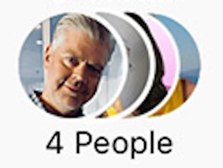
我有一个图片列表,我想要把它们重叠起来,使它们看起来类似于这样:

overlapped people

我的代码:

.avatar img {
    border-radius: 50%;
    position: relative;
    left: -5px;
    z-index: 1;
}
<div class="avatars">
    <span class="avatar">
        <img src="https://picsum.photos/70" width="25" height="25"/>
    </span>
    <span class="avatar">
        <img src="https://picsum.photos/50" width="25" height="25"/>
    </span>
    <span class="avatar">
        <img src="https://picsum.photos/20" width="25" height="25"/>
    </span>
    <span class="avatar">
        <img src="https://picsum.photos/100" width="25" height="25"/>
    </span>
    <!-- Variable amount more avatars -->
</div>
<p>4 People</p>

但很明显,我需要一个递增的 left 值,和一个递减的 z-index 值来控制头像图片数量。当然,我可以使用 @for 指令完成这个任务,但问题是,头像图片的数量是可变的。我也想过使用 length() 函数,但它的作用不符合我的需求。

另一个想法是使用一个固定宽度的 div,并将图像放在其中,但这会带来自己的问题(如果有 5 张图片或 20 张图片,如何控制宽度)。我也可以在其他地方将这些图片组合起来,而不使用任何 CSS。

3个回答

46

您可以使用flex和reverse order,无需z-index:

.avatars {
  display: inline-flex;
  flex-direction: row-reverse;
}

.avatar {
  position: relative;
  border: 4px solid #fff;
  border-radius: 50%;
  overflow: hidden;
  width: 100px;
}

.avatar:not(:last-child) {
  margin-left: -60px;
}

.avatar img {
  width: 100%;
  display: block;
}
<div class="avatars">
  <span class="avatar">
        <img  src="https://picsum.photos/70">
    </span>
  <span class="avatar">
        <img src="https://picsum.photos/80">
    </span>
  <span class="avatar">
        <img src="https://picsum.photos/90">
    </span>
  <span class="avatar">
       <img src="https://picsum.photos/100">
    </span>
</div>

以下是一个与规模相关的想法:

.avatars {
  display: inline-block;
  transform: scale(-1, 1);
}

.avatar {
  position: relative;
  display: inline-block;
  border: 4px solid #fff;
  border-radius: 50%;
  overflow: hidden;
  width: 100px;
}

.avatar:not(:first-child) {
  margin-left: -60px;
}

.avatar img {
  width: 100%;
  display: block;
  transform: scale(-1, 1);
}
<div class="avatars">
  <span class="avatar">
        <img  src="https://picsum.photos/70">
    </span>
  <span class="avatar">
        <img src="https://picsum.photos/80">
    </span>
  <span class="avatar">
        <img src="https://picsum.photos/90">
    </span>
  <span class="avatar">
       <img src="https://picsum.photos/100">
    </span>
</div>

如果您想保留图像顺序,可以考虑使用遮罩的另一个方法。这样还可以在图像之间提供透明度:

.avatar {
  display: inline-block;
  border-radius: 50%;
  overflow: hidden;
  width: 100px;
}

.avatar:not(:first-child) {
  margin-left: -60px;
  -webkit-mask:radial-gradient(circle 55px at 5px 50%,transparent 99%,#fff 100%);
          mask:radial-gradient(circle 55px at 5px 50%,transparent 99%,#fff 100%);
}

.avatar img {
  width: 100%;
  display: block;
}

body {
  background:pink
}
<div class="avatars">
  <span class="avatar">
        <img  src="https://picsum.photos/70">
    </span>
  <span class="avatar">
        <img src="https://picsum.photos/80">
    </span>
  <span class="avatar">
        <img src="https://picsum.photos/90">
    </span>
  <span class="avatar">
       <img src="https://picsum.photos/100">
    </span>
</div>

使用3D变换技巧的另一个想法(不需要透明度)

.avatars {
  transform-style:preserve-3d; /* here */
}

.avatar {
  display: inline-block;
  border-radius: 50%;
  overflow: hidden;
  width: 100px;
}

.avatar:not(:first-child) {
  margin-left: -60px;
  transform:rotateY(-1deg); /* and here */
}

.avatar img {
  width: 100%;
  display: block;
}
<div class="avatars">
  <span class="avatar">
        <img  src="https://picsum.photos/70">
    </span>
  <span class="avatar">
        <img src="https://picsum.photos/80">
    </span>
  <span class="avatar">
        <img src="https://picsum.photos/90">
    </span>
  <span class="avatar">
       <img src="https://picsum.photos/100">
    </span>
</div>


18

我更喜欢Temani的,但如果您不能使用flex,因为您需要支持IE 9或更早版本,我就把这个留在这里。

请注意,文本方向现在是从右到左,所以您需要颠倒头像的顺序。

.avatar img {
  border-radius: 50%;
  position: relative;
  left: -5px;
  margin-left: -25px;
  z-index: 1;
}

.avatars {
  direction: rtl;  /* This is to get the stack with left on top */
  text-align: left;  /* Now need to explitly align left */
  padding-left: 25px;  /* Same value as the negative margin */
}
<div class="avatars">
  <span class="avatar">
        <img src="https://www.fillmurray.com/50/50" width="50" height="50"/>
    </span>
  <span class="avatar">
        <img src="https://www.fillmurray.com/100/100" width="50" height="50"/>
    </span>
  <span class="avatar">
        <img src="https://www.fillmurray.com/200/200" width="50" height="50"/>
    </span>
  <span class="avatar">
        <img src="https://www.fillmurray.com/150/150" width="50" height="50"/>
    </span>
  <span class="avatar">
        <img src="https://www.fillmurray.com/50/50" width="50" height="50"/>
    </span>
  <!-- Variable amount more avatars -->
</div>


我很高兴你的回答向我展示了这个很棒的占位符内容资源。它应该是每个开发者工具箱中必备的。 - BobbyTables

0

尝试了反向 flex 的想法,虽然可行,但弄乱了我的列表,因为我需要保留顺序,如果事先将它们反转,会破坏另一个列表,我需要再次反转

现在我正在做的是在容器上使用 flex-space-x-2,并在循环中,通过索引,使每个项获得列表总长度减去当前索引的 z-index,对我非常有效。

z-index: array.length - index

如果你没有使用Tailwind,这里发生了什么

.-space-x-2 > :not([hidden]) ~ :not([hidden]) {
    margin-left: -0.5rem;
}

我去掉了一些Tailwind的魔法,基本上是使用子组合器>通用兄弟组合器~选择第一个之后的每个(非隐藏)子元素。

但我认为我也会尝试一下Temani提到的遮罩方法。


网页内容由stack overflow 提供, 点击上面的
可以查看英文原文,
原文链接