我有以下数据集:
> str(dat)
'data.frame':   5000 obs. of  3 variables:
 $ y: num  0.864 0.869 0.871 0.879 0.874 0.871 0.871 0.873 0.864 0.869 ...
 $ A: Factor w/ 5 levels "0.2","0.5","0.8",..: 1 1 1 1 1 1 1 1 1 1 ...
 $ x: num  1 2 3 4 5 6 7 8 9 10 ...
> head(dat)
      y   A x
1 0.864 0.2 1
2 0.869 0.2 2
3 0.871 0.2 3
4 0.879 0.2 4
5 0.874 0.2 5
6 0.871 0.2 6
"x" 列是向量 c(1:5000):
> all(dat$x==1:5000)
[1] TRUE
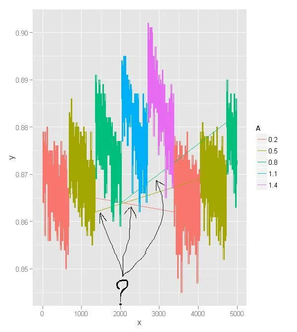
因此,当绘制以下图表时,我不理解某些线条的存在:
ggplot() + geom_line(aes(x=x, y=y, color=A), data=dat)
我要翻译的内容如下:
我所指的线在图中由三个黑箭头表示:
编辑:下面是一个类似的例子,使用可复制的模拟数据集:
set.seed(666)
mu <- rep(c(200, 400, 600, 300, 500), each=1000)
A <- factor(rep(c(1,2,3,1,2), each=1000))
y <- rnorm(length(mu), mu, 100)
dat <- data.frame(x=1:length(mu), y=y, A=A)
ggplot() + geom_line(aes(x=x, y=y, color=A), data=dat)
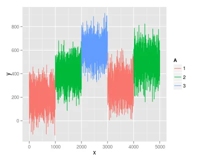
y或x值可能不符合您的预期。 - Roman Luštrik