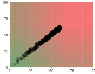
我需要一个图表,它作为一年中的日期函数,在x和y轴上从0到100%进行推进(其中每个轴是一个单独的指标)。根据数据相对于一年中的日期的位置,我想展示这是好还是坏。简单地说,我可以像这样展示它: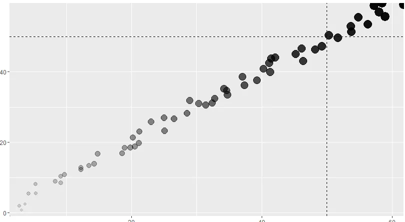 。
。
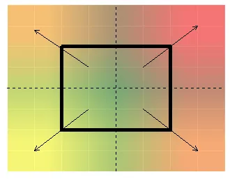
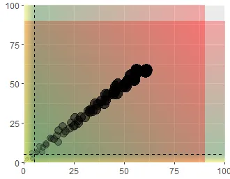
因此,上面的图表显示我们处于良好的状态,因为“尖端”(最暗最大的点)超过了50%的标记(假设我们已经完成了50%的年度计划)。但我想在水平和垂直线周围添加渐变线以显示更多细节。以下是区域的说明(第一幅图是解释...第二幅图是我希望在ggplot中展示的方式...区域完全填满)。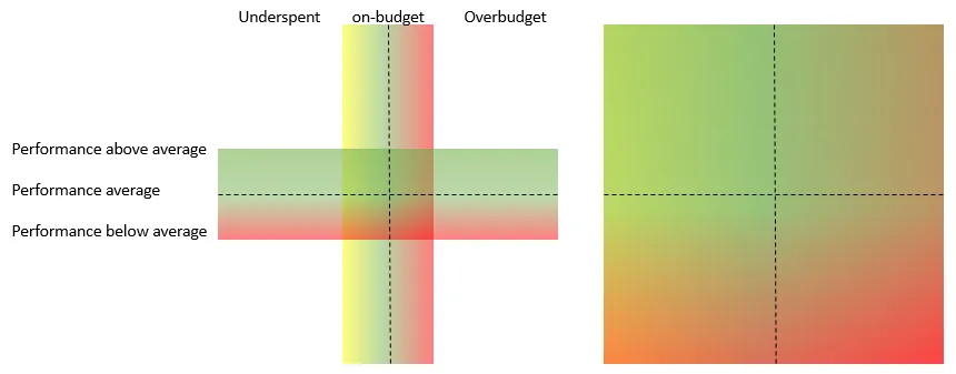 这是我在ggplot中所做的:
 我遇到的问题:
编辑:随着线条移动,渐变也会发生变化,因此静态背景在此处不起作用。
代码如下:
。因此,上面的图表显示我们处于良好的状态,因为“尖端”(最暗最大的点)超过了50%的标记(假设我们已经完成了50%的年度计划)。但我想在水平和垂直线周围添加渐变线以显示更多细节。以下是区域的说明(第一幅图是解释...第二幅图是我希望在ggplot中展示的方式...区域完全填满)。
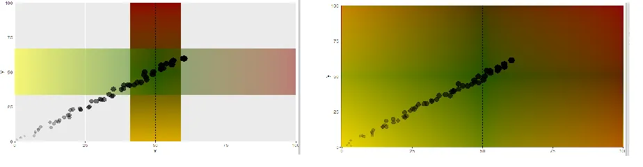
这是我在ggplot中所做的:
我遇到的问题:
- 由于某种原因,垂直渐变不接受alpha参数
- 我无法分配两个不同的渐变,一旦定义了渐变,它就适用于垂直和水平渐变。
- 这看起来很糟糕。我应该采取更好的方法吗?
geom_line的更好方法,请随时建议。编辑:随着线条移动,渐变也会发生变化,因此静态背景在此处不起作用。
代码如下:
dff <- data.frame(x = 1:60+(runif(n = 60,-2,2)),
                  y = 1:60+(runif(n = 60,-2,2)),
                  z = 1:60)

dfgrad <- data.frame(static = c(rep(50,1000)), line = seq(0,100,length.out=100))

## To see the gradientlines thinner, change the size on the geom_line  to like 200

ggplot(dff,aes(x,y)) +
  geom_line(data = dfgrad, aes(x=static, y=line, color=line),size=1000,alpha=0.5) +
  geom_line(data = dfgrad, aes(x=line, y=static, color=line),size=1000,alpha=0.5) +
  scale_colour_gradientn( colours = c( "yellow", "darkgreen","darkred"),
                          breaks  = c( 0, 3, 100),
                          limits  = c( 0,100)) +
  geom_hline(yintercept = 50, linetype="dashed") +
  geom_vline(xintercept = 50, linetype="dashed") +
  geom_point(aes(alpha=dff$z,size= (dff$z))) +
  theme(legend.position="none") +
  scale_x_continuous(expand = c(0, 0)) + scale_y_continuous(expand = c(0, 0))
最终编辑:提交的答案是正确的,但为了根据“今天”的行更改渐变,我不得不对其进行了一些修改...因此,我在这里粘贴它以防对任何人有用:
g1 <- colorRampPalette(c("darkgreen", "darkgreen","red"))(20) %>%
  alpha(0.3) %>% matrix(ncol=1) %>%  # up and down gradient
  rasterGrob(width = 1, height = 1)  # full-size (control it by ggplot2)

g2 <- colorRampPalette(c("yellow", "darkgreen","red"))(20) %>%
  alpha(0.3) %>% matrix(nrow=1) %>%  # left and right gradient
  rasterGrob(width = 1, height = 1)

timeOfYear <- 5
maxx <- max(timeOfYear,(100-timeOfYear))

ggplot(dff,aes(x,y)) +
  annotation_custom(g1, xmin = timeOfYear-maxx, xmax = timeOfYear+maxx, ymin = timeOfYear-maxx, ymax = timeOfYear+maxx) +
  annotation_custom(g2, xmin = timeOfYear-maxx, xmax = timeOfYear+maxx, ymin = timeOfYear-maxx, ymax = timeOfYear+maxx) +
  # annotation_custom(g1, xmin = 35, xmax = 65, ymin = -3, ymax = 100) +
  # annotation_custom(g2, xmin = -3, xmax = 100, ymin = 35, ymax = 65) +
  geom_hline(yintercept = timeOfYear, linetype="dashed") +
  geom_vline(xintercept = timeOfYear, linetype="dashed") +
  geom_point(aes(alpha=dff$z,size= (dff$z))) +
  theme(legend.position="none") +
  coord_cartesian(xlim = c(0, 100), ylim = c(0, 100), expand = F)
rasterGrob这个函数。 - Amit Kohlidivergentcolor,以查看差异有多显着。真的很有趣...我一直在尝试那个解决方案...无法解决数学问题...写在纸上只花了不到一分钟。还没有数字化! - Amit Kohli