使R的plotly绘图中坐标轴上的所有刻度都显示

3
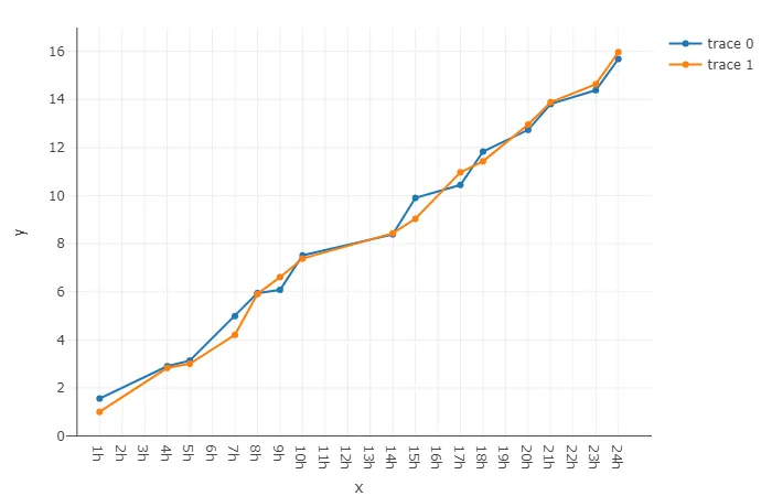
我编写了一段代码,使用我的数据制作了一个带有散点图的子图。下面是该图:

enter image description here

这是x轴上的小时数。如您所见,并非所有小时都出现在x轴上。我该如何使所有24个小时都出现在轴上?即使例如在数据框中没有23点的值,我也希望它出现在x轴上。怎样做呢?

以下是我的代码:

plot <- function(df) {

  subplotList <- list()
  for(metric in unique(df$metrics)){
    subplotList[[metric]] <- df[df$metrics == metric,] %>%
      plot_ly(
        x = ~ hr,
        y = ~ actual,
        name = ~ paste(metrics, " - ", time_pos),
        colors = ~ time_pos,
        hoverinfo = "text",
        hovertemplate = paste(
          "<b>%{text}</b><br>",
          "%{xaxis.title.text}: %{x:+.1f}<br>",
          "%{yaxis.title.text}: %{y:+.1f}<br>",
          "<extra></extra>"
        ),
        type = "scatter",
        mode = "lines+markers",
        marker = list(
          size = 7,
          color = "white",
          line = list(width = 1.5)
        ),
        width = 700,
        height = 620
      ) %>% layout(autosize = T,legend = list(font = list(size = 8)))
  }
  subplot(subplotList, nrows = length(subplotList), margin = 0.05)
}
1个回答

3

可以通过 xaxis 属性在 layout 中实现这一点。可以通过 tickvals 设置刻度或断点,通过 ticktext 设置刻度标签。

下面的可重现示例使用一些随机数据进行说明:

library(plotly)

set.seed(42)

d <- data.frame(
  x = sort(sample(24, 15)),
  y = 1:15 + runif(15),
  z = 1:15 + runif(15)
)

plot_ly(d) %>%
  add_trace(x = ~x, y = ~y, type = "scatter", mode = "lines+markers") %>% 
  add_trace(x = ~x, y = ~z, type = "scatter", mode = "lines+markers") %>% 
  layout(xaxis = list(tickvals = 1:24, ticktext = paste0(1:24, "h")))

enter image description here


网页内容由stack overflow 提供, 点击上面的
可以查看英文原文,
原文链接