如何控制ggarrange中某个绘图的刻度数量/纵轴值?

3

非常抱歉,我无法提供我的图表数据。我的根本问题是,如果使用以下 ggarrange 语法组合两个绘图,我无法弄清楚如何控制 y 轴上打印的值:

  gg.combined <- ggarrange(plot1, plot2, ncol = 1, nrow = 2, align = "v", heights = c(3, 1))

当渲染plot2时,它在y轴上有很多刻度标记,这对于图表本身来说是可以的。在上述ggarrange命令中,我将plot2缩小了1/3,因此刻度标记聚集在一起了。如何重新调整plot2中的y轴,使得在gg.combined中刻度标记不会聚集在一起?或者也许我需要在gg.combined中重新调整比例尺?
2个回答

5
您可以手动指定刻度,并在需要时增加刻度之间的间隔。
例如:
data(iris)
g1 <- ggplot(iris, aes(x = Sepal.Length, y = Petal.Length, col = Species)) + geom_point()
g2 <- ggplot(iris, aes(x = Sepal.Width, y = Petal.Length, col = Species)) + geom_point()

btw_tick <- 1 # space between 2 ticks
ggarrange(g1 + scale_y_continuous(breaks = seq(1,8, btw_tick)), 
          g2 + scale_y_continuous(breaks = seq(1,8, btw_tick * 3)), 
          ncol = 1, nrow = 2, align = "v", heights = c(3, 1))

enter image description here


令人惊讶的是,在ggarrange中没有选项可以漂亮地打印y轴标签或应用于其结果的某些转换... - Denis
说实话,Y轴非常宽的图表可能不应该被“挤压”到刻度重叠的程度;-) - RoB
最终采用以下解决方案:
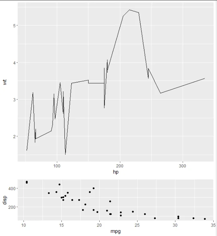
breaks <- c((plot2.y.max - plot2.y.min) / 4 + plot2.y.min, plot2.y.max - (plot2.y.max - plot2.y.min) / 4)。这个方法很有效!感谢您提供的示例! - Denis

1

我认为scale_y_可能会有帮助:

df <- mtcars
library(tidyverse)
library(ggpubr)
plot1 <- ggplot(data = df, aes(x = hp, y = wt)) +
  geom_line() 

plot2 <- ggplot(data = df, aes(x = mpg, y=disp)) +
  geom_point() + 
  scale_y_continuous(breaks = c(200, 400))

gg.combined <- ggarrange(plot1, plot2, ncol = 1, nrow = 2, align = "v", heights = c(3, 1))

gg.combined

image desc


网页内容由stack overflow 提供, 点击上面的
可以查看英文原文,
原文链接