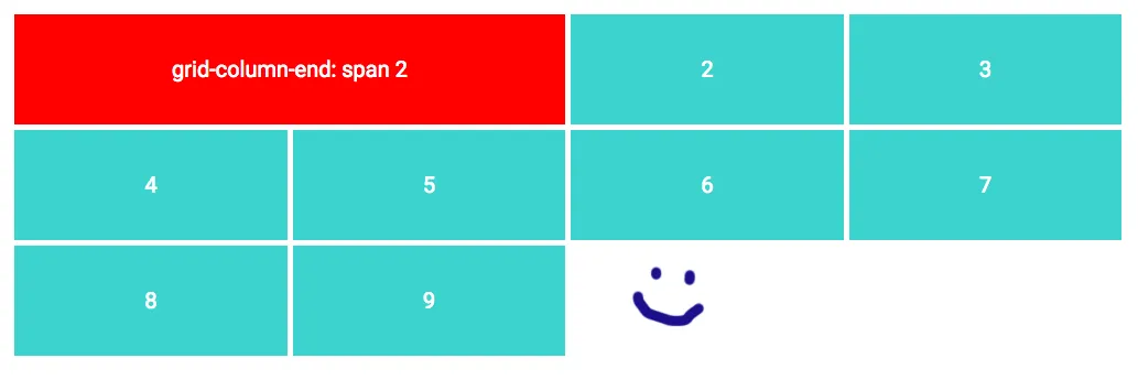
CSS响应式网格布局:grid-column span破坏了minmax

8

我有一个很棒的响应式网格,就像这样:

grid-template-columns: repeat(auto-fill, minmax(200px, 1fr));

这使得每个网格项至少有200像素的宽度。其中一个项目(红色的)是两倍宽,就像这样:

grid-column-end: span 2;

目前为止还不错!

大屏幕上显示良好的网格

现在当我调整到一个小宽度时,红色项目会强制该网格分为两列。这给了我一个奇怪的小栏,即使我指定了最小宽度为200px也是如此。看:

小屏幕上破坏的网格

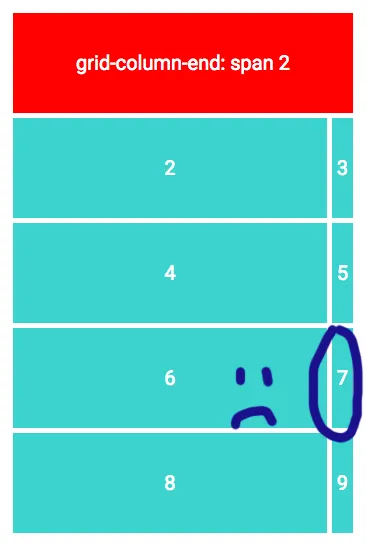
我真的希望红色项目能够折叠到一列,这样网格就不会破裂。

然而问题是,我不知道整个网格的宽度,因此无法使用特定视口大小触发的媒体查询。

有没有办法要么强制红色项到一列,要么以解决此问题的另一种方式定义网格列?


3
虽然你可能不知道你的设计在哪个具体尺寸上会出现问题,但你需要开始寻找这些问题点,并使用媒体查询来预测问题的发生。顺便说一句,如果你能发布你的[mcve]代码(包括允许该代码重现你的问题的虚拟内容),那么你可能会得到更好或更多的答案。或者,你应该/可以先为移动设备(小屏幕)设计,然后使用断点调整设计以适应更大的屏幕。这可能会简化你需要做的工作,也可能不会。 - David Thomas
很遗憾,我做不到。我正在开发一个可视化网站构建工具,并且在客户设计自己的布局时,这是我预料到的问题。例如,200像素的值可以是任何给定的宽度。 - tape2
2
如果没有足够的代码来重现问题(即使是非常基础的级别),那么很难提供解决方案。此时我们只能猜测。例如,也许您可以从当前网格中取出第一个项目。将其作为单独的容器,无论是网格还是弹性盒子。但这只是猜测;没有代码,我无法测试或展示结果。 - Michael Benjamin
你是在寻找仅使用CSS的解决方案,还是愿意使用JavaScript? - DKyleo
2个回答

1
使用网格时需要记住尺寸和一些数学知识。如果您告诉一个项目跨越2列,那么这意味着您的网格始终至少有2列,如果屏幕变小,它不会变成1列网格。现在您的网格具有400px的最小宽度。
对于那个奇怪大小的列,由于您有2列,第2列占用了其最小200px的宽度,之后的项目留下了那个奇怪的大小。
您可以在该断点处编写媒体查询,告诉项目1保留在列1中,这应该可以解决问题。
@media screen and (max-width:415px){
.item1 {
grid-column: 1;
background:red;
}
}

请查看我在此处链接的 Codepen

在 Codepen 上查看


1
尽管我总是不赞成没有充分理由就进行高度特定的媒体查询,但似乎这是除了将标记分解为较小部分(这本身可能会有问题)之外的唯一解决方案。据我所知,在CSS更新以便网格项可以跨越span minmax(1, 2)列之前,我们只能使用hack方法。 - Gust van de Wal
1
我非常期待 span minmax - Shahriar

0
CSS Grid Masonry的启发,CSS网格几乎可以满足我们的需求,我们只需要用一点JS来辅助。我有以下解决方案:
我们选择网格中的最大列数和每列的最小宽度。我们可以拥有任意数量的网格项,这些项可以跨越1到最大列数之间的范围。
本示例使用最多4列,每列最小宽度为256px。
HTML代码:
<div class="grid">
  <div class="w1"></div>
  <div class="w1"></div>
  <div class="w2"></div>
  <div class="w1"></div>
  <div class="w3"></div>
  <div class="w4"></div>
  ...
</div>

CSS:
.grid {
  display: grid;
}

.w1 {
  grid-column-end: span 1;
}
.w2 {
  grid-column-end: span 2;
}
.w3 {
  grid-column-end: span 3;
}
.w4 {
  grid-column-end: span 4;

JS:

// The minimum width in pixels for our columns
const colWidth = 256;
// The maximum number of columns in our grid
const maxCols = 4;

function resizeGrid() {
  const grid = document.getElementsByClassName("grid")[0];
  
  // Calculate the number of cols we can have by dividing the grid width by our colWidth.
  // This is the maximum number of cols we can have if they are all colWidth.
  const gridWidth = grid.getBoundingClientRect().width;
  let cols = Math.floor(gridWidth / colWidth);

  // Clamp this to our maxCols.
  cols = Math.min(maxCols, cols);

  // Set the number of cols in the grid
  grid.style.gridTemplateColumns = "repeat(" + cols + ", 1fr)";

  // Update grid-column spans limiting them to the number of cols we have.
  // We must do this as grid with an item that spans n columns will automatically have a default of n columns.
  for (let j = 1; j < maxCols + 1; j++) {
    for (const gridItem of grid.getElementsByClassName("w" + j)) {
      gridItem.style.gridColumnEnd = "span " + Math.min(j, cols);
    }
  }
}

window.addEventListener("resize", resizeGrid);
resizeGrid();

这通过计算适应最小宽度的列数来实现。然后我们将网格设置为具有该列数,并限制我们的项目跨越多达该列数。这会根据网格的宽度来减少列数。

您可以在此Codepen链接中查看其效果。


网页内容由stack overflow 提供, 点击上面的
可以查看英文原文,
原文链接